
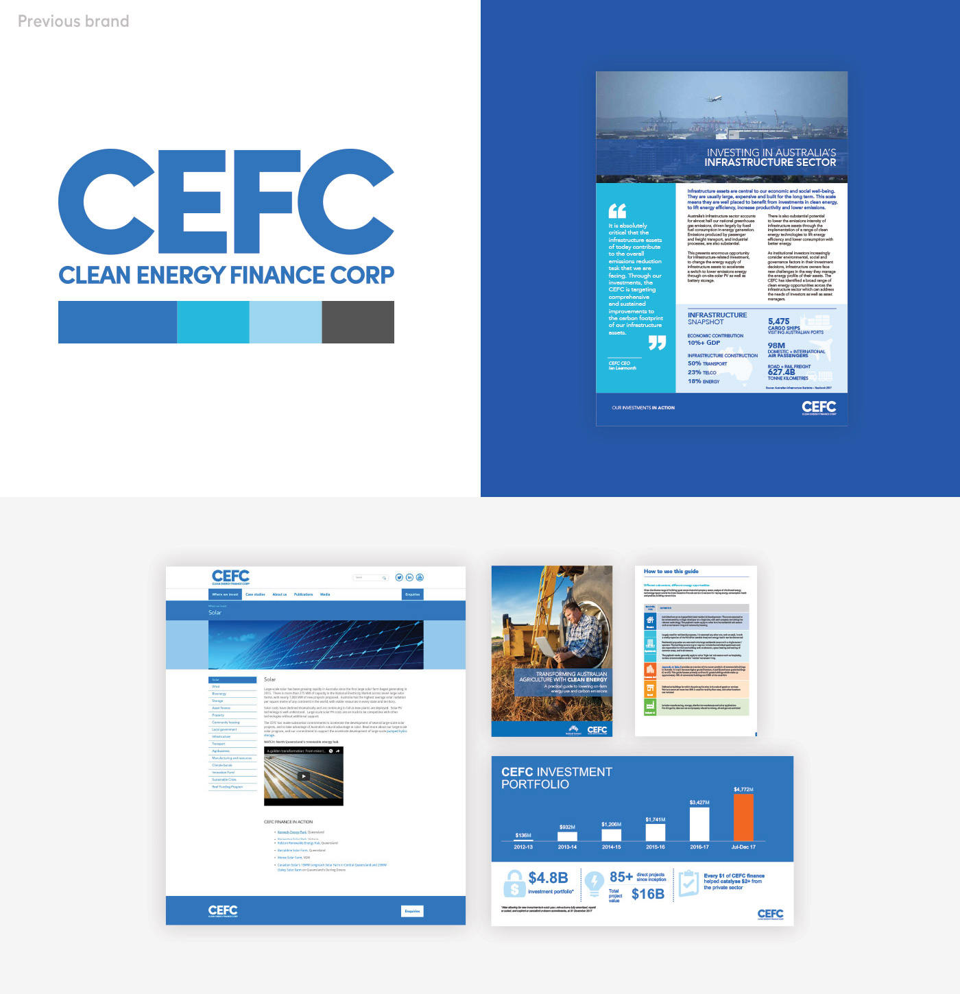
Noted: New Logo and Identity for CEFC by Designate

“It’s Not Easy Bein’ Clean”
(Est. 2012) "The CEFC (Clean Energy Finance Corporation) has a unique role to increase investment in Australia's transition to lower emissions. We invest to lead the market, operating with commercial rigour to address some of Australia's toughest emissions challenges - in agriculture, energy generation and storage, infrastructure, property, transport and waste. We're also proud to back Australia's cleantech entrepreneurs through the Clean Energy Innovation Fund. In investing $10 billion on behalf of the Australian Government, we work to deliver a positive return for taxpayers across our portfolio."
Design by
Designate (Sydney, Australia)
Related links
Designate project page
Relevant quote
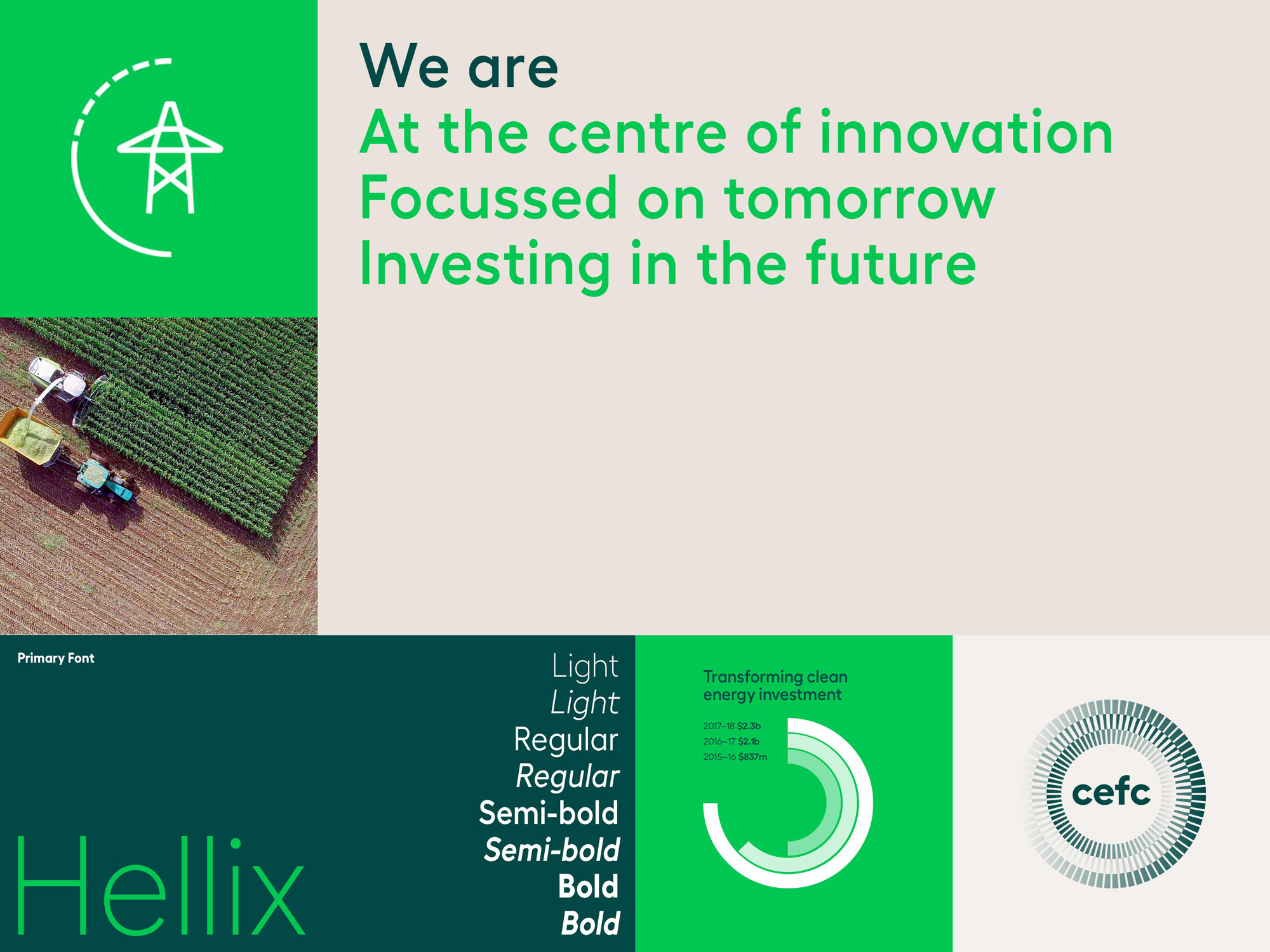
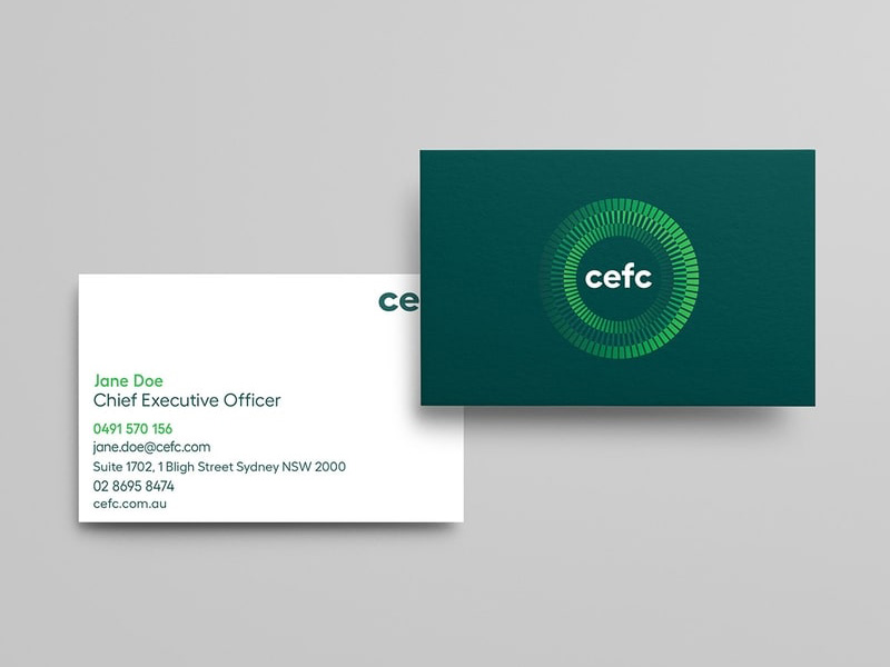
The refreshed brand positions the CEFC at the centre of innovation. Visually, it is a significant departure from the original, understated brand. It was time to take ownership of the organisation’s mission and successful track record and to make these an integral part of the brand’s story, essential to establishing credibility in this sector.
Images (opinion after)

Opinion
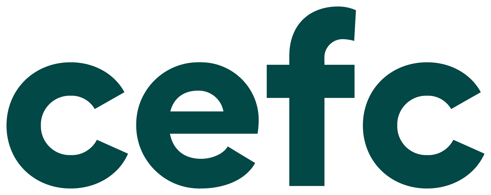
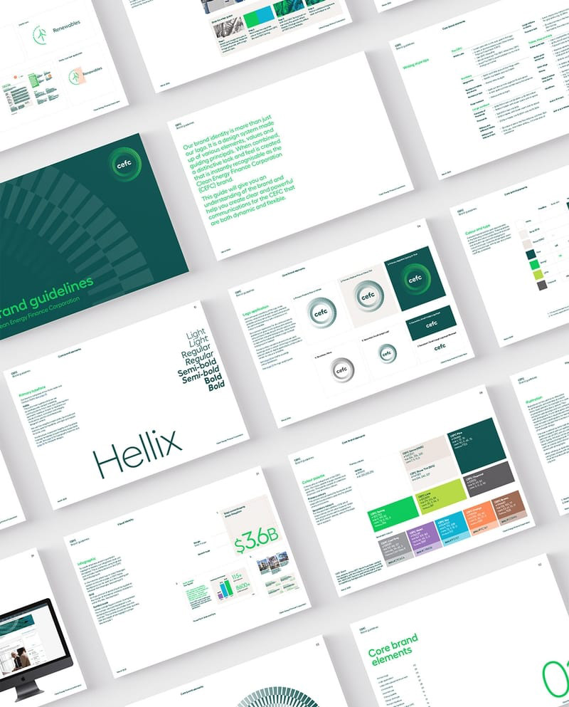
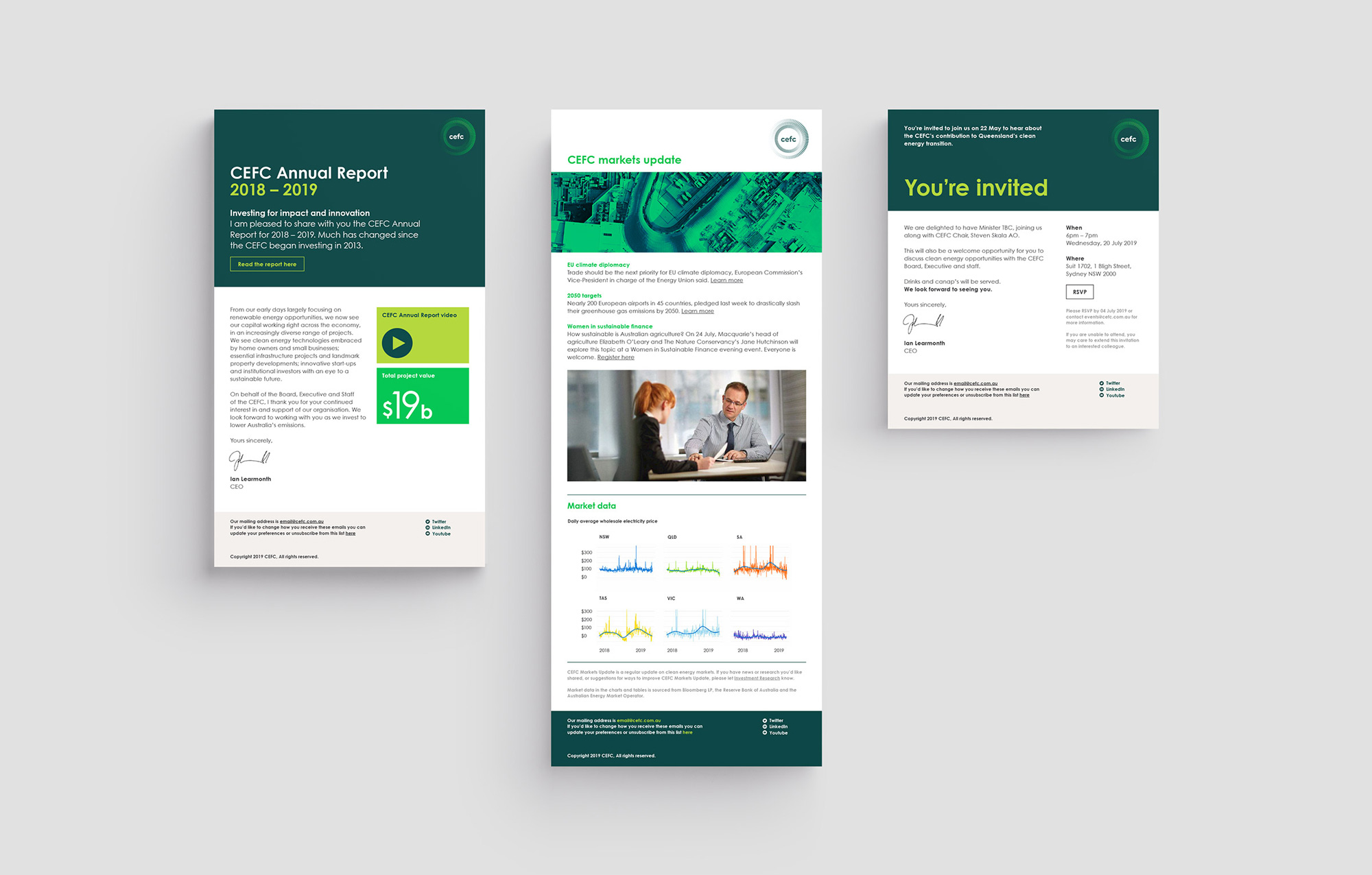
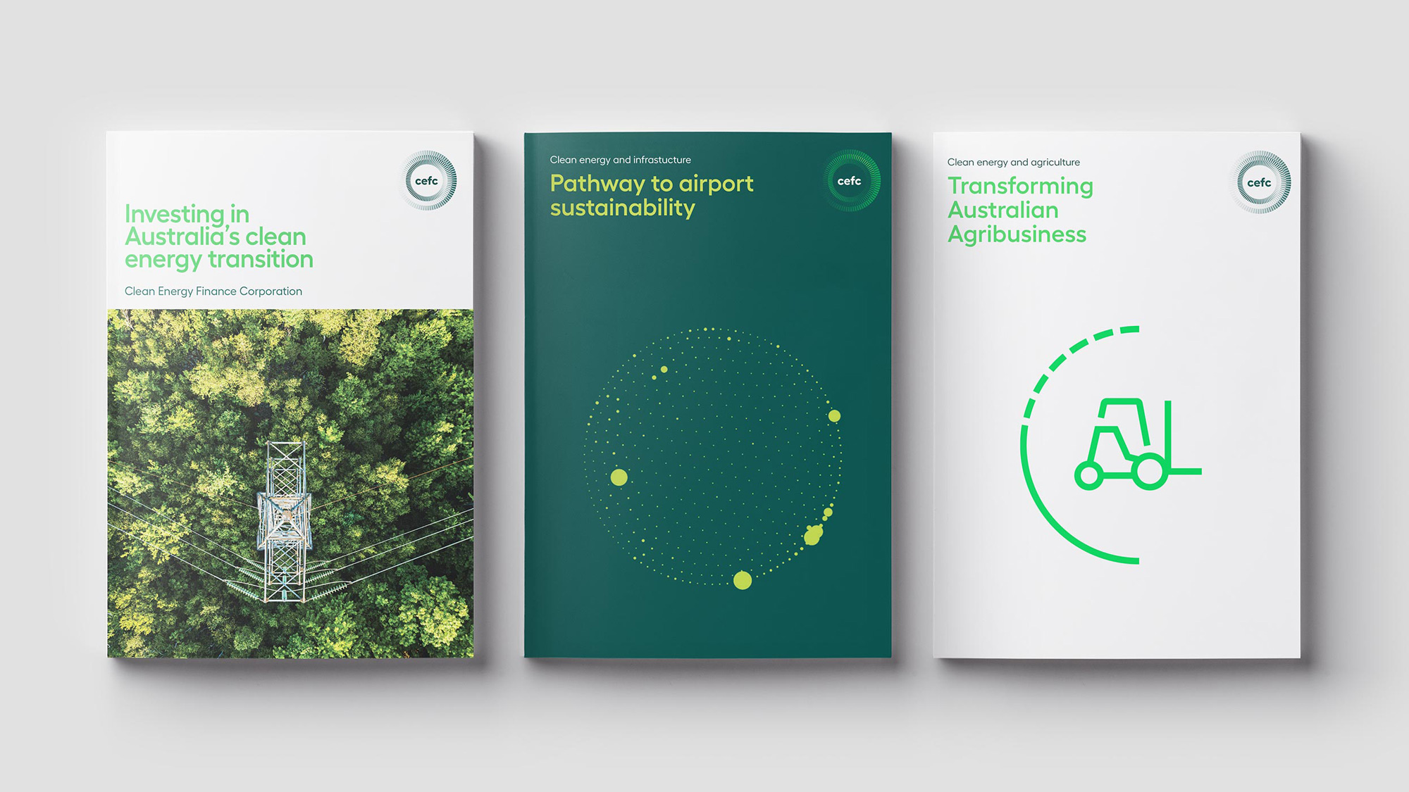
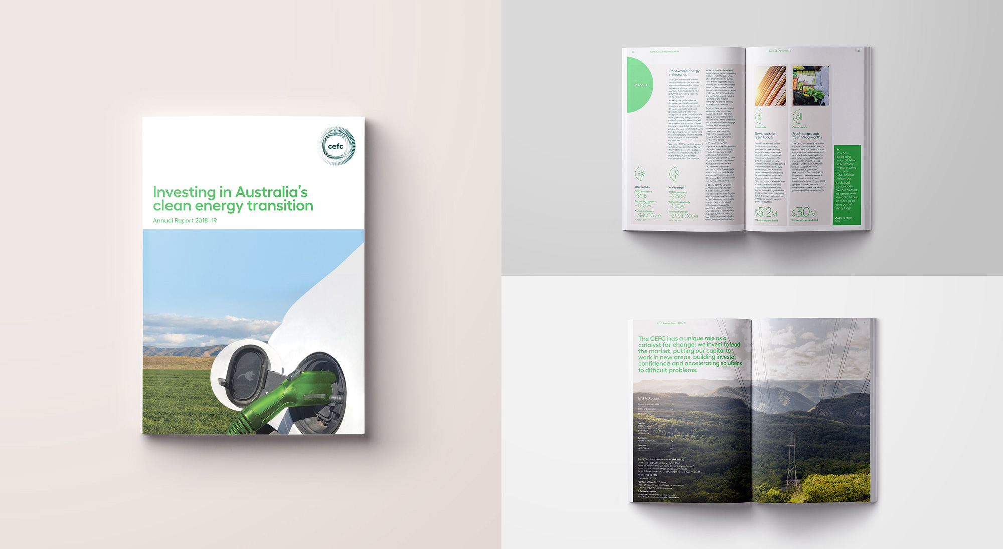
Between the old logo and new logo it’s a matter of choosing what kind of wood shavings you would prefer snacking on because both are pretty dry in their sans serif starkness. Relatively speaking, the new one is a little more engaging as the round lowercase characters work well together and look more lively. While the wordmark is used on its own on the website and the social media avatars, it also comes in a more decorated variation with a radial graphic device that is nice to look at, particularly when used small as seen in the print publications — at large sizes it’s too overpowering and somewhat out of proportion with the wordmark. The illustrations are a little cringe-y and unfinished, which is surprising given how nice the icon set is. The applications are fairly decent and those print publication covers show the best-case use of the elements. Overall, a nice evolution that just needs to figure out what to do about its two logo variations.