
Noted: New Logo and Identity for EQ3 by Wedge

“Three’s a Crowd Pleaser”
(Est. 2001) "EQ3 is a Canadian retailer and manufacturer offering simple, clean, functional furnishings and home accents for every room. Founded in 2001, EQ3 is commited to quality craftmanship and original design while promoting a Canadian perspective on home furnishings in a modern environment. EQ3 offers iconic brands like Herman Miller, Marimekko, and more, as a part of its EQ3+ collection. EQ3 has 12 retail locations across Canada and two in the U.S. Apart from a large-scale wholesale presence, EQ3 also has a substantial e-commerce presence in Canada and the United States, as well as studios and stores around the world."
Design by
Wedge (Montréal, Québec)
Related links
Wedge project page
Relevant quote
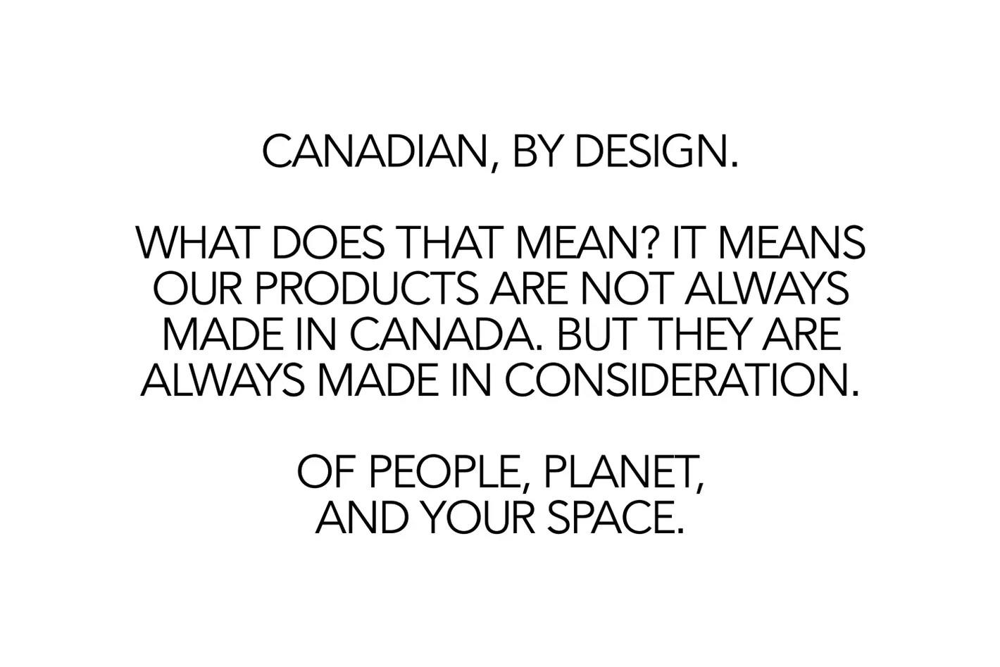
The challenge was to define what they stand for, and bring new value to what it means to be a Canadian brand in today’s culture.
We responded by learning about their business and DNA from key teammates, company-wide. By exploring their practises, their culture, what works, what doesn’t, and being given the space to challenge their point of view in order to evolve it, we were able to respond with a brand vision that didn’t reinvent the wheel, but reflected EQ3’s existing truths with fresh eyes.
We defined a strategic position distinctly Canadian, by Design. Not an aesthetic, but a value system that is thoughtful, human, inclusive, pragmatic, restrained, and progressive, to guide every facet of the organization. Our goal was also to elevate the brand expression in a more premium direction to honour the business and quality product. Every aspect now works to attract a more premium consumer and build trust.
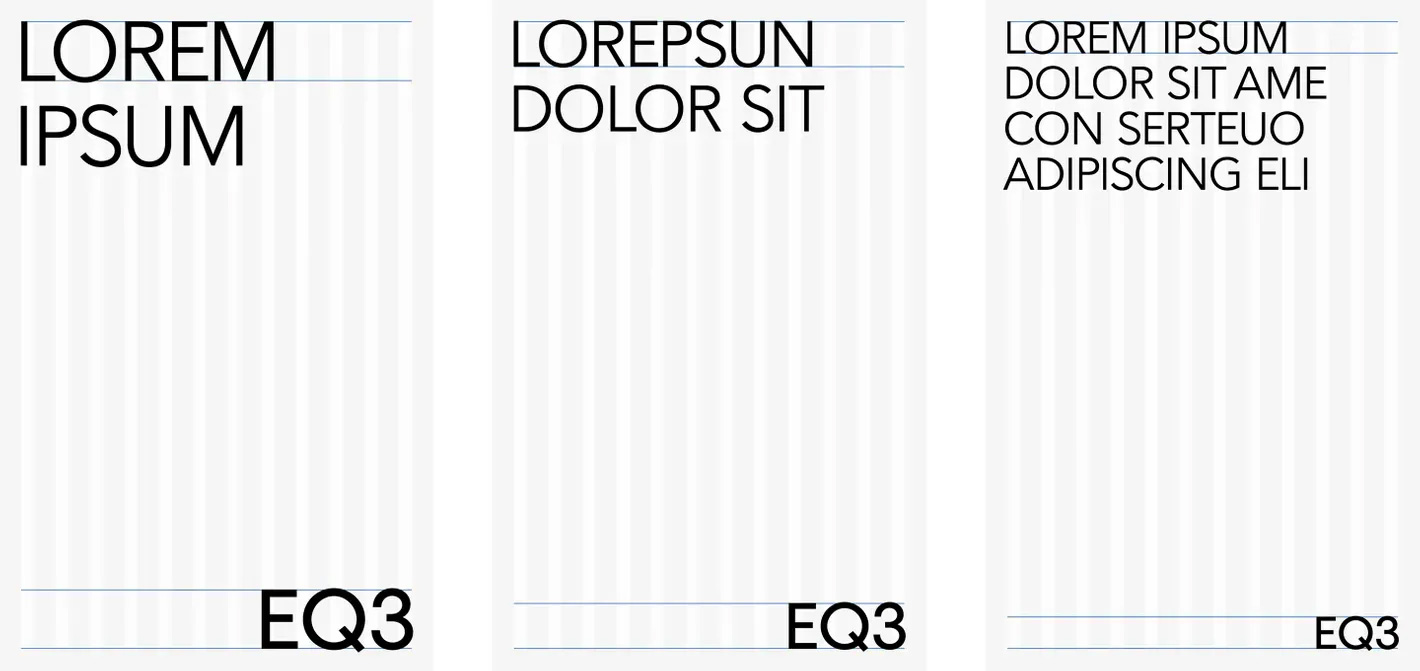
By evolving elements like a carefully crafted logo, standardizing design systems, and providing a guide for photography and branded elements across channels, we developed a strong foundation and guide for internal teams.
Images (opinion after)
Opinion
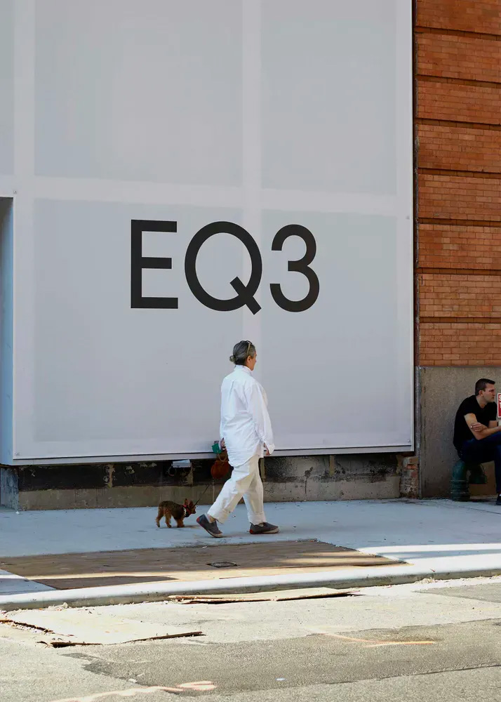
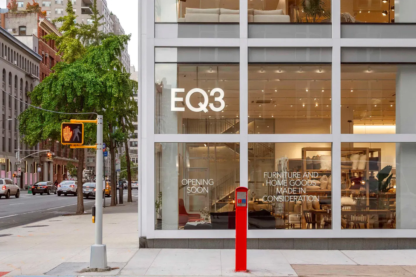
The old logo was okay, I guess, at least in terms of not being terrible. The red box with the rounded corners, though, felt cheap and unrelated to the letterforms. The new logo smartly drops the box and goes for a much more fashion-y look with an elegant and minimalist evolution of the original typography. There is really not much to the logo but somehow it’s quite nice. The subtle change to the “3” makes such a huge difference. The applications are very minimal and stark, perhaps to a fault but they certainly exude design-y classiness, all done in a single weight of what seems to be a custom sans, “EQ3 Book”, which has that deadpan hipster vibe that’s maybe a year late but still effective. Overall, there is a nice aspirational quality to the identity that gives the furniture some extra cachet.