
Noted: New Logo and Identity for 2019 World Fencing Championships by Explicit Design Studio

“Face Off”
(Est. 1921) "The World Fencing Championships is an annual competition in fencing organized by the Fédération Internationale d'Escrime or FIE, (International Fencing Federation in English). The world championships are, after the Olympic Games, the most prominent international competition in the sport of fencing. Contestants may participate in foil, épée, and sabre events. The 2019 World Fencing Championships was held from 15 to 23 July 2019 in Budapest, Hungary." (Wikipedia)
Design by
Explicit Design Studio (Budapest, Hungary)
Related links
Explicit Design Studio project page
Relevant quote
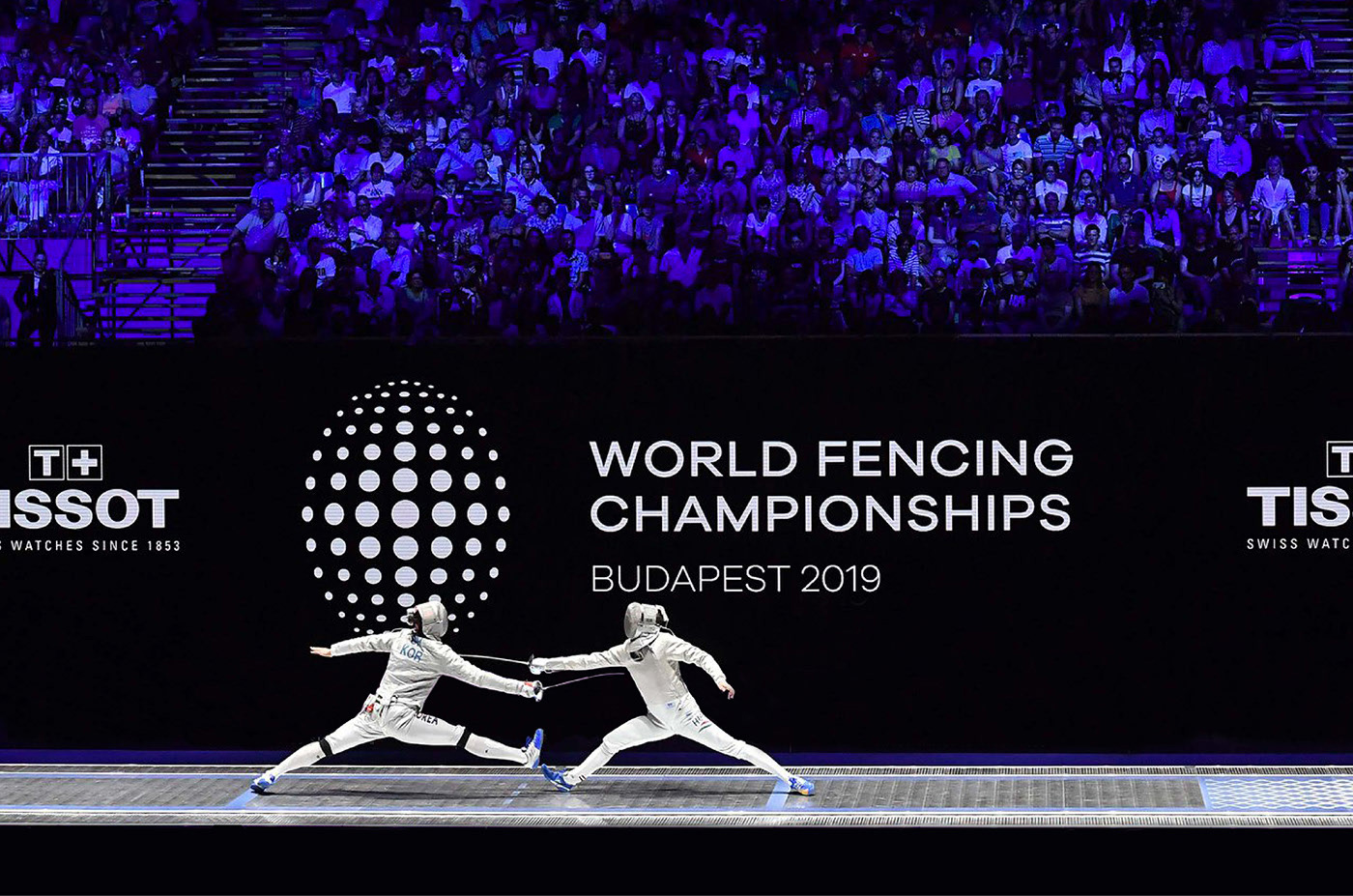
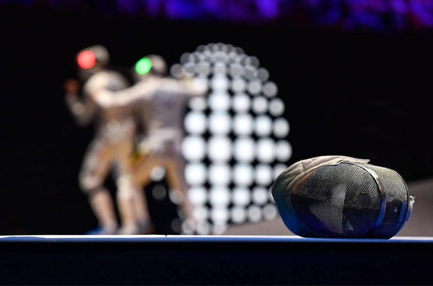
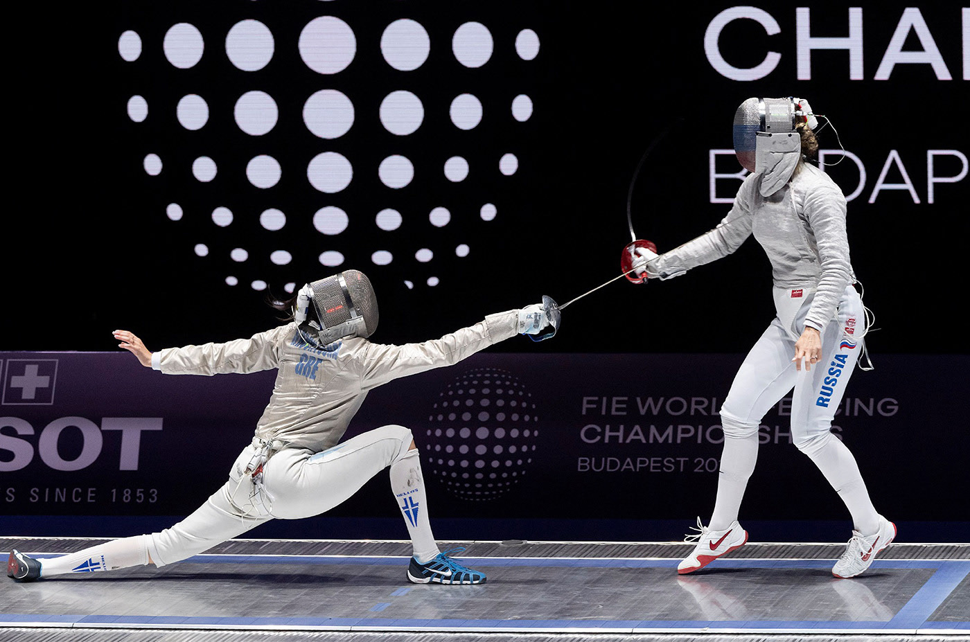
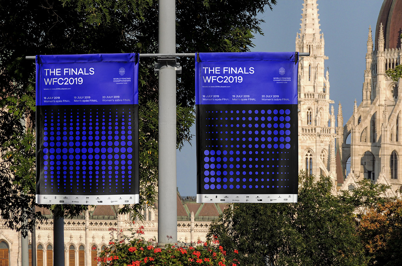
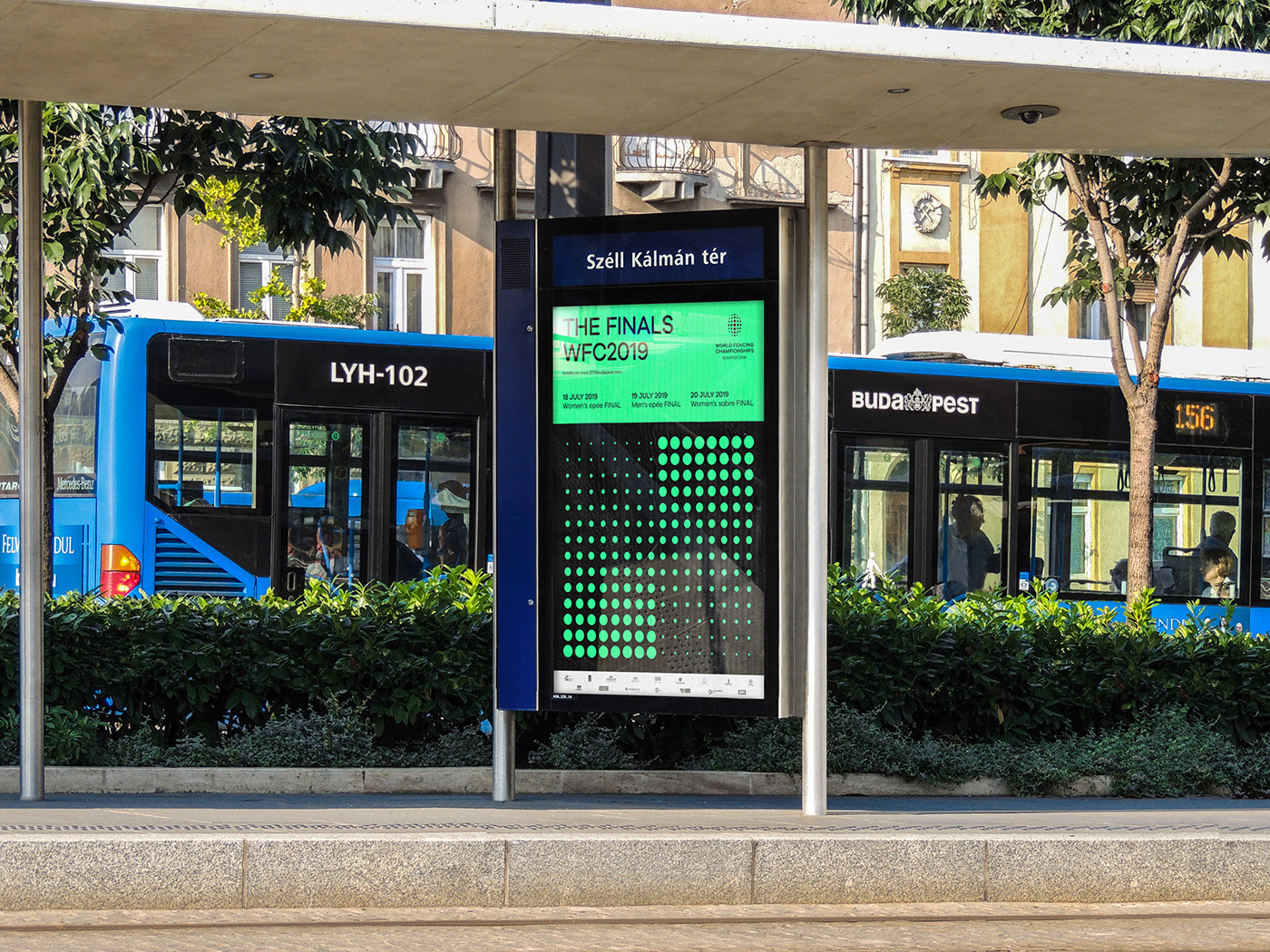
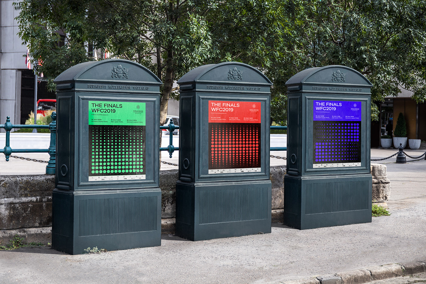
The emblem is a structure which blends optics, the mask as the most iconic element of fencing, and the format of the world championships, which results in only one person emerging as winner. During the event, the logo appeared in forms smaller than 1 centimeter and as large as 5 meters. Due to this, we decided to design a responsive emblem that offers the same visual delight in all cases.
The official range of ellipses define the process of becoming a champion, and as such this is the fundamental point of the emblem. The circle/ellipsoid motif represents the world as well as the mask. The full circle inside of the emblem alludes to the champion. Only one winner, only one victor can come out on top at the world championships. The emblem is a visual reflection of the contest itself, its components depicting all the contenders who partake in the event.
Images (opinion after)
Opinion
Last year’s logo was groovy… the drawing was nice and perhaps some better coloring strategy would have taken it up a notch but it captured the basics of the sport well. The type, though, barely considered. The new logo features an abstract representation of the mask and even with the volume and distortion being so exaggerated, the intent is clear and effective: you know it’s a fencing mask. The bonus concept that the center dot represents the sole winner is pretty good and I like that they properly created different versions for different sizes. The wordmark is nice and slightly different than usual, typeset in Galano Grotesque. The secondary graphic element of the scaling dots looks good but I think it starts to dilute the icon a little bit as they become more decoration than functional and, when seen on their own in advertising on the street, look more like EDM posters than fencing. Overall, it’s all quite nice and I feel like this logo could stay for future years of the event as it encapsulates the sport in a non-literal way with an icon that works very well across all applications.