Noted: New Logo for Sears
“Too Legit to Quit”

(Est. 1886) "Sears, Roebuck and Company, colloquially known as Sears, is a chain of department stores founded by Richard Warren Sears and Alvah Curtis Roebuck in 1893. Formerly based at the Sears Tower in Chicago and currently headquartered in Hoffman Estates, Illinois, the operation began as a mail ordering catalog company and began opening retail locations in 1925. The first location was in Evansville, Indiana. In 2005, the company was bought by the management of the American big box chain Kmart, which formed Sears Holdings upon completion of the merger. Sears had the largest domestic revenue of any retailer in the United States until October 1989, when Walmart surpassed it. In 2018, Sears was the 31st-largest retailer in the United States. After several years of declining sales, its parent company filed for Chapter 11 bankruptcy on October 15, 2018. Sears announced on January 16, 2019 it had won its bankruptcy auction and would shrink and remain open with 425 stores." (Wikipedia)
Design by
N/A
Related links
A lot stories with opinions about the new logo
2010 Brand New post
Relevant quote
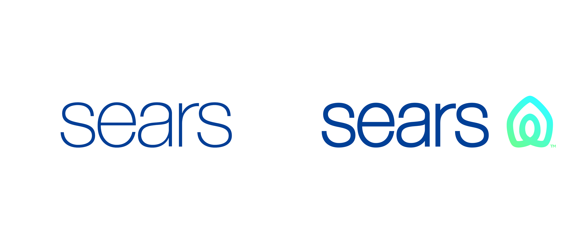
The new icon was created to represent both home and heart, this shape also conveys motion through an infinity loop, reminiscent of one getting their arms around both home and life. The rings, like those of a tree trunk, show longevity. With home and heart at the center, the rings radiate and grow to encompass our broad assortment of products and services.
Images (opinion after)


Opinion
Given how many 1980s retailers have disappeared in the last five years it’s kind of amazing that Sears is still around because it’s one of the most dated retail brands with very little keeping it top of mind with consumers. Yet here we are, as Sears exits bankruptcy not only keeping a number of stores open but even planning to open new, smaller stores. Back in 2010, Sears first moved away from its classic inline logo to what we have today, which is an extra bland Helvetica-esque wordmark in a light weight. Unmemorable and feeble. For the new logo, the wordmark has gotten a little bolder but the biggest surprise is the addition of an icon. An icon that wants to be everything — a home, a heart, an infinity loop, a washer and dryer (I made that last one up) — but ultimately is nothing. As a drawing, it’s fine but as a value-add to the Sears brand it’s fairly useless: if Sears has anything going for it is its name and the fact that the name has survived so many decades and this recent bankruptcy is a testament to its holding power. Diluting it with a gratuitous icon, at this point in its history, comes across as a desperate move for relevance. Execution-wise, we can not avoid the it-looks-like conversation because, yeah, it looks like the Airbnb logo which is very telling on the effectiveness of the Airbnb logo and even more telling of how easily people stop complaining that the Airbnb logo looks like male/female genitals. But back to Sears… Sears, I think, is on borrowed time as there is very little about its offering that will make it relevant for years to come and this new icon isn’t it.


Comments
sears got airbnb'd.
original thinking isn't always original. but i bet they got paid phat for that.
To me the new typeface and logo seem disconnected - like neither have shared values...