
Noted: New Logo and Identity for Correos de México by Carl Forsell

“Pigeon Confidential”
(Est. 1580) "Correos de México, in addition to fulfilling an elementary social function of keeping the entire Mexican society communicated, provides value-added services in the field of philately, messaging and parcels, which as a whole benefit both the general public and to entrepreneurs and businessmen of all lines and sizes. Our wide coverage that covers 98% of the Mexican Republic, as well as more than 27,000 service points, more than 2,800 land routes and more than 15,000 collaborators willing to provide quality services, place us as one of the most important distribution companies in Mexico."
Design by
Carl Forsell (Cuernavaca, Mexico)
Related links
Carl Forsell project page
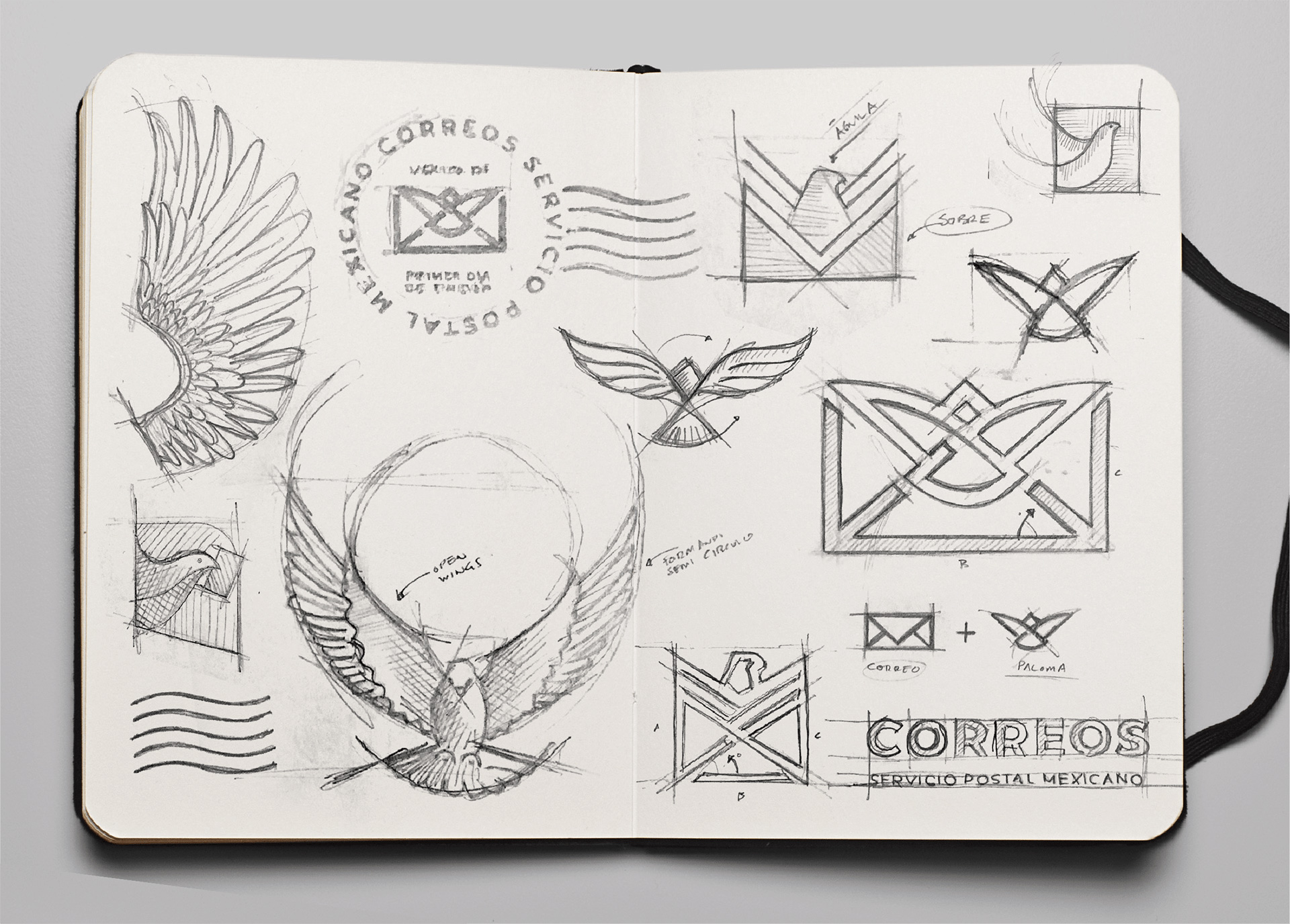
2008 Brand New post
Images (opinion after)

Opinion
I get a lot of pleasure when, 10 or more years later, I get to review something that has already been through a Before/After on Brand New. It’s even better when it’s from my home country, since we don’t cover that many big redesigns from Mexico. So… the old logo had a certain charm with the pigeon holding an envelope but that charm wasn’t nearly enough to make it a good logo, especially not with that terribly spaced wordmark. The new logo keeps the same two elements but integrates them into a single unit. The approach is rather clever — matching the angle of the envelope’s folds to the pigeon’s active wings — and the execution is almost there but, somehow, at the finish line, it’s missing something to take it from “okay” to “awesome” and I think it could have gotten to the latter. The sizing and placement of the wordmark is quite nice too, with the “O”s being nearly symmetrically placed and aligned with the angles of the envelope. Again, with some more finesse and tightening of the final lock-up, this could have been rather epic. The colors remain the same and while I love the Hot Mexican Pink — we call it Rosa Mexicano — I don’t think green (or, at least, this particular green) is its best complement and it could have been an opportunity to change things up and perhaps bring back the blue often association with postal service. The applications… they are all fine… I doubt we’ll ever see any of them applied in that way but there are some decent approaches in there that hopefully, at the very least, make it to Correo’s website because… sheesh, or, I mean, because… ay güey.