
Noted: New Logo and Identity for Go1 by DesignStudio

“The More You Gnow”
(Est. 2015) "At Go1, we are committed to providing the best learning opportunities to improve lives through education and training. Core to Go1's work is our mission to unlock positive potential through a love for learning. We provide the opportunity for individuals to develop themselves to face the future, and for organizations to reach their strategy. Go1 is an established leader in online learning and education, and continues to work alongside some of the largest companies in the world covering a wide range of industries and regions."
Design by
DesignStudio (Sydney, Australia office)
Related links
DesignStudio project page
Relevant quote
We partnered with Go1 to tap into what makes them compelling. We saw that corporate learning could be transformed into a personalised, agile, ever-evolving experience. One that tracks progress and motivates people; fitting seamlessly into any system, application or context. Go1 ensures organisations stay fit for the future, giving them the resources they need to engage and motivate their people.
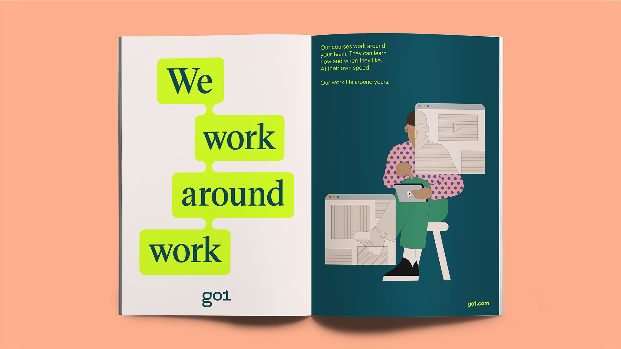
We developed the brand concept 'Learn Athletic'; a call to action for teams to adapt and grow to face challenges, like an athlete training for greatness. It demanded a brand with personality, movement, and high energy.
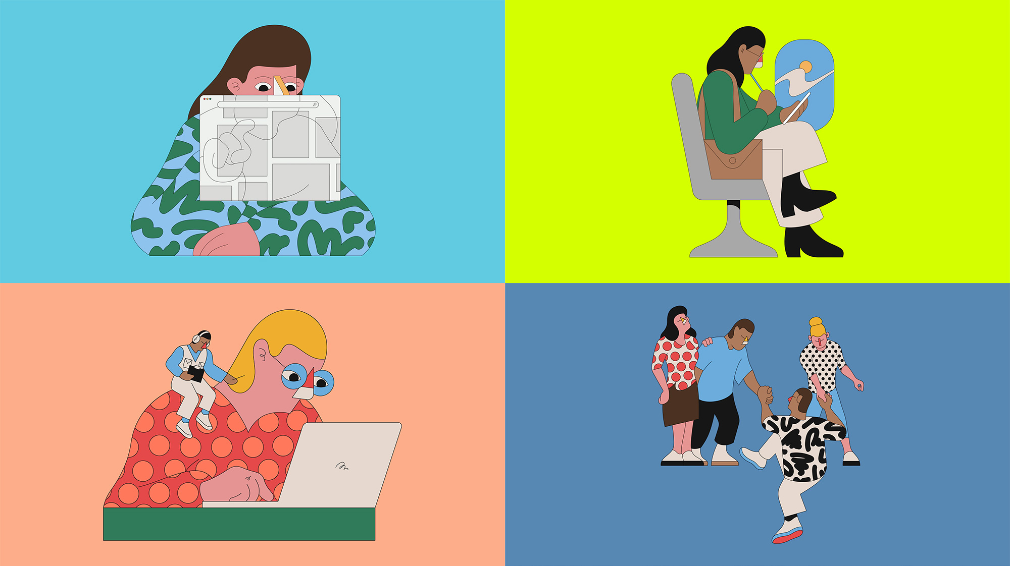
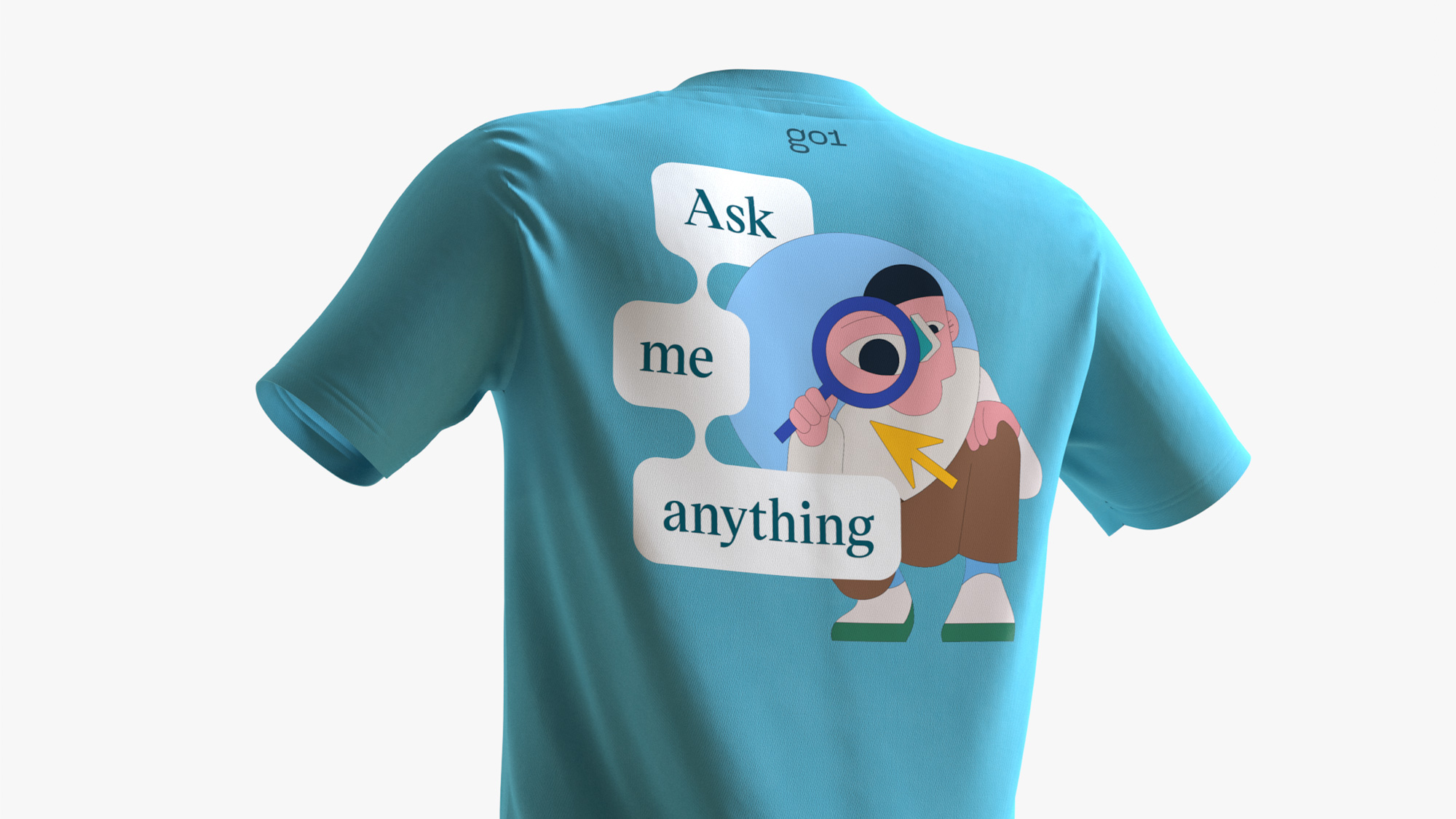
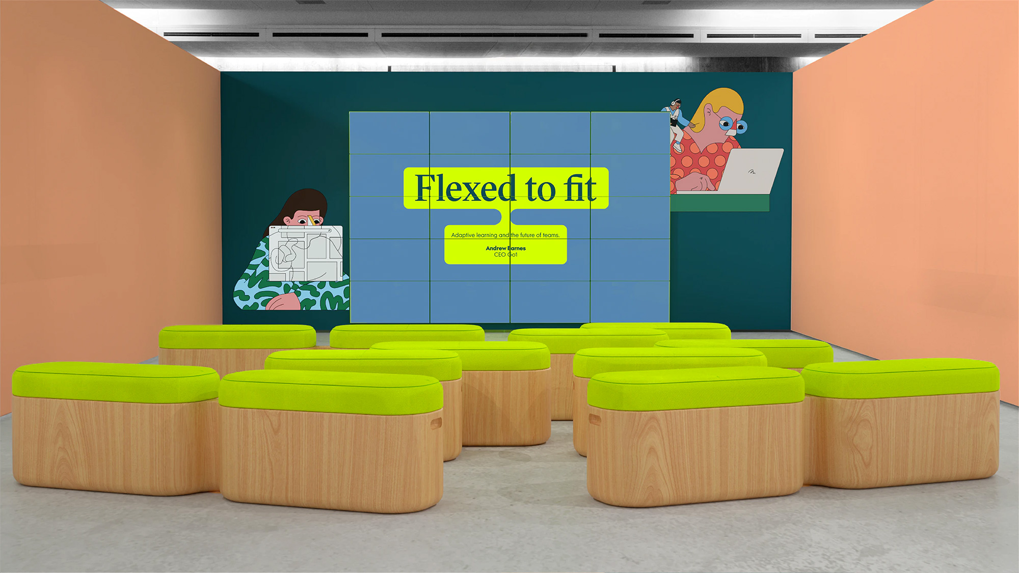
We created a playful new mark and visual system, connecting blocks of content the way Go1 interlinks its different topics, content, and courses around a learner’s needs. Partnering with Camilo Huinca, we created a suite of illustrations which champion the people at the heart of the learning experience.
Images (opinion after)

Opinion
The old logo, I want to say it had the right intentions but, nope, most of the intentions were wrong and the execution was pretty bad. The new logo, I’m not sure what its intentions are but at least it looks very cool. I like the “g”, I like the “o”, I like the “1”, and I like them all together, even though the Mexican-Reptilian part of my brain keeps reading “gol“ (as in goal) but that’s a me problem. The logo ties into the identity through the overarching quirkiness of all the elements, starting with the illustrations that I sense are not going to do well in the comments today as many here have worn weary of this style. I still dig it but I can definitely get on board with the feeling that it’s being overused and applied to any industry, product, and service whatsoever. Aside from the illustrations there is a nice device in the connecting speech-like bubbles with a striking serif inside. The identity is at its best when it mixes the illustrations with the bubbles as seen in the t-shirt… I think that starts to get into some interesting and original territory that makes the disparate elements come together nicely. Overall, I’m not sure this whole thing is right but I think what it does well is create a sense of curiosity and oddity that are not bad associations to have with learning.