
Noted: New Logo and Identity for British Geological Survey by Threerooms

“Below and Beyond”
(Est. 1835) "The British Geological Survey (BGS) is a world leading applied geoscience research centre that is part of UK Research and Innovation (UKRI) and affiliated to the Natural Environment Research Council (NERC). BGS core science provides objective and authoritative geoscientific data, information and knowledge to inform UK Government on the opportunities and challenges of the subsurface. It undertakes national and public good research to understand earth and environmental processes in the UK and globally. The BGS annual budget of approximately £60 million pa is funded directly by UKRI, as well as research grants, government commissions and private sector contracts. Its 650 staff work across the UK with two main sites, the head office in Nottingham and Lyell Centre, a joint collaboration with Heriot Watt University in Edinburgh. BGS works with more than 150 private sector organisations, has close links to 40 universities and sponsors about 100 PhD students each year."
Design by
Threerooms (Nottingham, UK)
Related links
Threerooms project page
Relevant quote
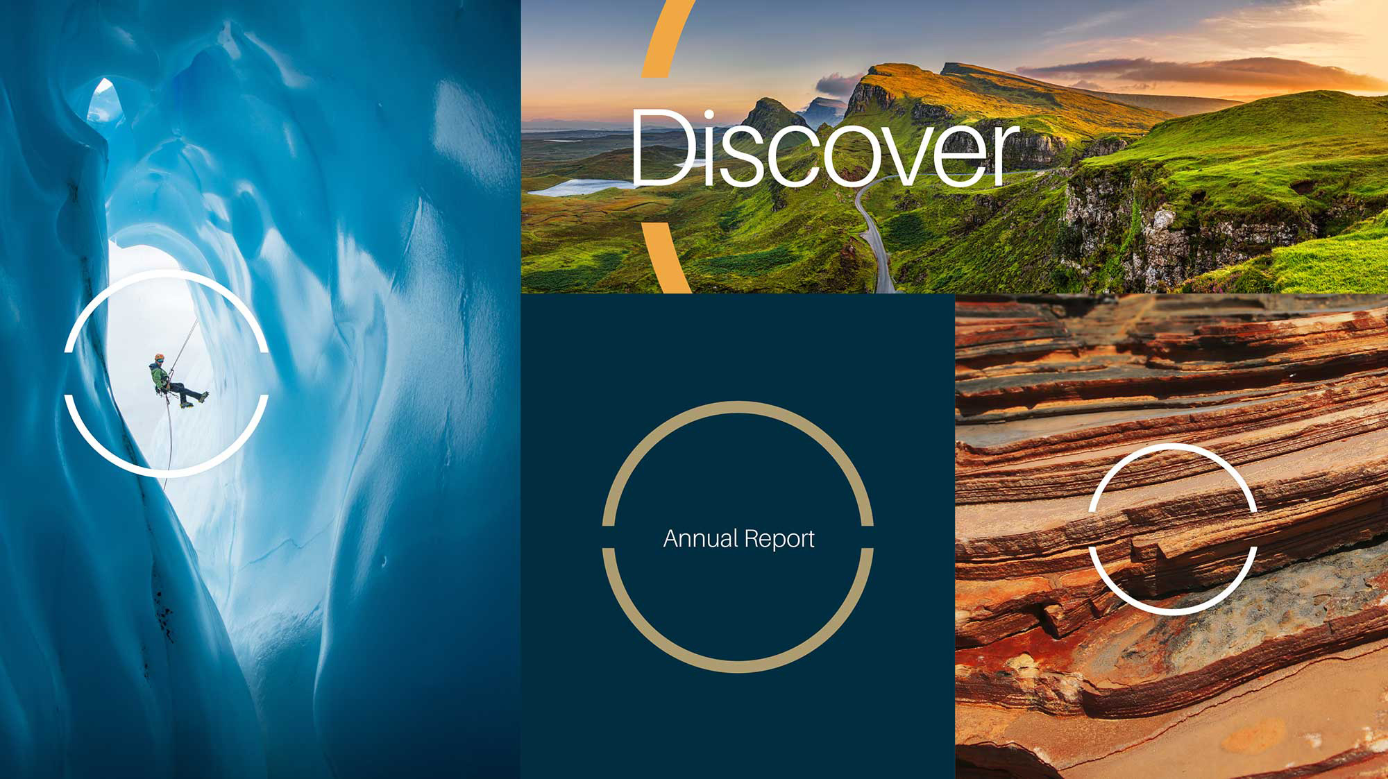
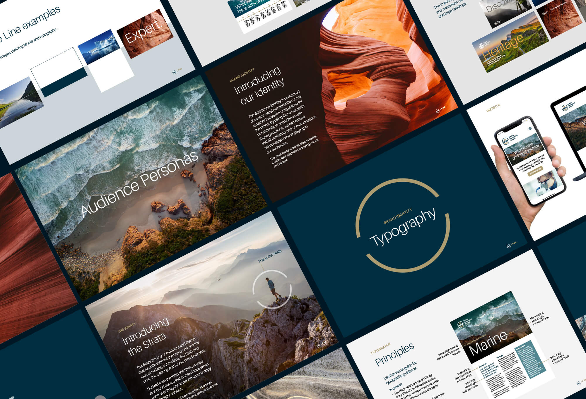
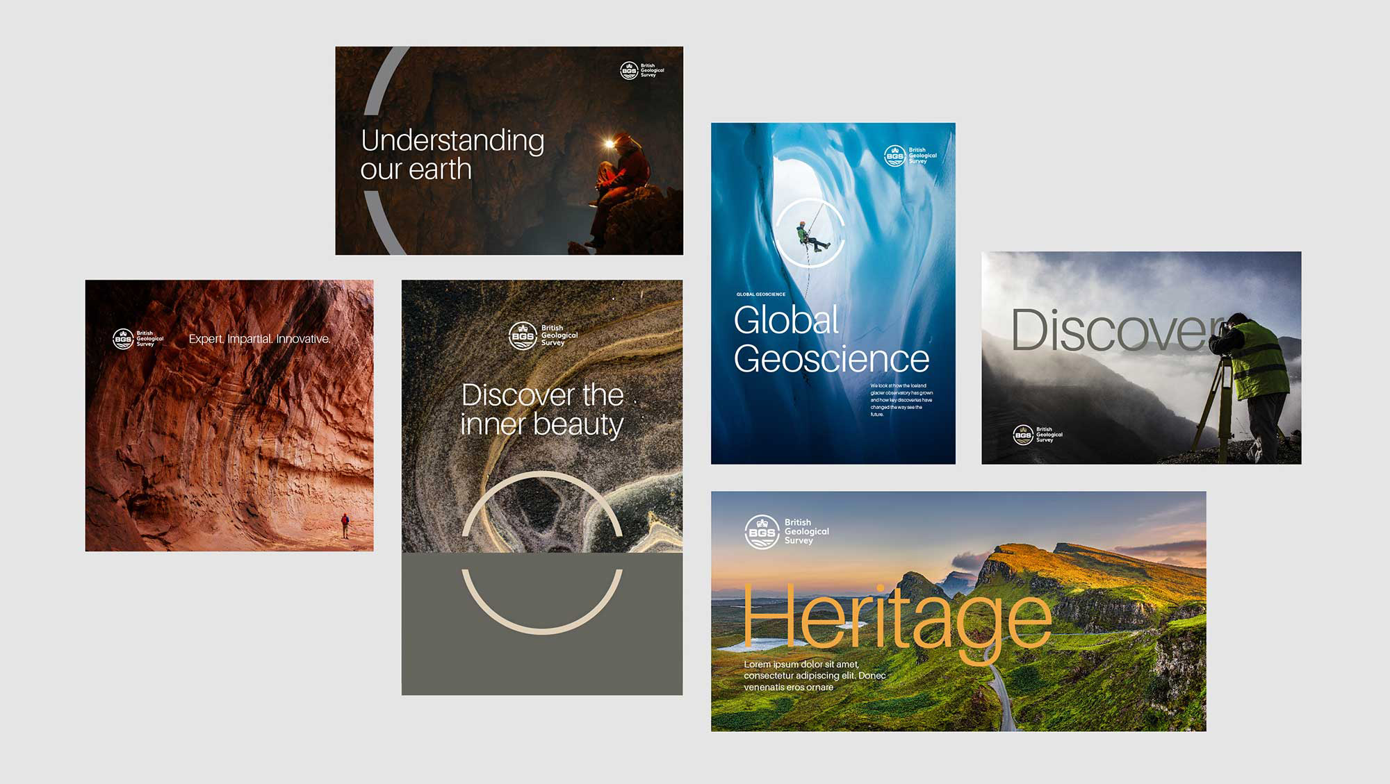
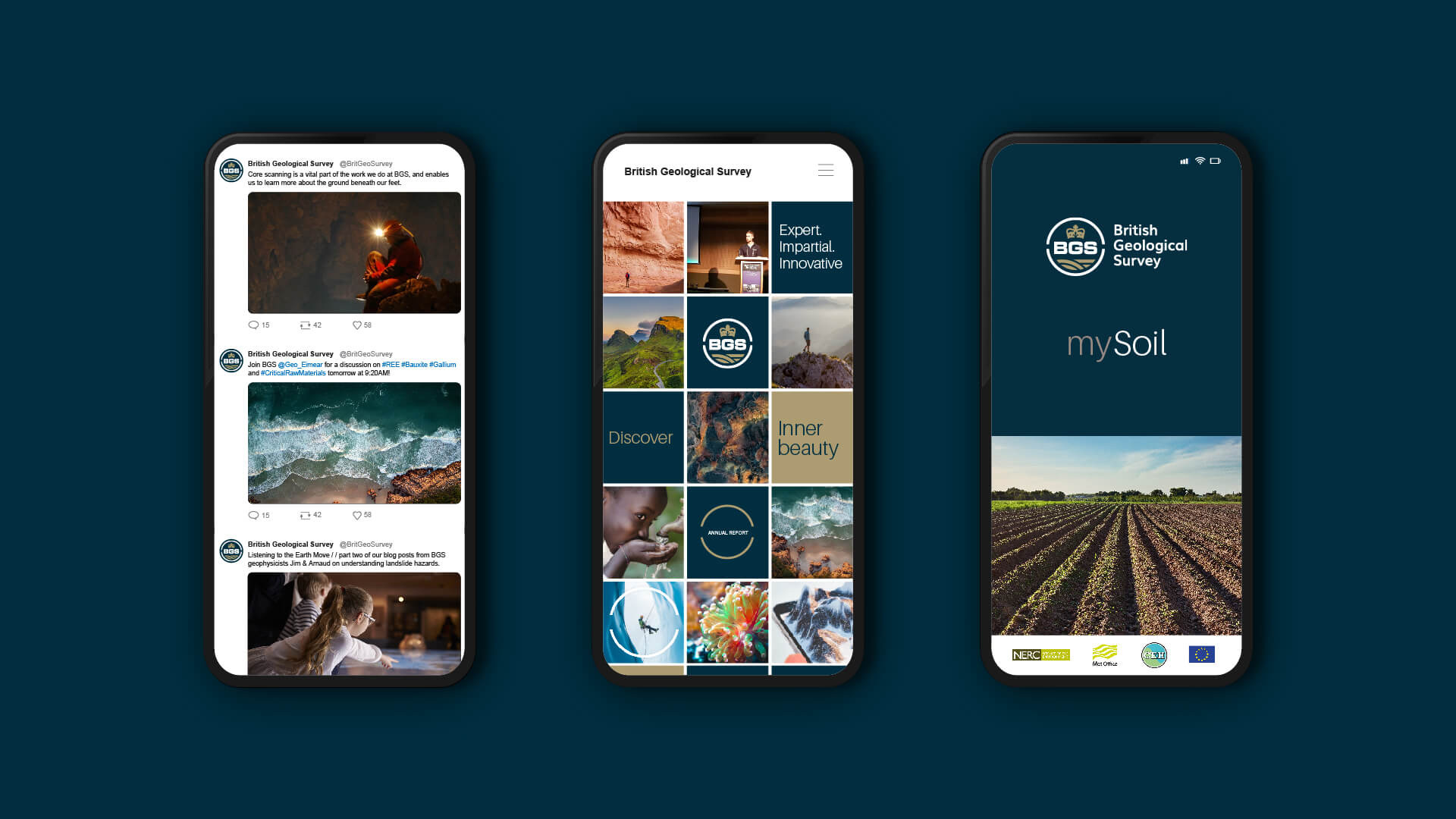
When we set about bringing the brand to life, we knew we wanted the Earth to play a fundamental role in the brand identity. Every design element revolved around the world’s natural beauty, showcasing dramatic landscapes and natural images. To underpin the concept, we created a linear grid derived from core samples taken from Earth. A circular device within the logo represents the surface and sub-surface, and the harmonious colour palette was directly influenced by the natural world. Every decision was carefully validated.
Images (opinion after)
Opinion
The old logo was quite something with, like, a dozen different graphic approaches in the myriad elements, from the detailed and ornate crown to the extra bold and extended acronym to the 1960s-esque geological lines, all tightly packed in a thick stroke. I almost kind of like it. The new logo is a much more concise and consistent execution of the same elements although it’s not without its detriments, mainly the inconsistent spacing and thickness of the “negative” lines: the notch in the circle is super wide in contrast to the smaller spacing between the geological lines in contrast to the spacing that separates the geological lines from the circle. This could be tightened a little more and the crown could potentially be abstracted a couple more degrees. The wordmark is okay, although somewhat random in that that typeface never reappears in the applications. The “Strata” element is kind of interesting and it gets put to good use as a way to highlight text or point out something in a photograph but I feel that the use of the light weight of a grotesque sans somehow cheapens the whole look, looking more like a small university than a national research center. Overall, I think this had some good, solid thinking and premises behind it, all properly based around what the organization does, but the execution fell a little short.