
Noted: New Logo and Packaging for Vyne Botanicals by BrandOpus

“Whose Vyne is it Anyway?”
(Est. 2020) Vyne Botanicals is a new brand of hop-infused sparkling water from Molson Coors Beverage Company.
Design by
BrandOpus (London, UK)
Related links
N/A
Relevant quote
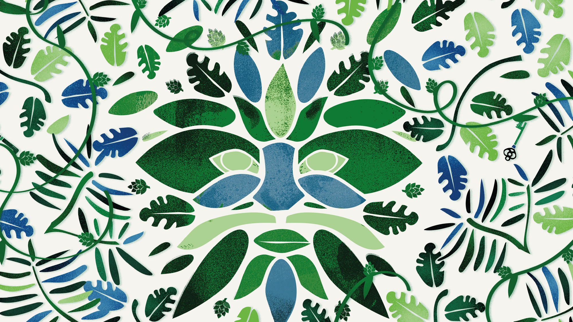
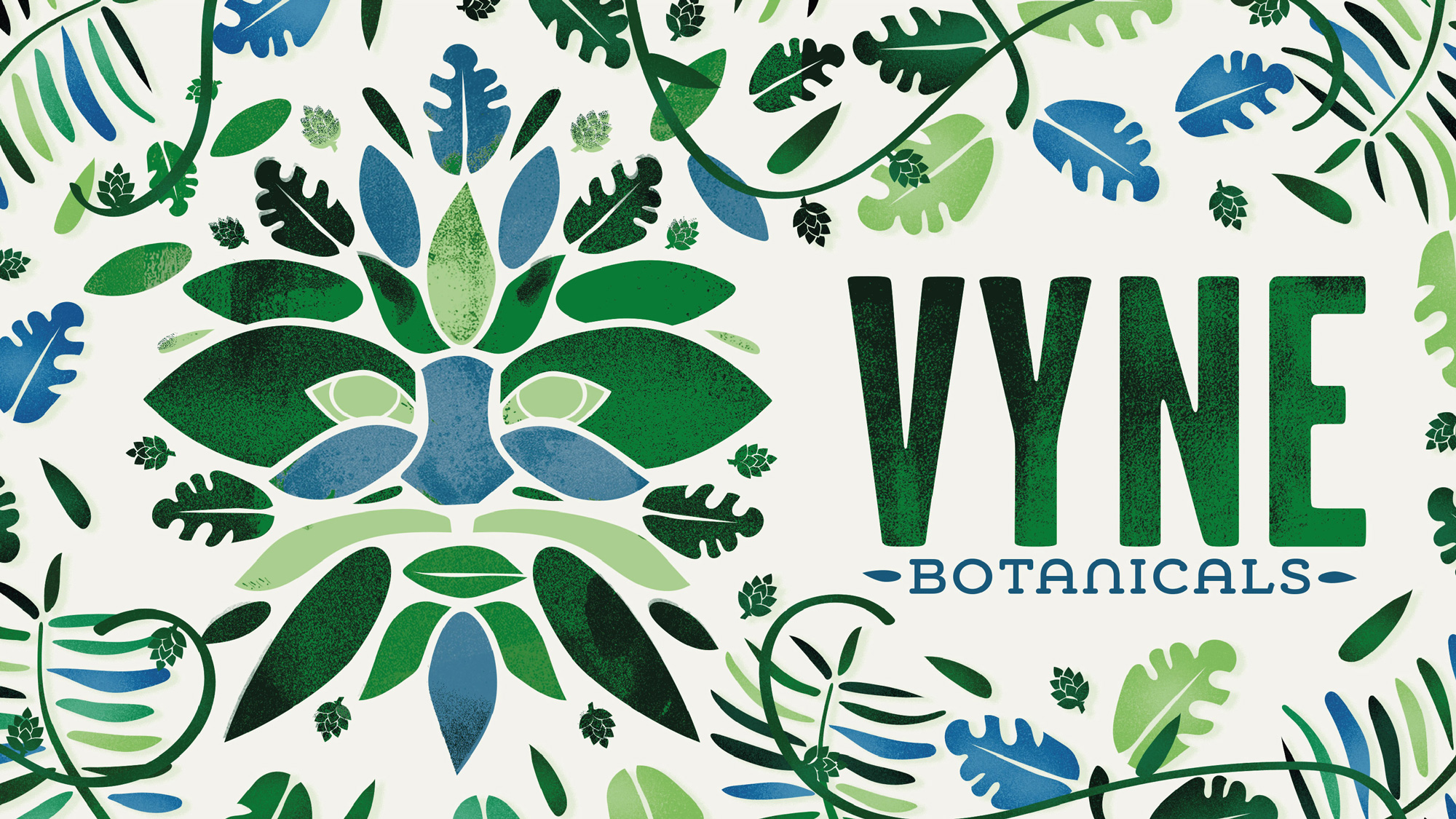
BrandOpus weaves a story of intrigue and mystery through the Green Man, a mysterious historic symbol crafted to appear camouflaged into its surroundings. “We wanted the brand to bring the vitality of nature into our everyday lives.” Comments Paul Taylor, Chief Creative Officer, “The Green Man, as a metaphor, is a perfect embodiment of this idea as he crosses the divide from the world of nature into our world. It speaks to the brand’s ability to reignite a sense of curiosity and to explore a bit more of the wildness at the heart of life.”
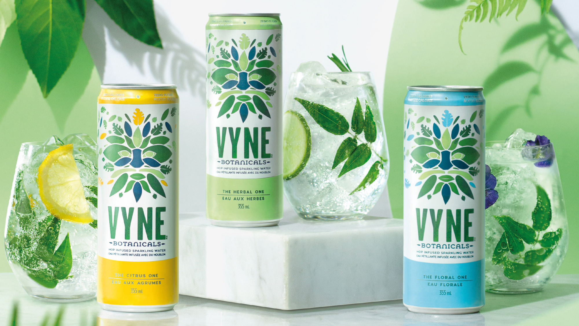
The brand’s visual world is brought together through illustrative and photographic foliage and has the ability to burst into real world experiences. Taylor comments “it was important that Vyne brought the natural world into consumers lives in a really positive way, adding colour and vivacity to every situation.
Images (opinion after)
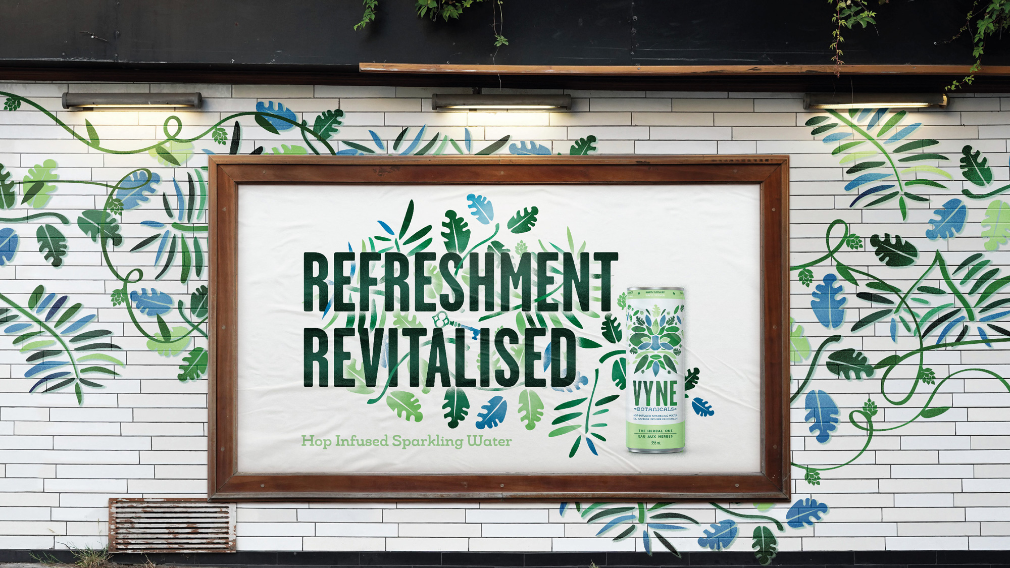
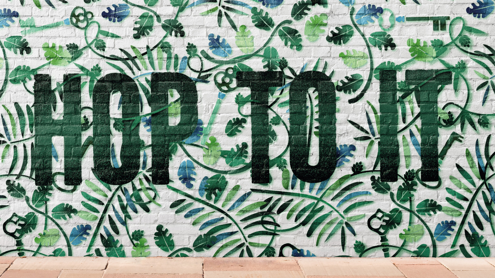
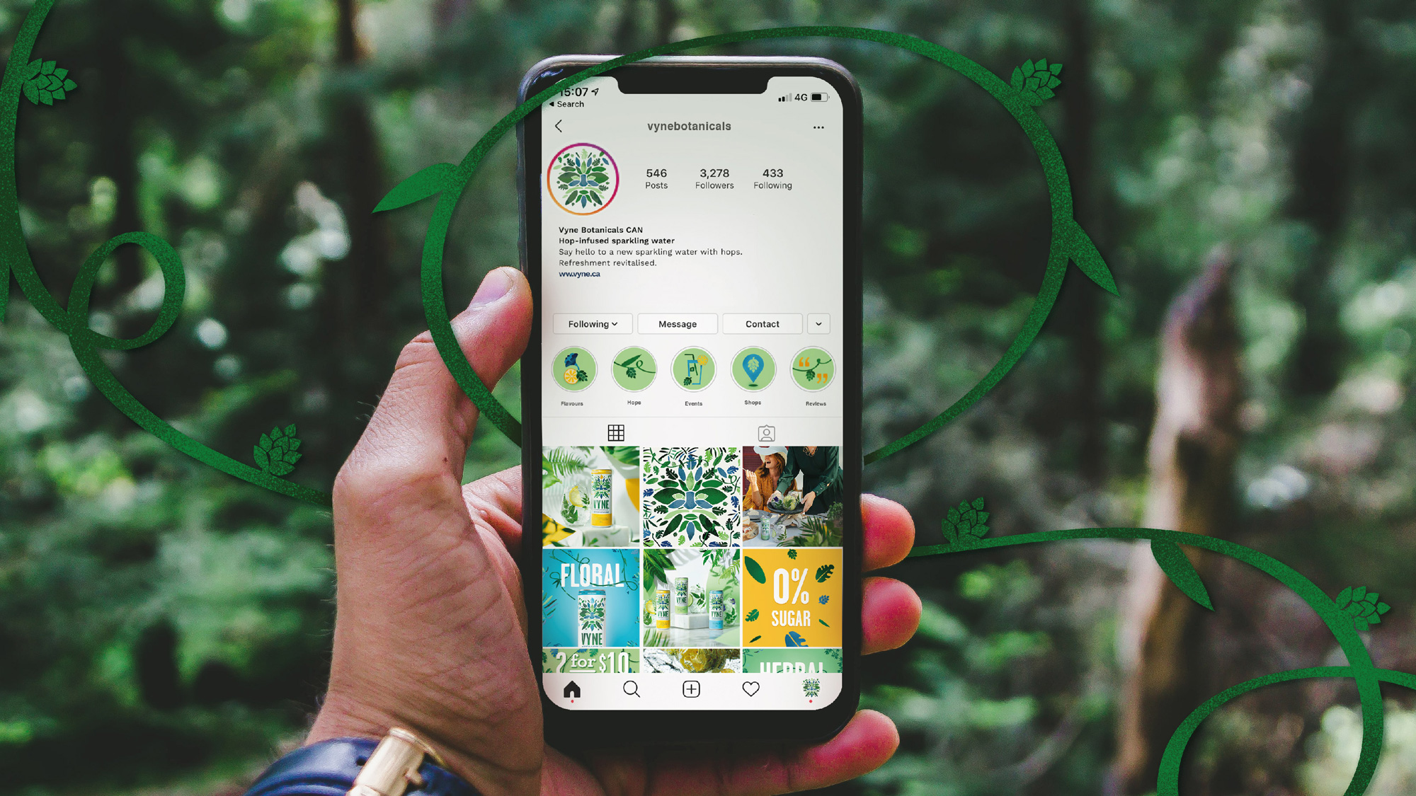
Opinion
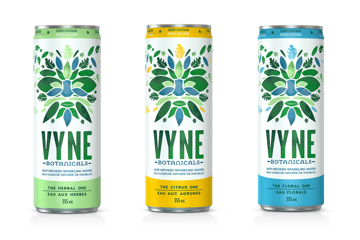
Sparkling water is definitely getting creative, now infused with hops usually reserved for beer, and as the concoctions get more unexpected so does their branding. That could be a good thing. Take Vyne, which is introducing “Green Man” — which sounds like a True Detective suspect — as the hero graphic of this new brand. I actually like “Green Man” but I am also terrified of the nightmare I will eventually have with him. Semi-kidding aside, I really appreciate the graphic effusiveness of this and how it’s not yet another minimal design. The wordmark is nice, with its condensed typeface — the “YN” pair needs to be tighter — and texture. Even the somewhat silly slab serif with one of the worst “N”s I have seen in a while gets a pass simply for being more expressive. Okay, fine, it doesn’t get a pass, especially being so tightly spaced in contrast to “VYNE” and how close they are to each other, but you get my point. The packaging is nice, mostly thanks to the illustration and typography as the other elements on it are nothing too exciting. I like how they expanded the illustration and type treatment into ads, which yield a nice textural presence. Overall, a pleasing and splashy entry into a sparkling water market that is getting very same-y.