
Reviewed: Friday Likes 314: From Two Times Elliott, Abraham Lule, and Moodley

“From Two Times Elliott, Abraham Lule, and Moodley”
A little bit of weirdness wedged in between straightforward typography this week, with work from London, Brooklyn, and Graz.
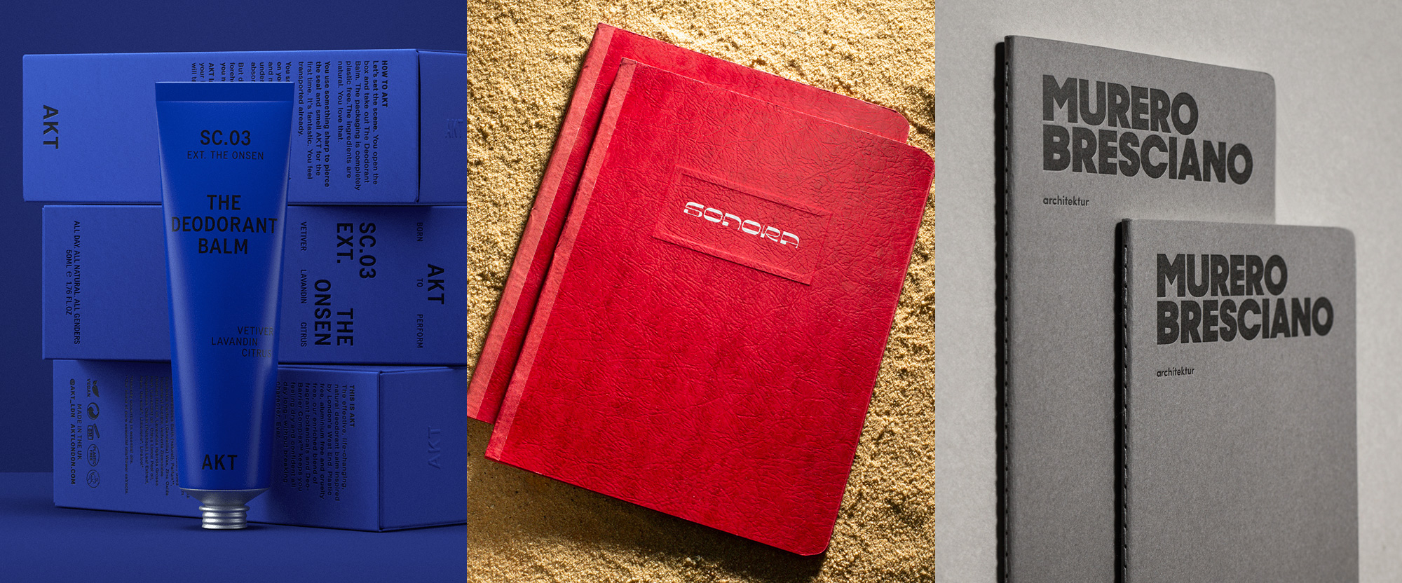
Akt by Two Times Elliott
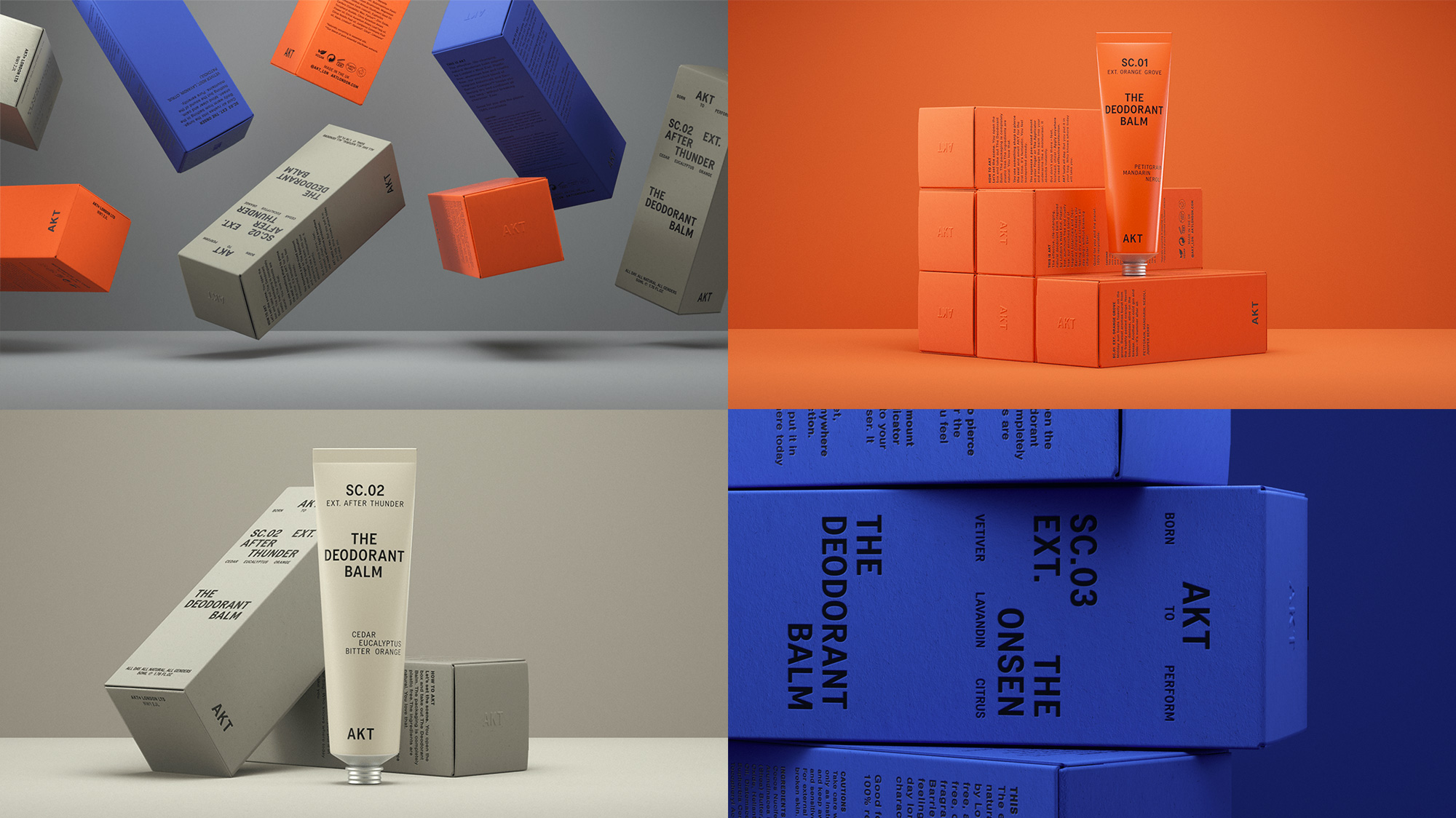
Akt is a new brand of unisex deodorant balm created by two theater actors from London's West End after they decided to do something about the lack of effectiveness of existing deodorants. Their product is completely natural, not tested on animals, and its packaging is plastic-free. The packaging, designed by London-based Two Times Elliott, takes direct inspiration from the old school theater marquees of the West End and their deadpan, utilitarian typography. Typeset in Colophon Foundry's Transcript, the boxes and tubes have a striking simplicity thanks to a lack of any distractions and some really bold and intense colors -- even the off-white, tan-ish color has a real depth to it. My favorite thing about this is how the text alignment vacillates between being centered, being full justified, and sometimes simply being whatever it wants to be. From the design alone I would bet these things smell good. See full project
Sonora by Abraham Lule
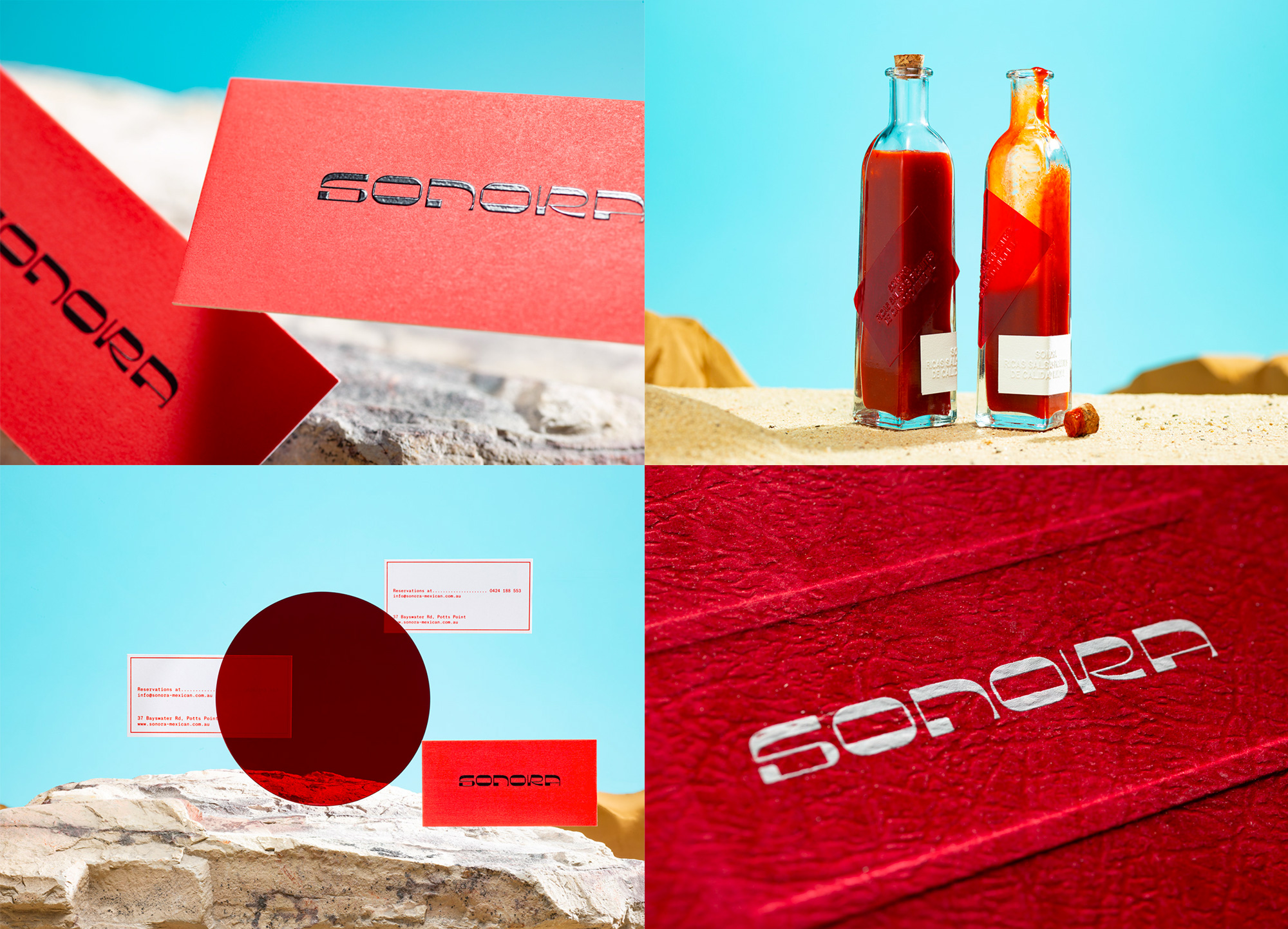
Sonora is a Mexican restaurant in Potts Point, a suburb of Sydney, Australia. The brief for Brooklyn, NY-based Abraham Lule was to design a "retro-futuristic brand" which he interpreted as a wordmark that "carries a retro-pixel personality, while sharp edges and extreme weights add contrast". Neither the brief nor the rationalization are... normal, which is a good thing because the logo has none of the visual trappings of most Mexican restaurants and instead does its own weird, cosmic thing. Except for the "N", I love all of the characters, especially that "R". The presentation of the project -- many more photos of it at the link -- is pretty fun too, in a faux desert-like landscape with a touch of surrealism, just the way I like my tacos. See full project
Murero Bresciano by Moodley
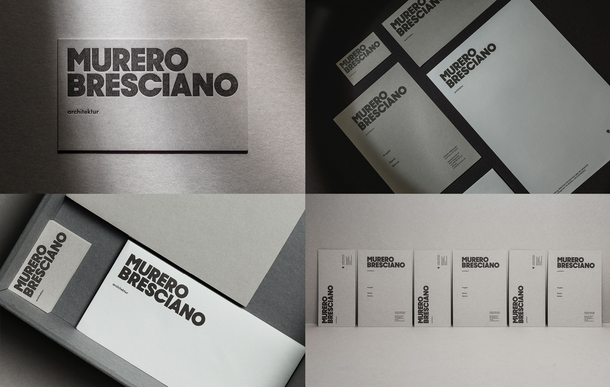
Murero Bresciano is an architecture firm in Klagenfurt, Austria, working on residential, commercial, and public projects with a bold and minimal yet playful approach. The new identity, designed by Graz, Austria-based Moodley, revolves around a "bold and minimal yet playful" wordmark that has such a great presence on all the different ranges of gray paper and materials for the identity. So simple, so effective.See full project