
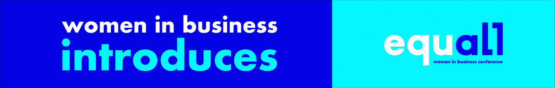
Noted: New Name, Logo, and Identity for Equall by StormBrands

“All Things Being Equal”
(Est. 2000) "Women in Business began in 2000 as a club for the prestigious MBA programme at the London Business School, one of the world's most respected business schools, with 45,000 alumni working across 155 countries. Women in Business is now a leading MBA club in Europe and its annual conference drives the progression of diversity and inclusion in business. This year marks its 20th anniversary, and to look ahead to the next twenty years of disrupting the business industry and inspiring the next generation of leaders, Women in Business needed a flexible, inclusive, gender-neutral brand that welcomes everybody." (StormBrands provided text)
Design by
StormBrands (London, UK)
Related links
N/A
Relevant quote
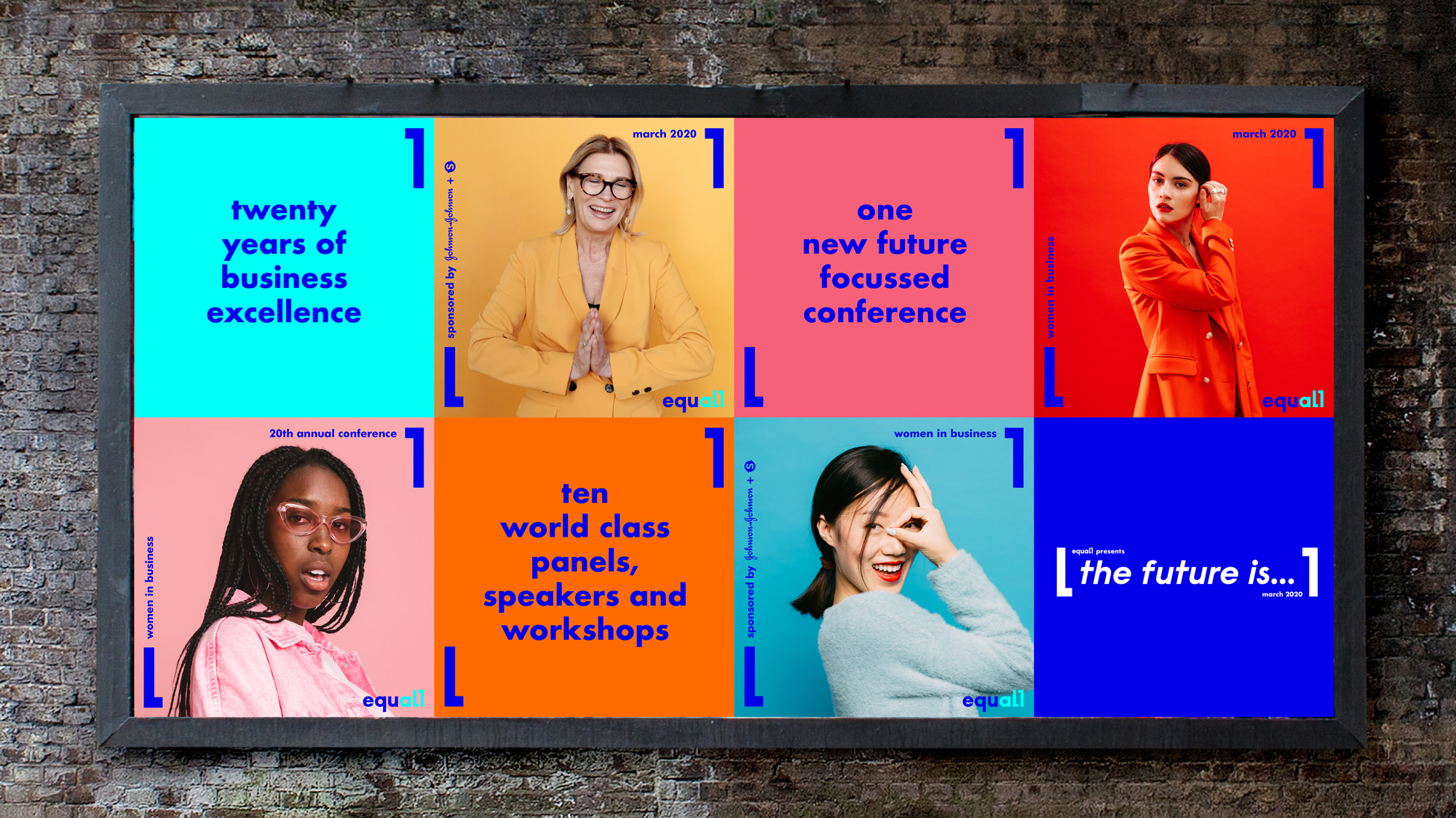
The new brand brings together both the members club and conference with one unified goal; equality for all. While the club retains the heritage of its name at the school, it launches a new annual conference, Equall and a refreshed identity to reflect its new purpose. The conference plays an important role for the club as a platform to reach the wider business community and drive change.
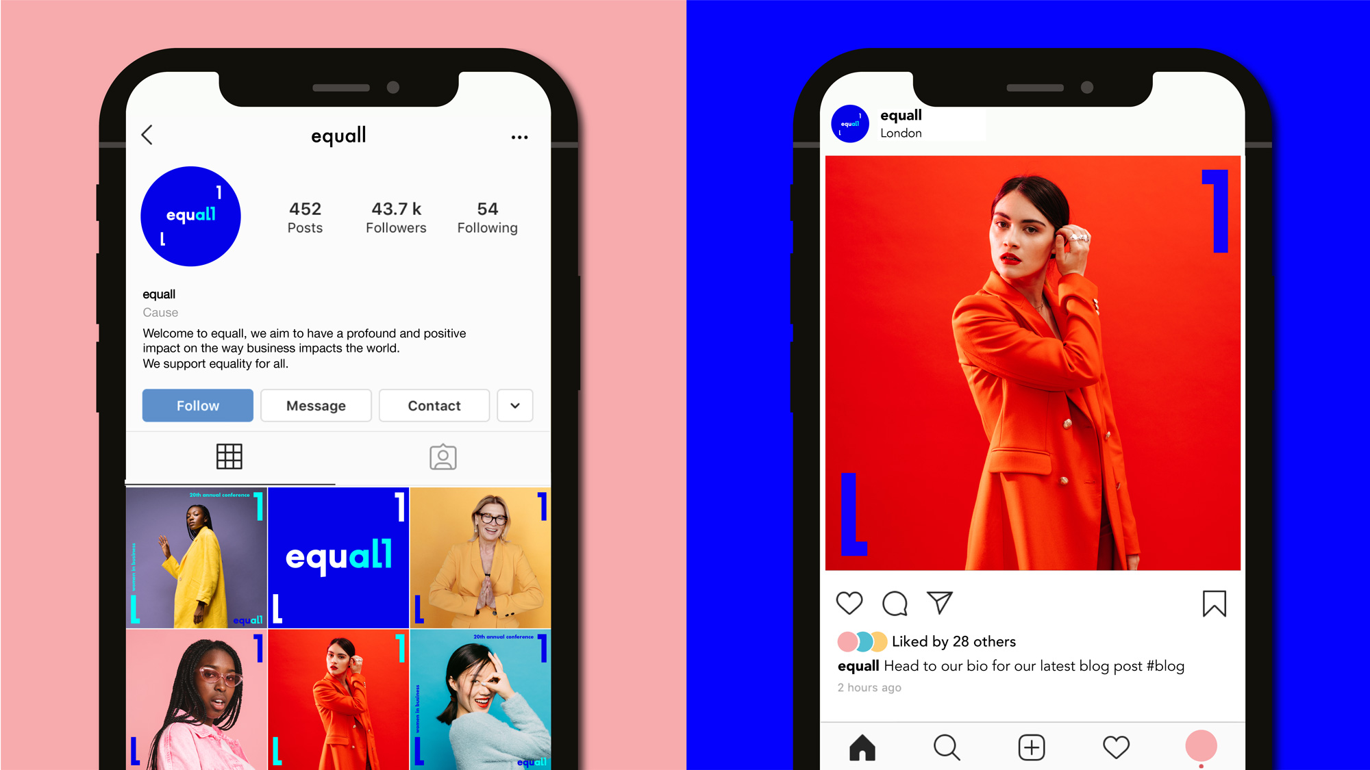
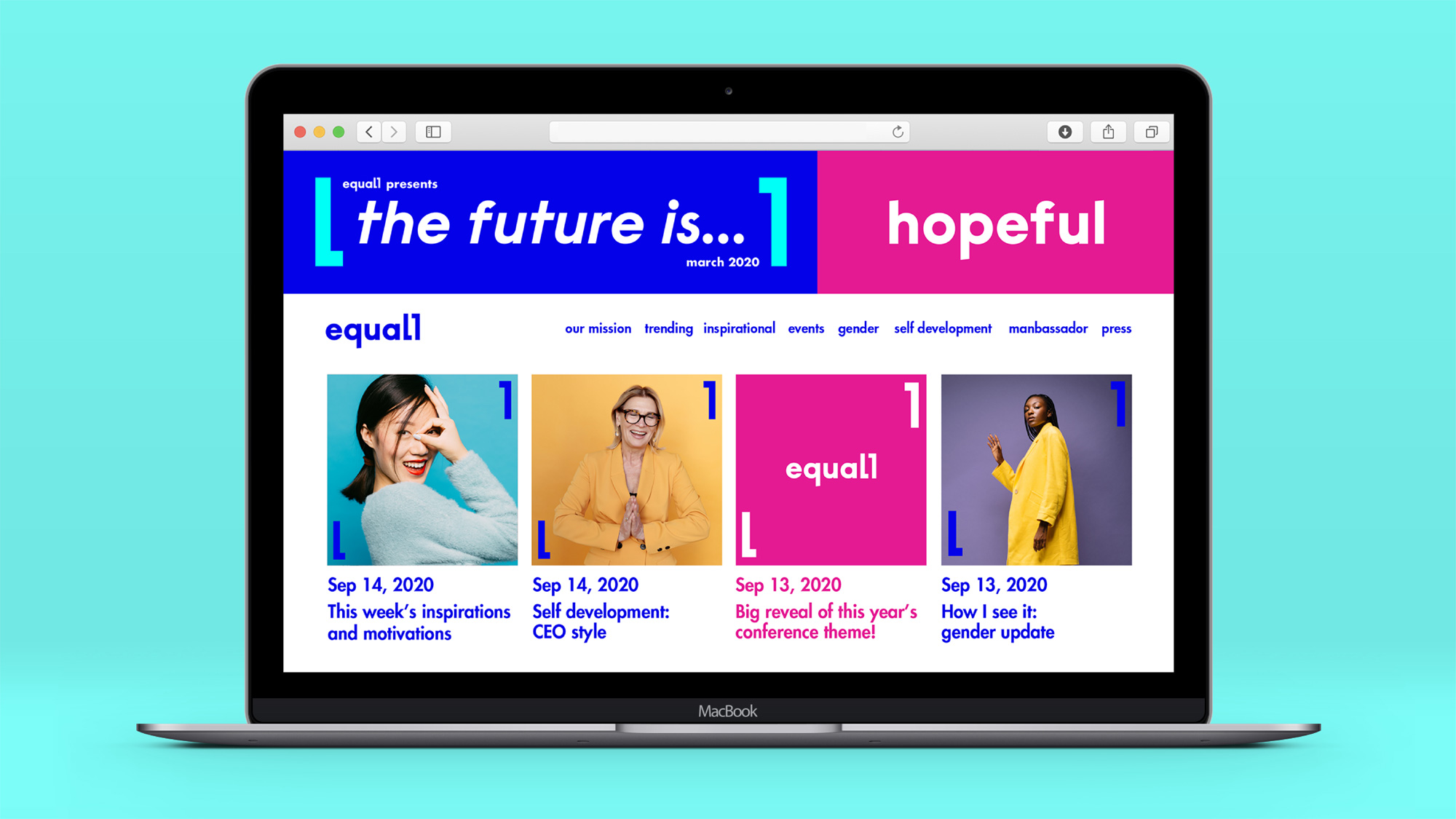
The previous logo and identity felt corporate and restrictive, and the update needed to feel contemporary and progressive to match the organisation’s values and vision. The rebrand also needed to be adaptable and flexible for future growth. StormBrands worked on all elements of the brand identity – from the logo itself to the website and photography guide, all pulled together with the defined strategy into a future-focussed brand toolkit. Key to the refreshed brand is the bold, bright colours.
“Diversity should be celebrated. Pops of colour help tell the stories and communicate optimism. Electric blue is the dominant colour, which brings energy and dynamism to a brand that felt static. It was important to have maximum vibrancy and pace while still being legible, clear and professional”, says Gabriella Corbett, Graphic Designer at StormBrands.
The logo also has an illustrative quality. The logo frame device acts as a visual metaphor for ‘framing the conversation and breaking boundaries.’
Images (opinion after)
Opinion
The old logo wasn’t great but it wasn’t terrible either, at least the serif “WIB” part because the spelled out name was a little awkward in its alignment and type sizing. The new name merges “equality” and “all” into a single word, which is okay but not entirely original — I’m not saying they copied this but that’s what happens when you sometimes go for the low hanging fruit/concept. The new logo is mostly bland but it’s at least saved by the two “l”s at the end although their repetition as frames in the primary logo are too redundant. In a way, I prefer the drier usage with the LBS logo where the wordmark stands out better. In application, the “l” frames work better when they are much bigger than the wordmark and, while also not entirely original, the framing approach is fine. The colors are a little on the annoying side and a few years too late on the extra bright trend. I wonder about the photography, where it starts to look almost like a fashion brand’s look book but maybe that’s a good thing? Bringing a little more joy and style to business can’t be all bad. Overall, this is fine but it treads on a lot of slightly overused design tropes.