
Noted: New Logo and Packaging for Utenos Alus by étiquette

“Utenos, Lithuanian for “Hold my Beer””
(Est. 1977) "Utenos Alus is a Baltic region brewery. More than 400 million litres have been brewed in its facilities over the last decade. Every year, Utenos Alus brews more than 100 million litres of beer and over 28 million litres of other drinks, 50 per cent more than the output in the first years after its foundation. The Utenos Alus Brewery is one of the Carlsberg Group breweries in Europe. It not only brews beer for Lithuanian consumers, but also makes products for international brands for the Scandinavian and northern European markets." (Wikipedia)
Design by
étiquette (Vilnius, Lithuania)
Related links
étiquette project page
Relevant quote
Utenos beer is the 2nd strongest beer brand in Lithuania. Historically, it has a loyal audience of 30-50 males. Regular guys. They’re typical Lithuanians who are looking for a reward moments after a hard day’s work.
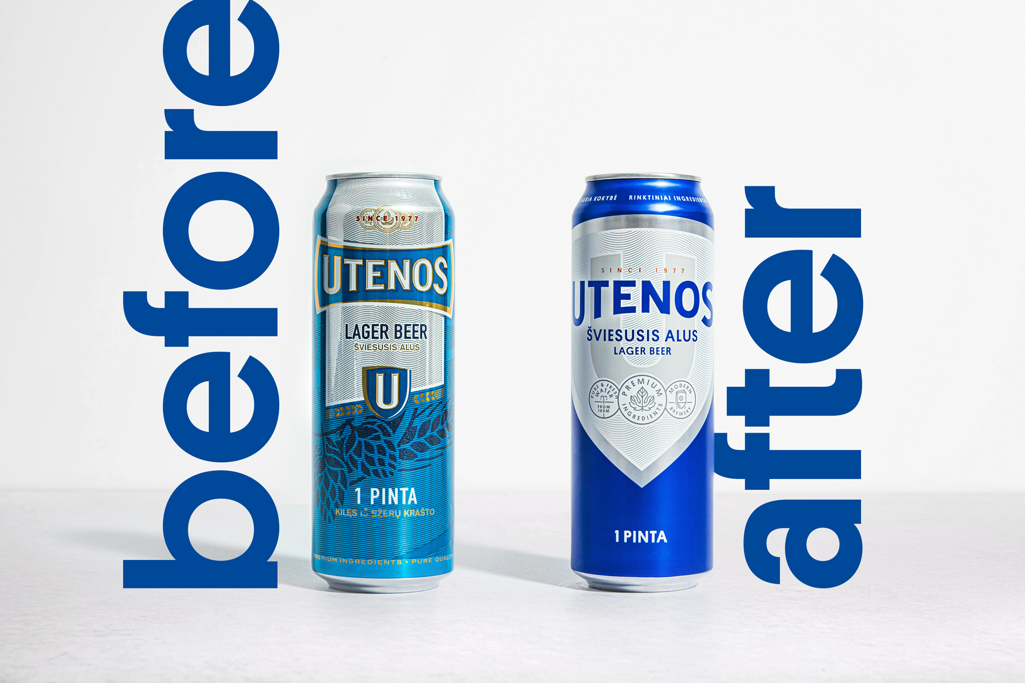
We’ve been asked to create a new look and feel of Utenos beer. It should stay attractive to the historical consumers, on the other hand, try to become more relevant to under 30. Utenos should become the king of light beers for casual moments. Hence, the design should be as simple as the beer itself.
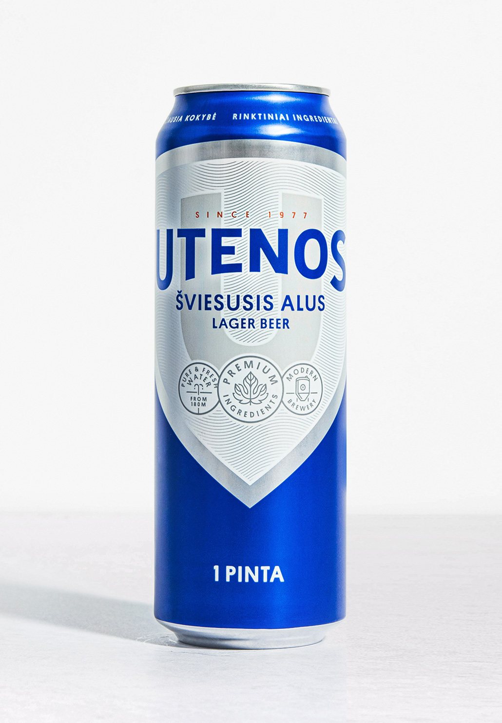
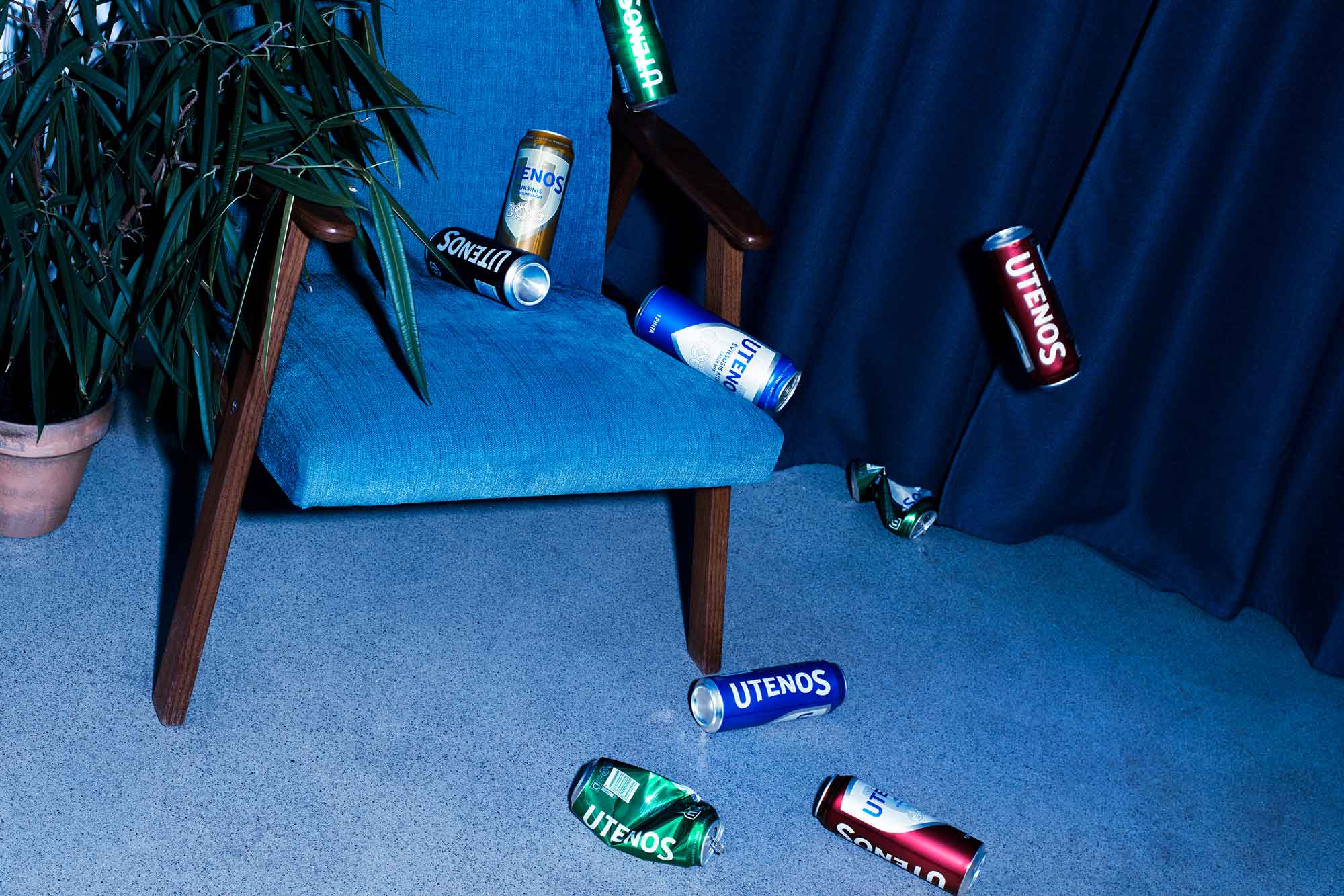
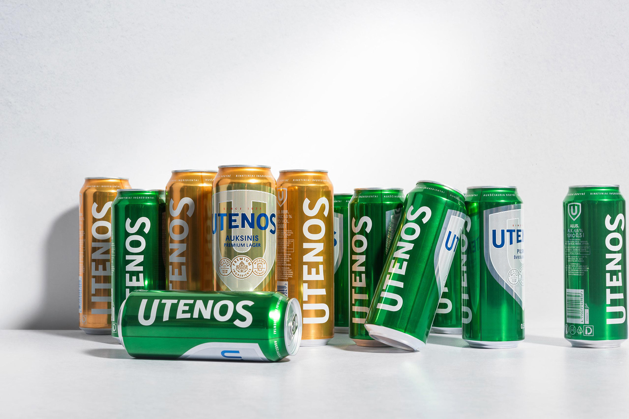
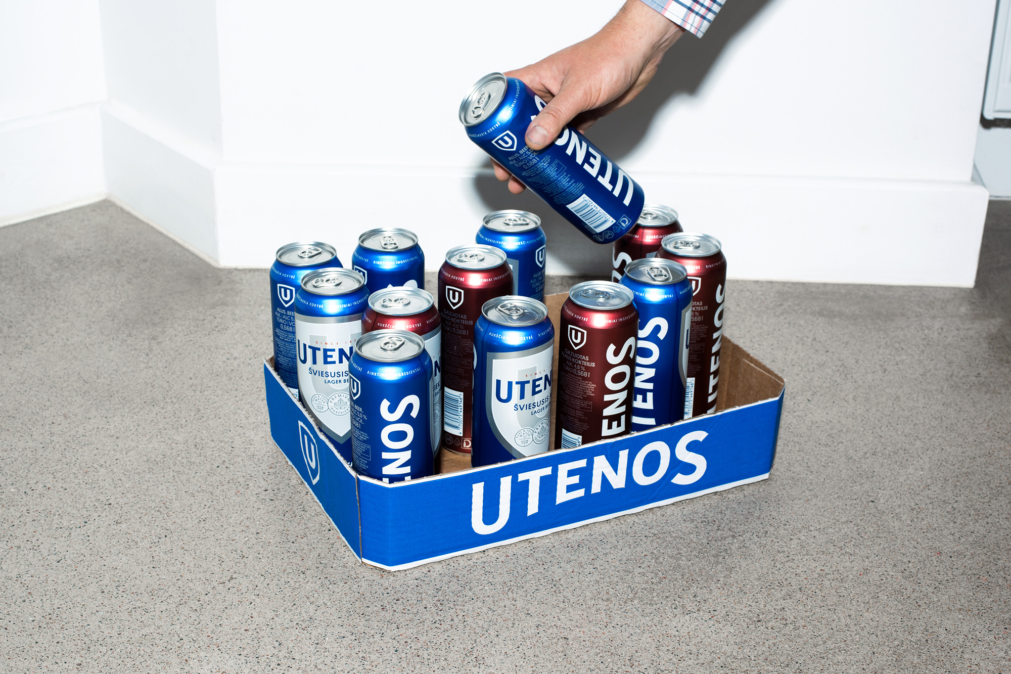
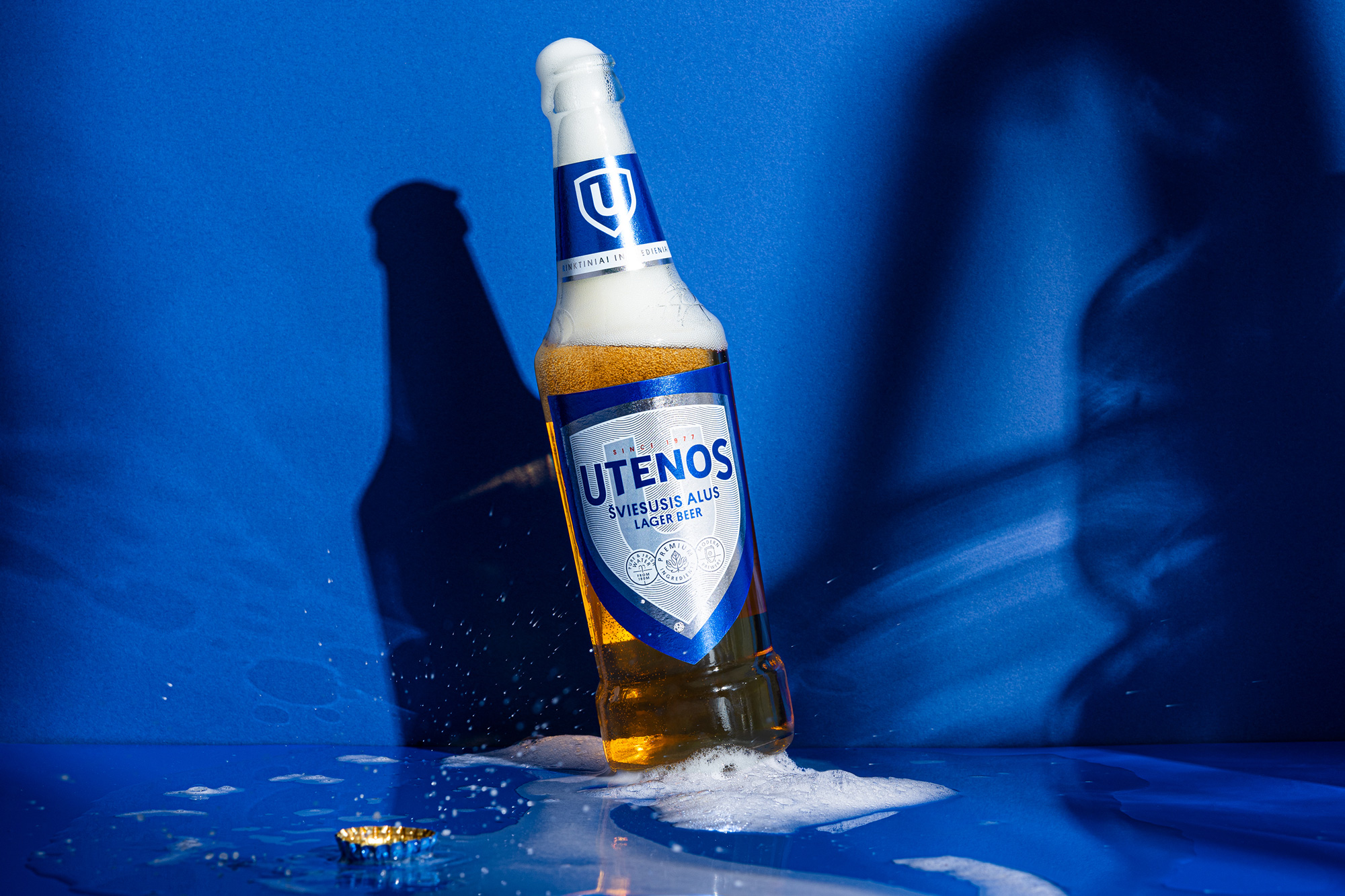
Meet old new Utenos! Totally revised but still recognisable. We stripped as much crap as possible from the logo and made it bold. We reviewed the most important historical visual assets and picked up only the best. Every detail was redrawn, from icons to the famous shield and typography.
Oh, wait! We renewed the Blue Color, which ensures a spectacular improvement in visibility on the shelves. So, the design’s answer to the brief is – visual comfort.
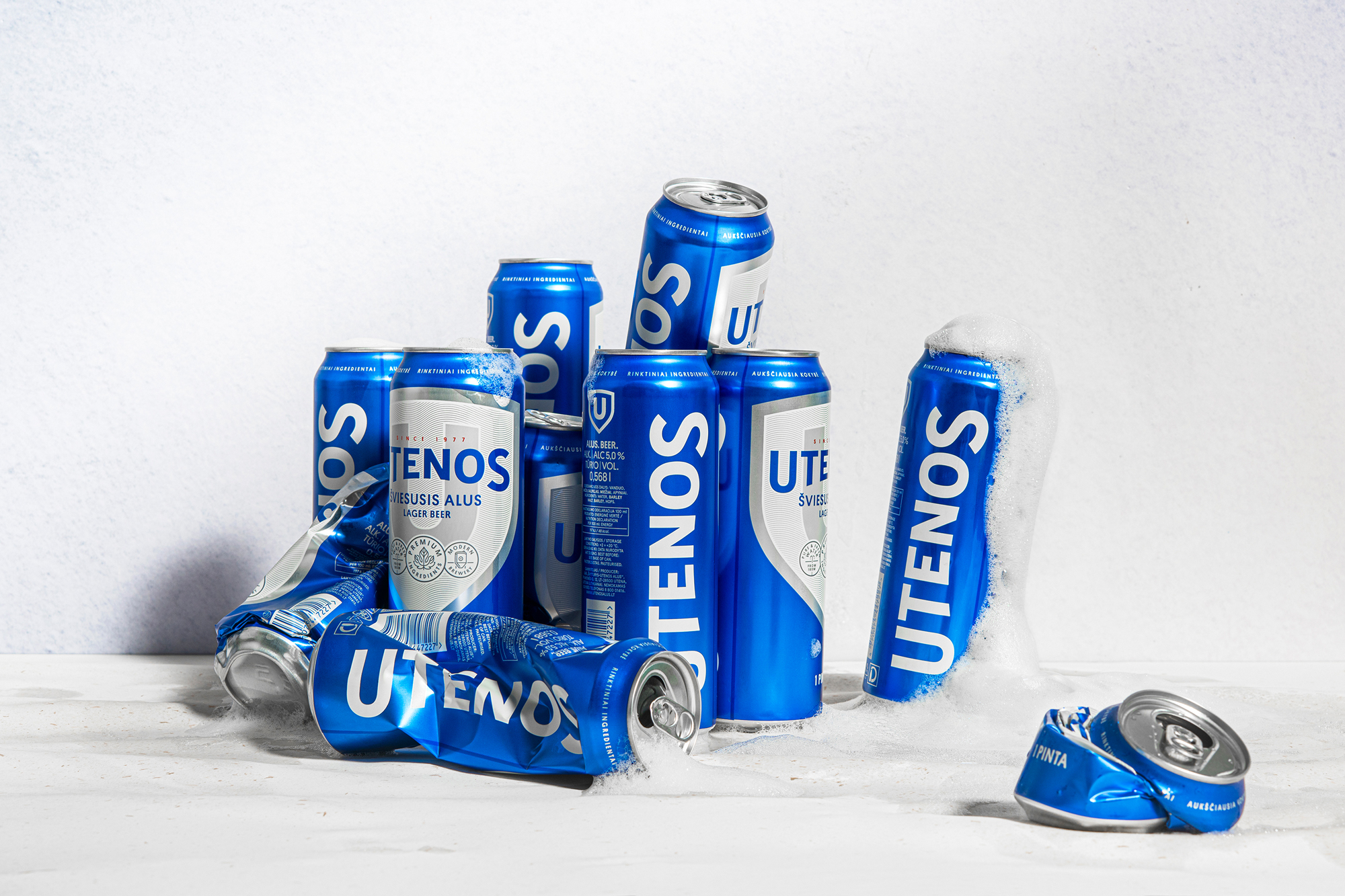
Images (opinion after)

Opinion
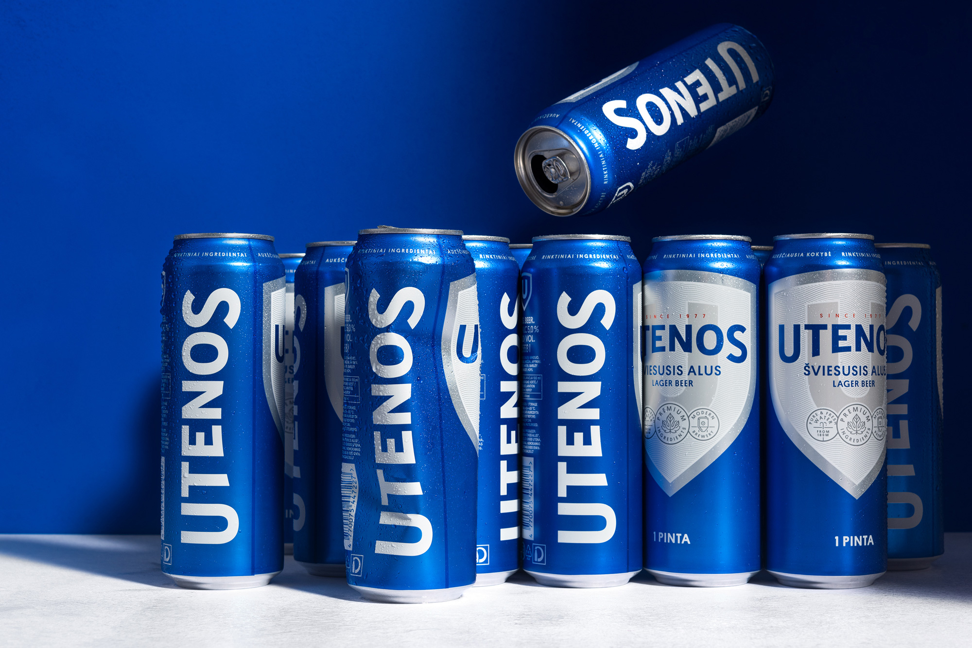
The old logo was fine — nothing great, nothing terrible, and light-beer-y enough. It did have, as the quote states, a lot of “crap” that could easily be discarded and which the new logo did away with — perhaps a little too extremely. The new logo is fine as well, with a well done type-on-a-curve effect that benefits from both the “U” and the “S” having curves at the bottom that help as the beginning and ending of the curve. The “N” gets a little squat and the “O” a little wide but for the most part it’s good. The simplicity of the logo is nicely offset by maintaining the ornate approach of the old can but in a slicker design, with a strong “U” shield in the background and some nice-looking seals as extra decoration. The large logo on the side of the can is interesting — I don’t believe I’ve seen something like that where the brand name is always very generously present on the can. It’s definitely an in-your-face move. The secondary colors for the other beers are also quite pleasant and work well with the design — although I would have loved to see the tone-on-tone approach continue instead of making the logo blue against the gold, green, and brown cans. Overall, a pretty nice redesign that maintains the legacy look of the beer but in a more contemporary and stylish way.