
Noted: New Logo for Chicago Fire FC by Doubleday & Cartwright

“Fan the Flames”
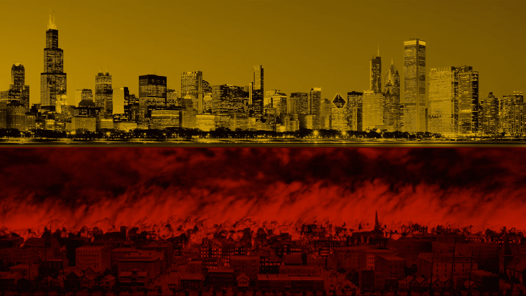
(Est. 1997) "Chicago Fire Football Club is an American professional soccer club based in Chicago, Illinois. The team competes in Major League Soccer (MLS) as a member of the league's Eastern Conference, having moved to the conference in 2002. The franchise is named after the Great Chicago Fire of 1871, and was founded as the Chicago Fire Soccer Club on October 8, 1997, the event's 126th anniversary. The team began play in 1998 as one of the league's first expansion teams. The Fire won the MLS Cup as well as the U.S. Open Cup (the "double") in their first season in 1998. They also won U.S. Open Cups in 2000, 2003, and 2006, in addition to the 2003 MLS Supporters' Shield. In 2015, the club won the first ever MLS Wooden Spoon, and repeated the feat in 2016. The Fire's home stadium is Soldier Field." (Wikipedia)
Design by
Doubleday & Cartwright (Venice, CA and Brooklyn, NY)
Related links
Chicago Fire FC brand page
Chicago Tribune story
Relevant quote
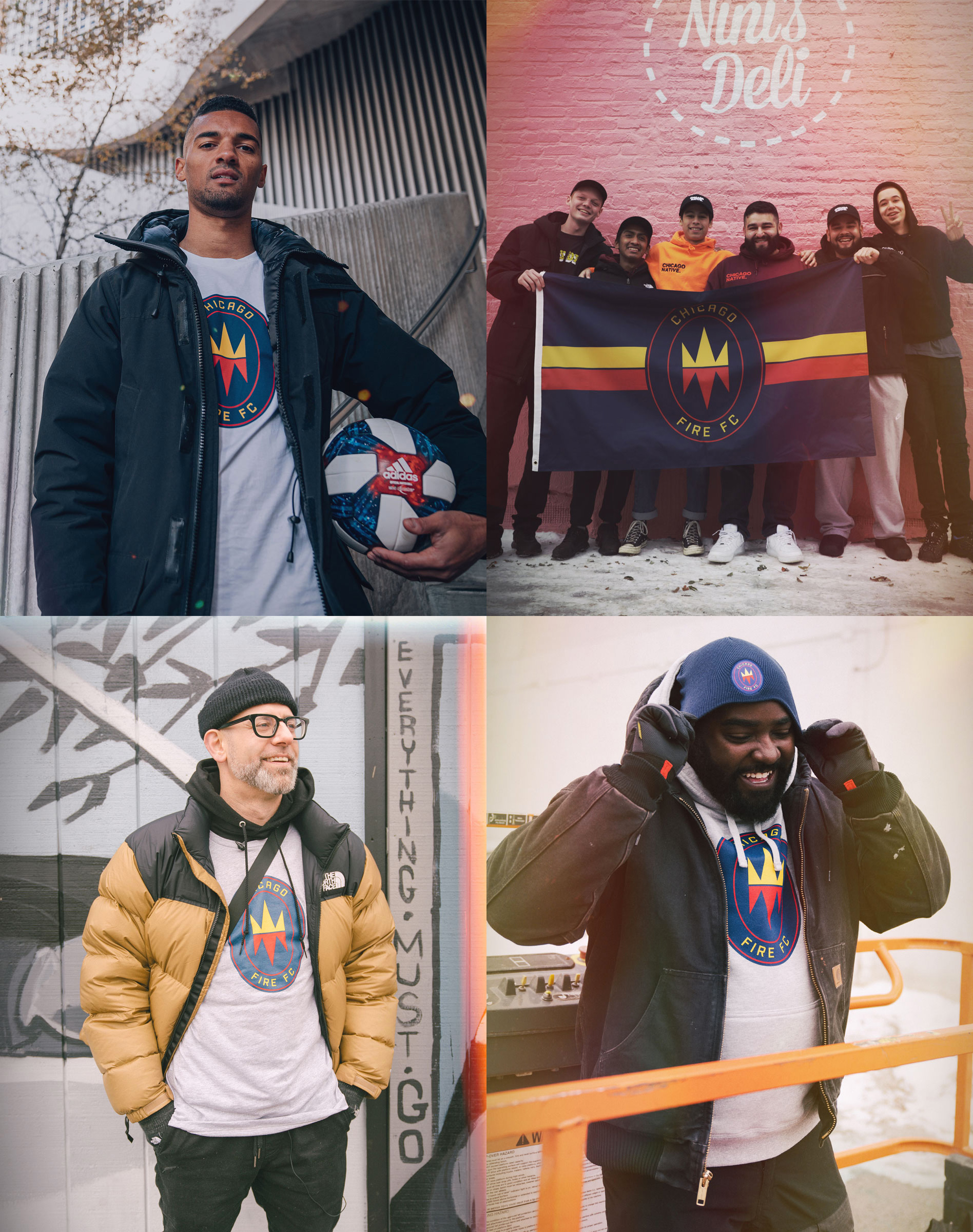
Chicago Fire FC's badge honors the founding legend of Chicago itself.
After the Great Fire of 1871 razed the city to ashes, the people of Chicago stood on still-scorched earth and resolved to rise again.
At the center of our badge, the Fire Crown -- with flames inverted to become a crown -- tells the story of a dramatic rebirth, and how it became the legend of our city's people.
Images (opinion after)

Opinion
The old logo emulated a fire department badge which made it hard to dislike because firefighters are heroes and cool as shit but if we all stopped and took a hard look at that “C” — yeesh. The new logo has been met with a lot — A LOT — of derision and dislike, from the replies on the team’s Twitter announcement to the tips I have received in my inbox (calling for its de facto inclusion as one of the year’s worst). While I don’t like the logo by any means and wouldn’t defend it with my honor I’m not convinced it’s SO bad. I think there was a decent idea in the concept of using the storied story of Chicago’s fire and the idea of mirroring a flame into a crown is also interesting but the execution falls so flat that it’s very easy to find extreme faults in it. One of the biggest social arguments against it is the use of a gold crown, a symbol associated with one of the most vicious gangs in the U.S., the Latin Kings, which originated in Chicago — so, yeah, that’s something that could and should have been avoided. Visually, it’s bland for sure but the most detrimental part about it is the proportion that leaves huge empty gaps where nothing happens, which is the wrong kind of negative space one wants in a logo. The secondary logo where the crown/flame is on its own is a little more interesting and in the swag, whether people like the logo or not, it does look good and makes a proper impact. Again, I’m not defending it — I have no horses in this race — but perhaps the reaction has been a little too harsh? It’s the kind of backlash that would have many a client hitting the undo button so we’ll see if they stick with it or throw in the towel.