
Noted: New Logo and Identity for Breast Cancer Now by Wolff Olins

“Deep Embrace”
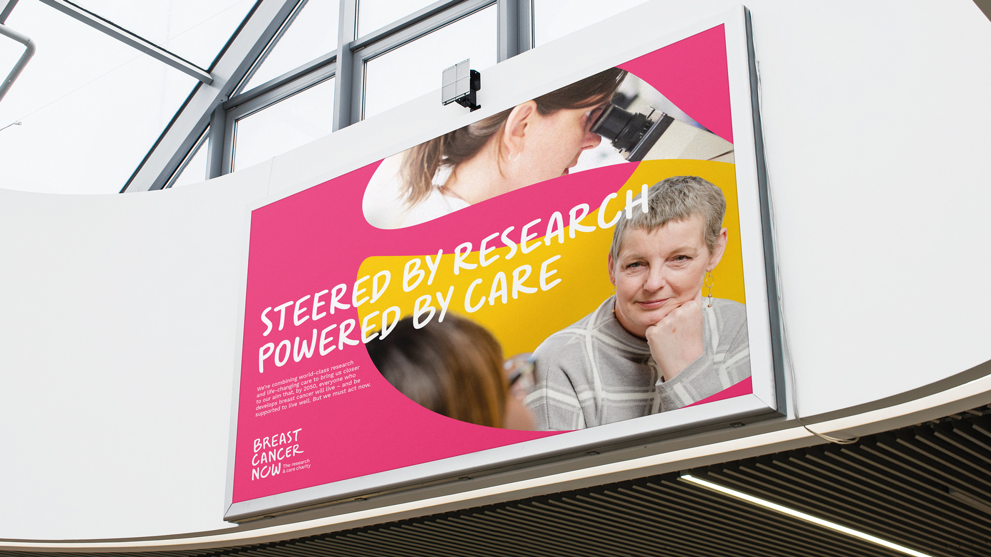
(Est. 2015) "Breast Cancer Now is the UK's first comprehensive breast cancer charity, combining world-class research and life-changing care to build a complete view of breast cancer and make faster progress for everyone affected. Steered by research and powered by care, Breast Cancer Now's ambition is that, by 2050, everyone who develops breast cancer will live and be supported to live well. Breast Cancer Now funds around a third of all breast cancer research in the UK. By working with almost 340 of the brightest minds in breast cancer research, the charity is helping discover how to prevent more cases, save more lives and enable more women to live well with the disease. Breast Cancer Now, the research and care charity, launched in October 2019, was created by the merger of specialist support and information charity Breast Cancer Care and leading research charity Breast Cancer Now."
Design by
Wolff Olins
Related links
Wolff Olins project page
Relevant quote
We helped the team recognise that bringing world-class research and care together gave the charity a unique perspective; a complete view of the disease and of people’s experience of it. So the charity can improve outcomes and offer more personalised approaches, through world class research and life-changing support. We built the proposition from this: “The complete view. The whole way through.”
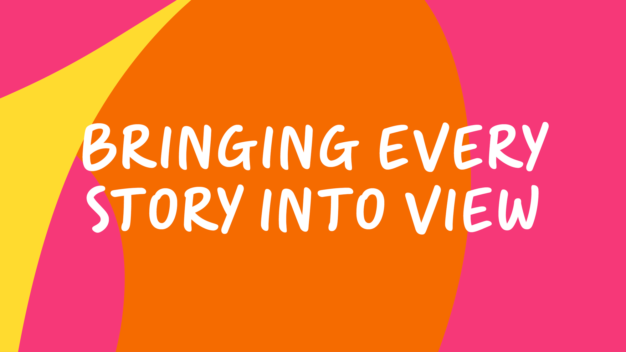
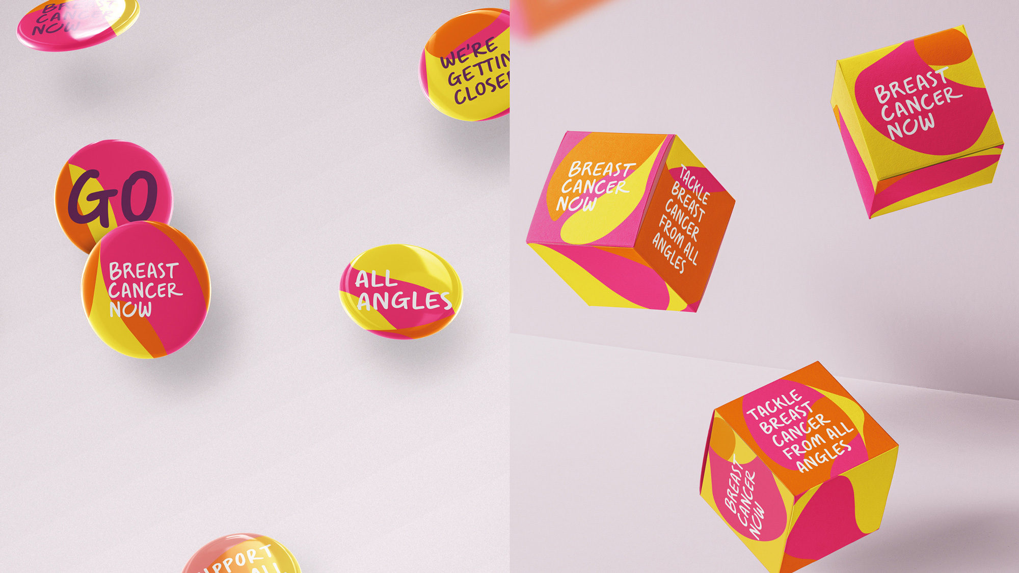
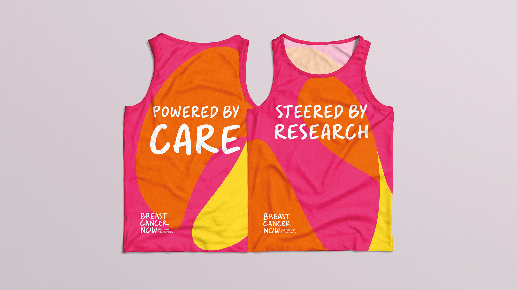
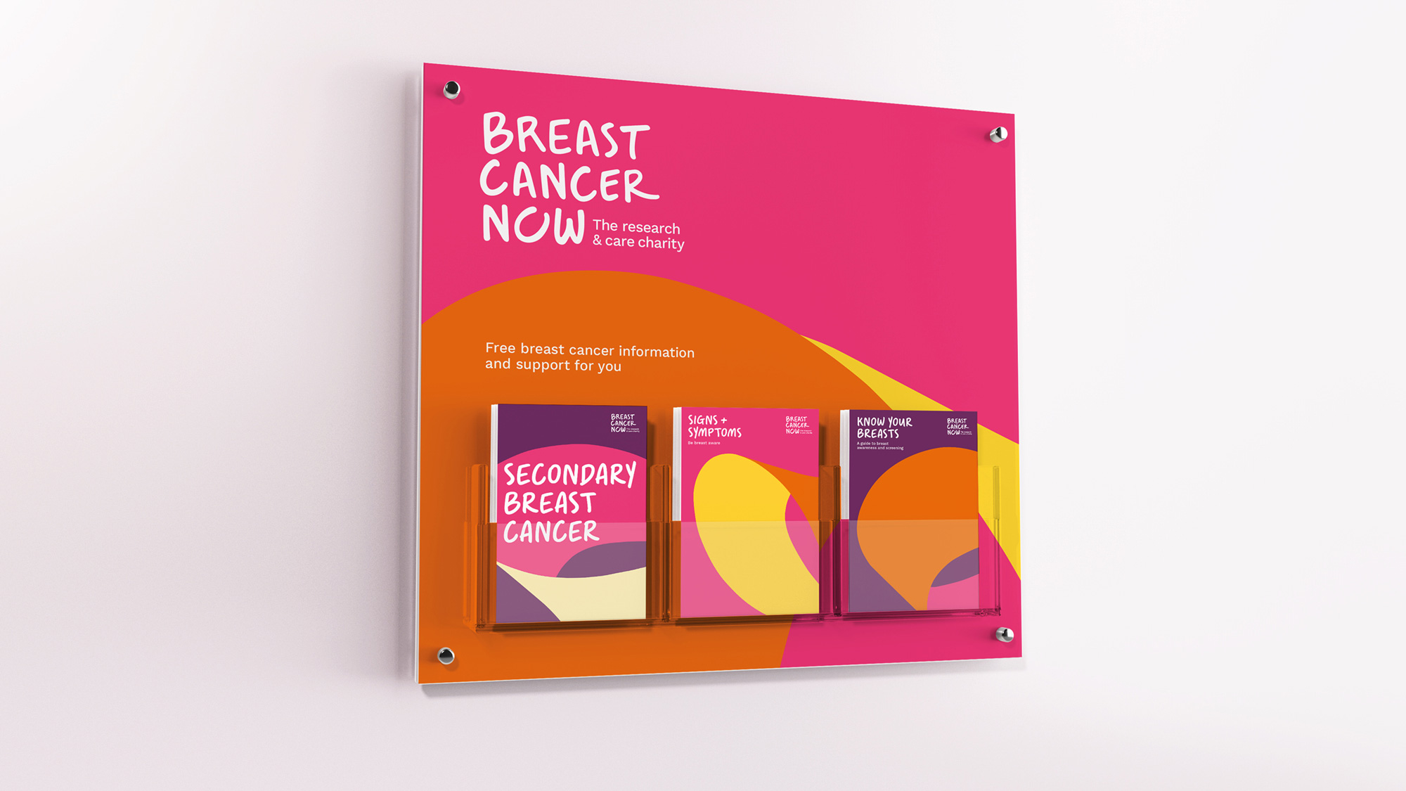
The identity reflects this idea of the complete view of individuals’ journeys. ‘The embrace’ – which represents the joining together of research and care to support those affected by the disease – is used throughout the both the logo and brand identity, as well as being a frame for photography, showing the experiences of people affected by breast cancer on the inside, and the charity on the outside. As it moves, it reveals different angles of people’s journeys and the charity’s work. The colour palette – which again draws on the legacy brands – and tone of voice is designed to have stretch to be both bold and reassuring. The colour palette demands stand-out compared to the sector’s ‘pink fog’ – and also includes a purple shade to help represent the serious nature of breast cancer, including secondary breast cancer. We also developed a handwritten typeface to give the charity a more personal presence.
Images (opinion after)
Opinion
The old logos weren’t good, especially Breast Cancer Care in all lowercase super tight rounded sans serif while Breast Cancer Now, also oddly in all lowercase, could have had an interesting thing going with the “O” and its heart perhaps being interpreted as a breast. The new logo goes for approachability with a handwritten wordmark. It’s nicely executed but I wonder if it’s right — is it too informal? Or too friendly? I also can’t help but think of one of Wolff Olins’ greatest hits, Macmillan, in part because both deal with cancer and in part because of the hand-drawn approach. I’m not sure what bringing up Macmillan achieves except maybe as a point of reference that in the UK this approach to Cancer-related charities works. The applications introduce a supporting element, “The Embrace”, which I didn’t get what it was until I saw it in motion. Static, it looks like random curve shapes but it’s pretty neat animated and the idea that there are two stories told on each facet of the device is pretty interesting. As with the logo I am not sure the handwritten font is the best option across all applications — I feel like it makes everything too happy, friendly, and as if the identity is reporting a happy ending instead of making it feel as if urgent, consistent action is required. But maybe I’m getting too hung-up on my own interpretation of the handwritten approach.