
Reviewed: Friday Likes 302: From Menta, Caserne, and Bartosz Szymkiewicz

“From Menta, Caserne, and Bartosz Szymkiewicz”
All packaging this week, spanning the spectrum from high- to low-end, with work from Guadalajara, Montréal, and Warsaw.
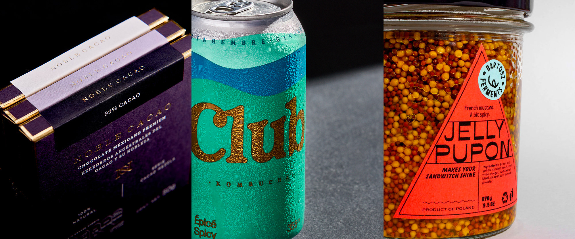
Noble Cacao by Menta
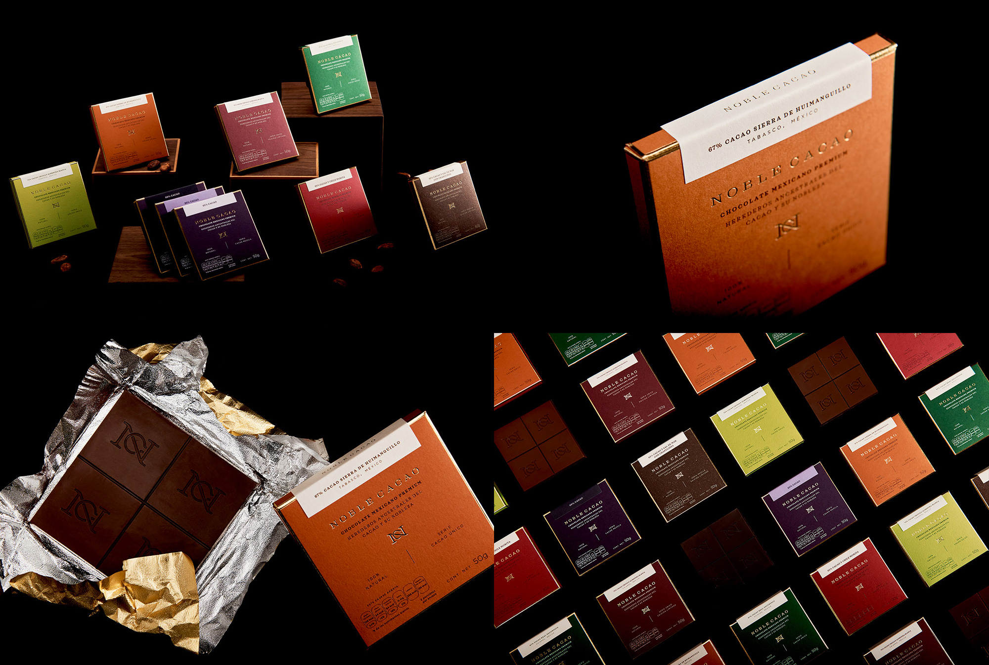
Noble Cacao is a premium Mexican Chocolate brand created from the cacao plantations in the southeastern part of the country where 70% of Mexico's cacao is grown. The packaging, designed by Guadalajara, Mexico-based Menta, exudes premium-ness with thin boxes made from cotton paper flooded in deep, rich colors and accentuated by a gold foil frame and logo. Finished by a small label that wraps around, the boxes all have simple and lovely typography -- even the calorie and nutrition badges on the front are nice. The "NC" monogram, designed by fellow local Henriquez Lara Estudio, adorns the bars themselves and, whether on purpose or coincidence, I like how its thickness matches that of the division of the bars. Lastly, one of the flavors is Chocolate with sea salt and crickets. That is all. See full project
Club Kombucha by Caserne
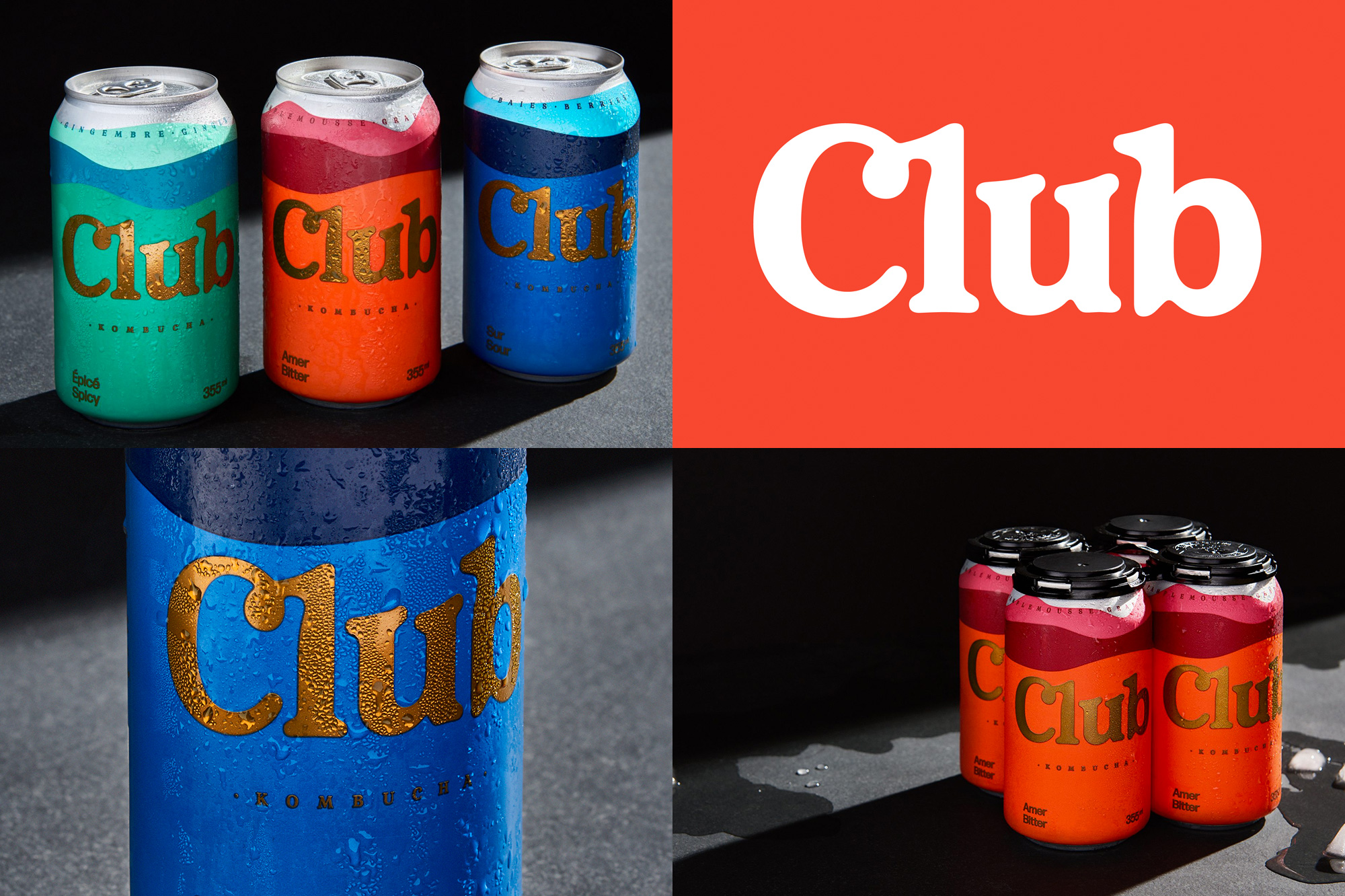
Club Kombucha, as its name implies, is a brand of Kombucha, this one in Canada and sold in a can -- a Can can kombucha if you will. (Sorry.) The packaging, designed by Montréal, Québec-based Caserne, features a delicious wordmark in a bubbly serif that, based on their web font use, looks to be a customized version of Livorno, where they have added some funky indentations to the "l" and "b". Rendered in gold on top of some wave graphics that change colors, there is no evident conceptual linkage to Kombucha, but with cans that look this good I ain't going to complain much. Maybe just the one thing that clashes is the category typography at the bottom of the cans, where the deadpan sans serif looks like it belongs on the can of a microbrewery's IPA. That "Club" type, tho. See full project
Bartosz Ferments by Bartosz Szymkiewicz
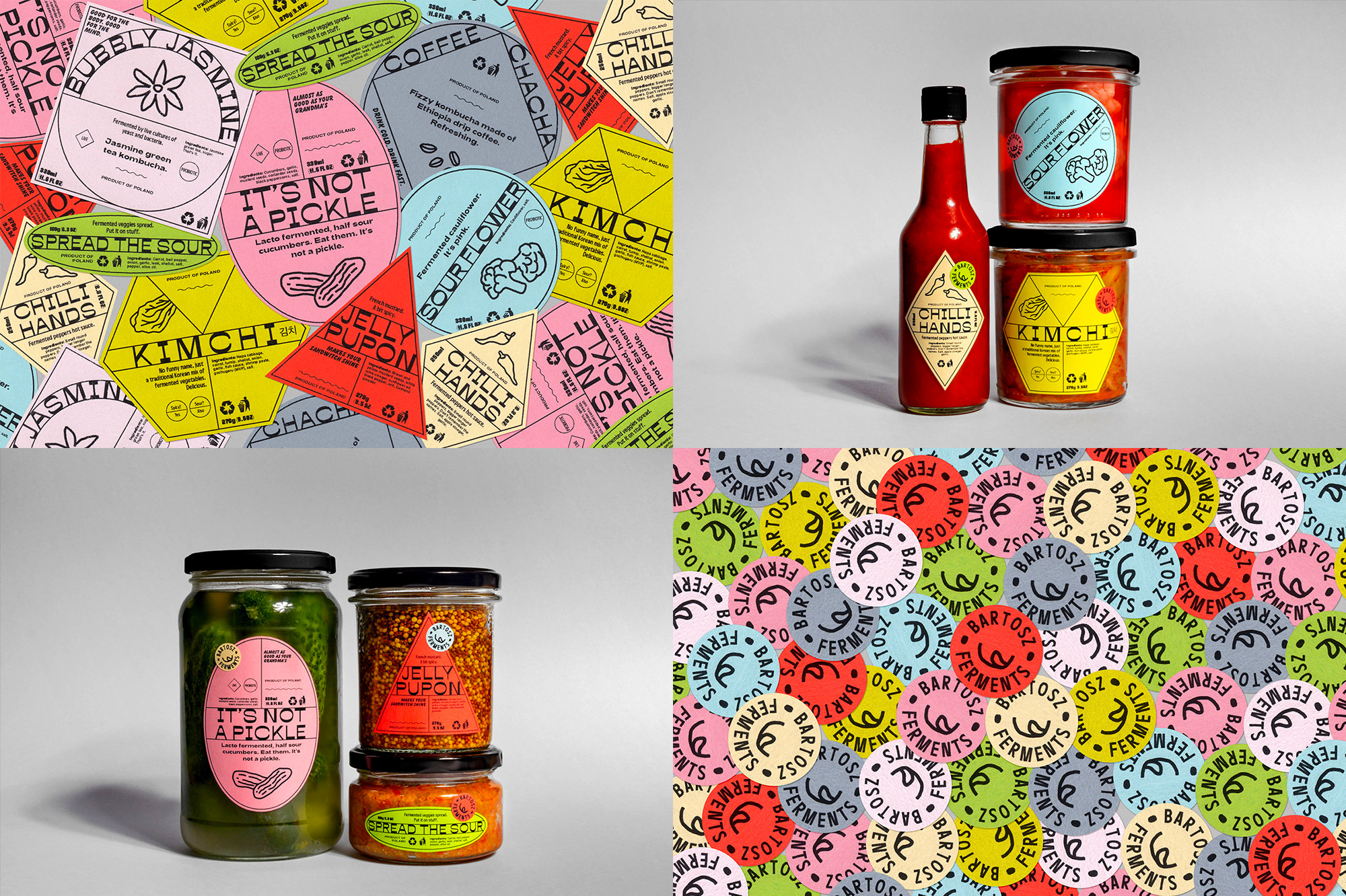
Bartosz Ferments is a brand of fermented vegetables and condiments available to friends and acquaintances of Warsaw, Poland-based Bartosz Szymkiewicz who, after getting into home brewing, got into home fermenting, and like a good designer would, he created a label system for his own products. Without budget for gold foil -- LOL -- Bartosz uses funky label shapes to match the different jars and pairs each one with a smaller round sticker with his logo. The typography on the labels also looks as if it has been fermented -- more LOL -- with a weird headliner font and some odd companions that don't belong together at all anywhere else in the universe but come together (im)perfectly in these labels, along with some crude drawings of the veggies in each jar. It almost sounds like I'm putting this down but I really love (and perhaps envy) the looseness of it and how it feels so much like a home-made product. See full project