
Reviewed: Friday Likes 288: From Diano, makebardo, and A Friend of Mine

“From Diano, makebardo, and A Friend of Mine”
Minimalist yet effusive use of typography this week, with work from Ljubljana, Queenstown, and Melbourne.
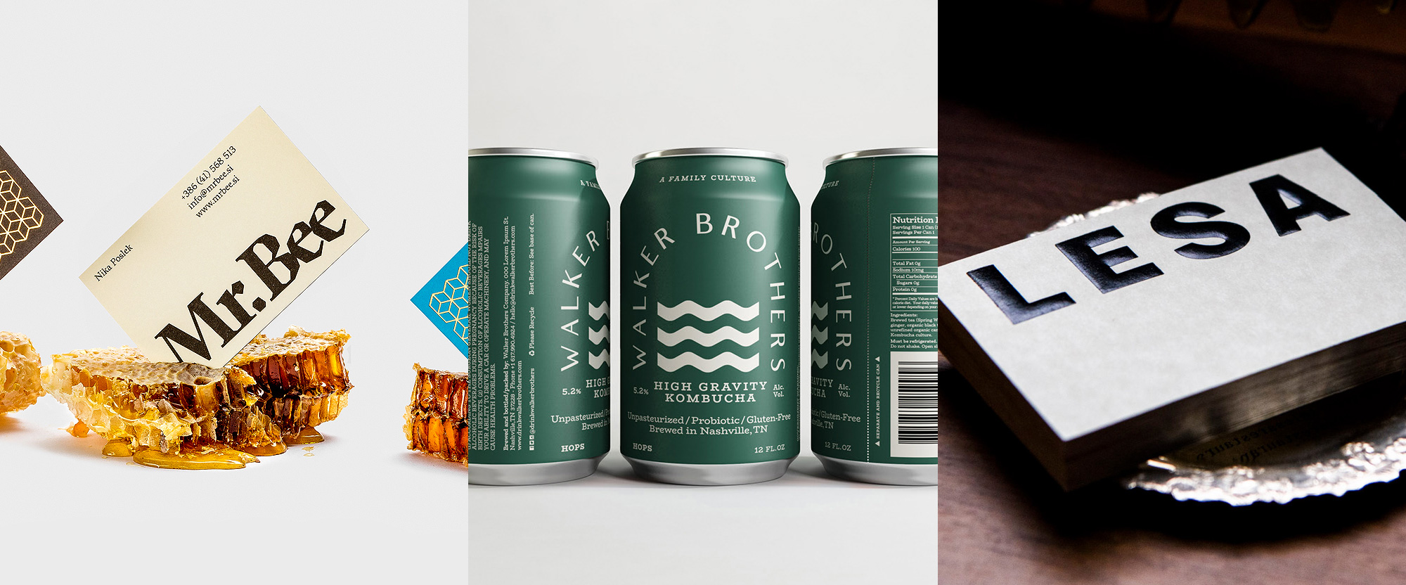
Mr.Bee by Diano
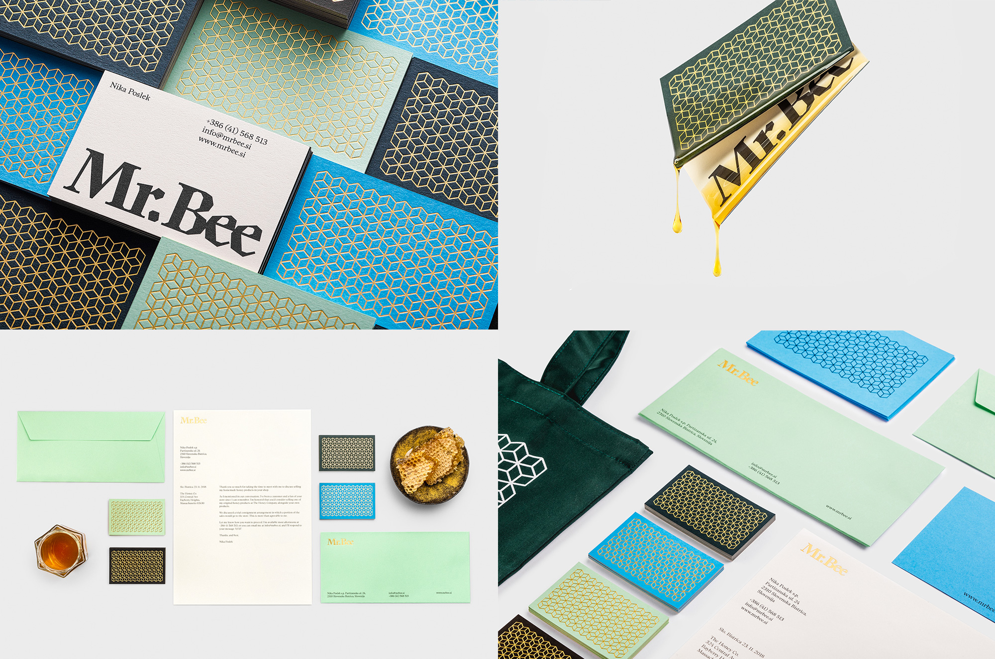
Mr.Bee is a beekeeper in Zgornja Polskava, Brezovica, Slovenia, producing and selling honey products locally. Ironically, Mr. Bee is a Ms., run by Nika Poslek. Her business' new identity, designed by Ljubljana, Slovenia-based Diano, uses a fairly expected honeycomb pattern that makes sense and looks good in gold foil on top of the brisk color palette but what really got my attention was the typography for the logo, which is all kinds of quirky, exuberant, and the antithesis of a geometric sans. It looks great typeset so tightly and looks as good in gold foil as it does in black as it does drenched in honey. See full project
Walker Brothers by makebardo
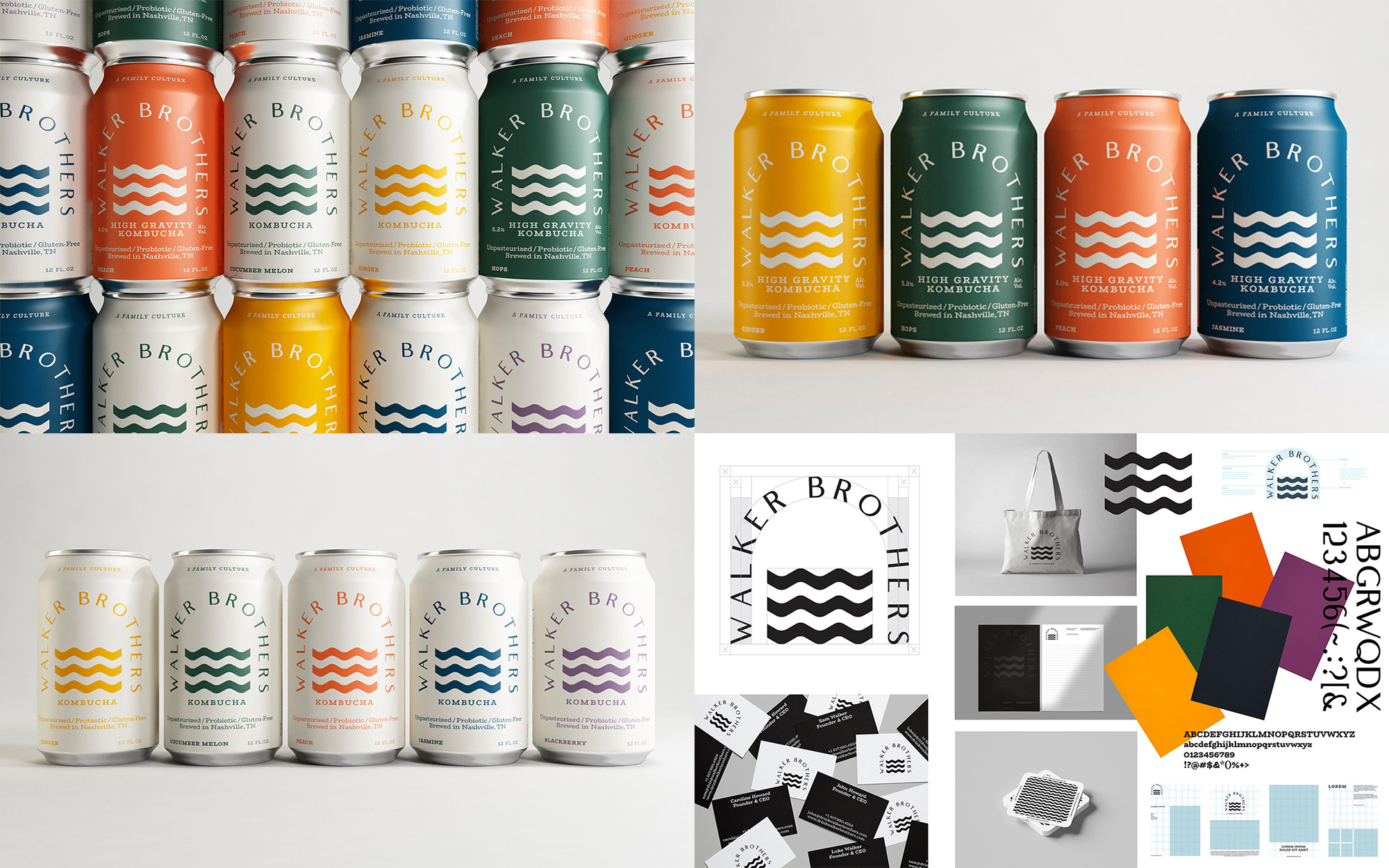
Walker Brothers is a line of craft kombucha brewed in Nashville, TN, available in non-alcoholic and alcoholic variations. The identity and packaging, designed by Queenstown, New Zealand-based makebardo, uses a "bridge" concept -- a "symbol [that] captures what Walker Brothers are going for in their core values as a business" -- that is represented by the name arranged as a bridge in a thin, elegant, high-contrast sans serif contrasted by thick waves (of Kombucha goodness) going through it. The composition works great on the shape of the can, filling up the space nicely but with plenty of airiness around it. The color palette is beautiful and the matte finish of the cans works great with the muted tones. The "A Family Culture" tagline on the top of the can is such a nice touch for its placement and play on words. See full project
Lesa by A Friend of Mine
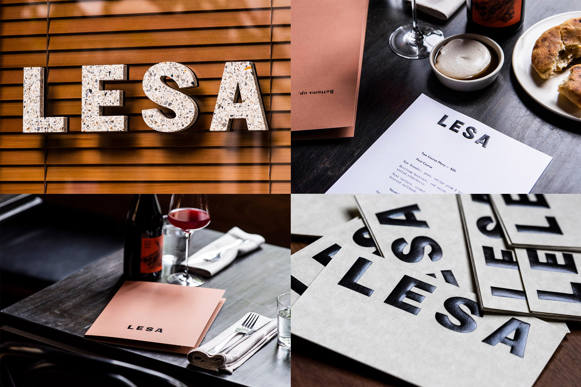
Lesa is a contemporary restaurant in Melbourne, Australia, that serves as the first-floor restaurant to the upstairs wine bar, Embla. The identity, designed by local firm A Friend of Mine, is quite straightforward with a simple sans serif wordmark -- that features a killer "S" -- and a muted palette of browns and creams but it's the application of it that's quite special. Whether it's the waterjet-cut speckled terrazzo that welcomes patrons or the hand-sculpted curved emboss for the menus and business cards, it elevates the logo in amazing ways. See full project