
Noted: New Logo and Identity for Round Table Pizza by Sterling-Rice Group

“And Now my Watch Begins”
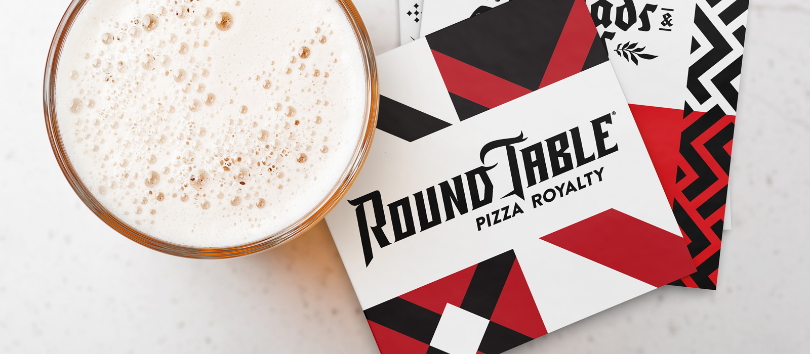
(Est. 1959) "Inspired by the honor, valor and revelry of the Knights of the Round Table, Round Table's superior pizza and commitment to quality and authenticity have earned the reputation of 'Pizza Royalty' for 60 years. With more than 440 restaurants across the United States, Round Table celebrates community, family and making merry."
Design by
Sterling-Rice Group (Boulder, CO)
Related links
Round Table press release
Relevant quote
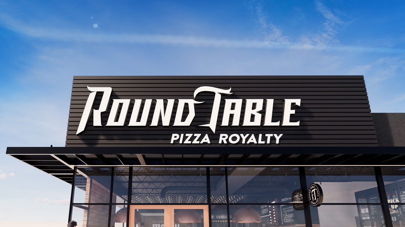
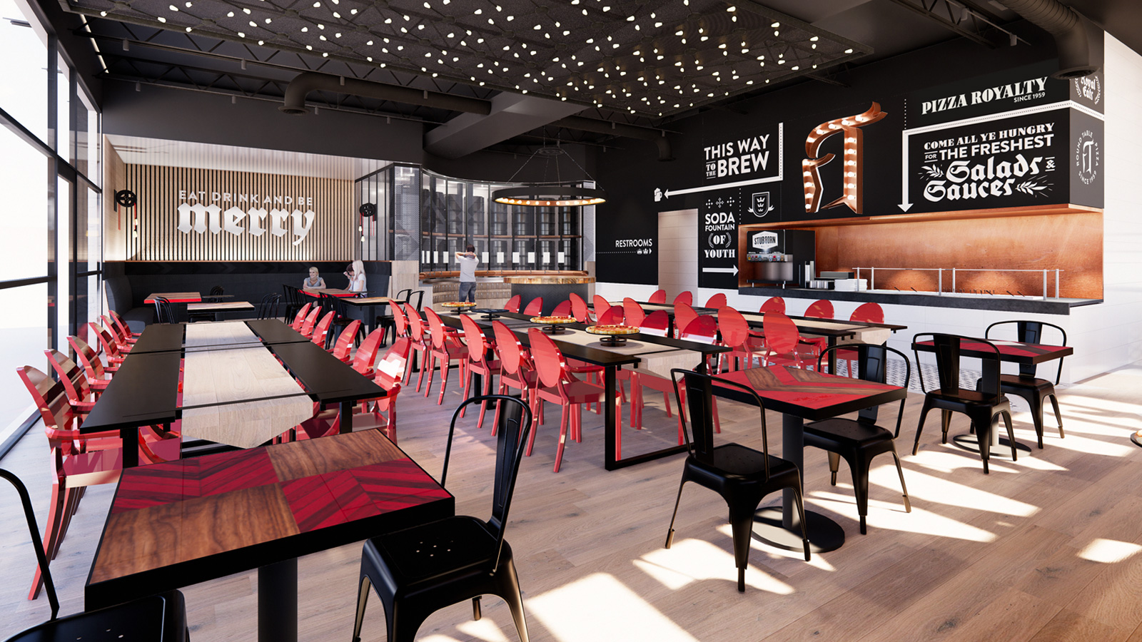
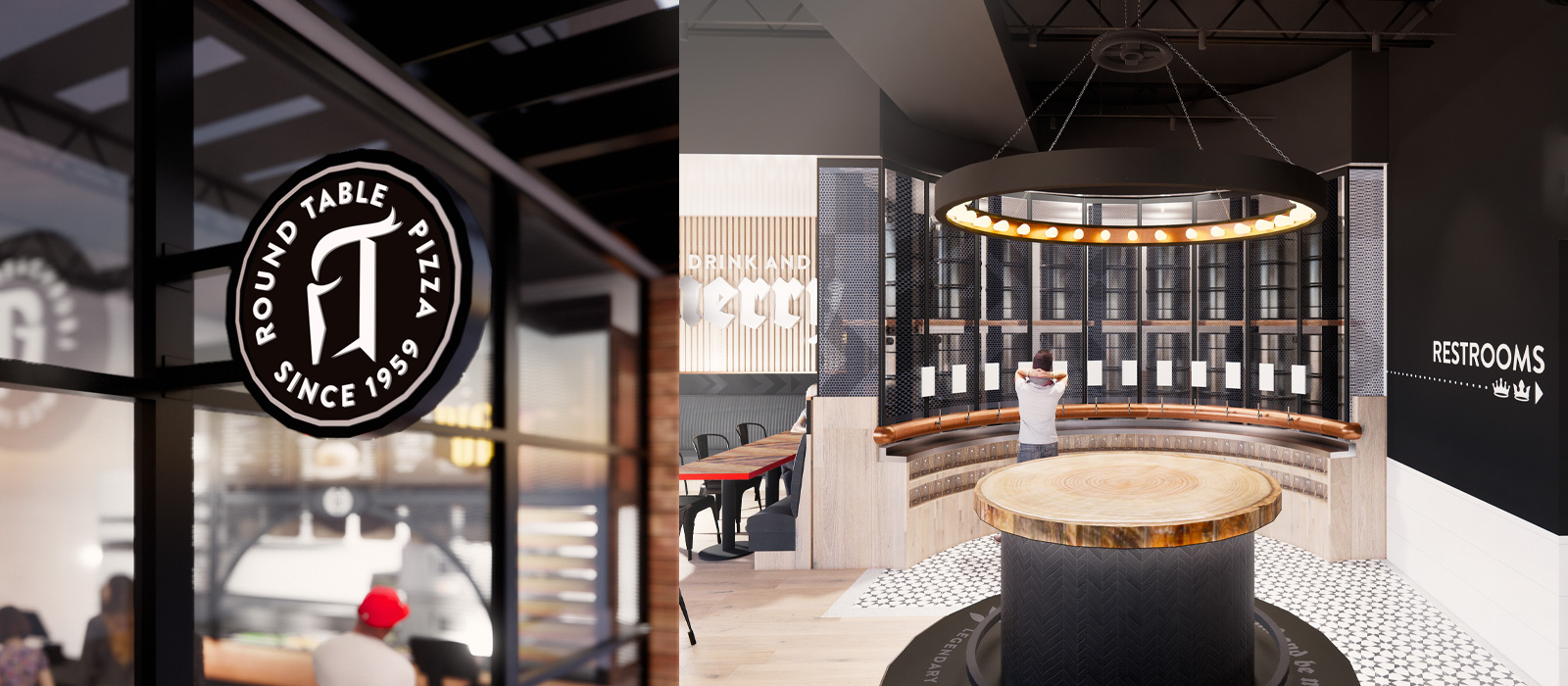
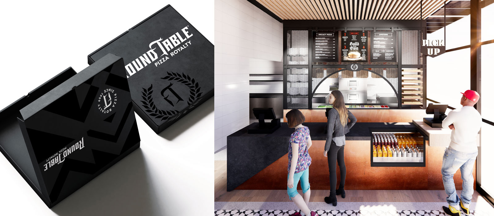
Round Table’s new Brand persona embodies its iconic legacy and speaks with pride, confidence and conviction while still being lighthearted and approachable. Every detail represents the Brand’s “Coat of Arms” of honor, valor and revelry. The new logo or Brand Mark (now used throughout the website and social media), was designed to reflect the fun, confident and gallant personality of Round Table. It was also inspired by the font used in the original Round Table Pizza logo. When looking closely at the full logo, one can see the silhouette of a knight’s helmet between the “D” and “T.” That knight when taken alone, represents the “r” and the “T” (in Round Table), which will be used as a seal and icon found on packaging, uniforms, menus and more.
Images (opinion after)
Opinion
The old logo looked so cheap with its hard shadows and clunky arrangement — from its look I would have never guessed there were 440 of these restaurants. The new logo harkens to the original logo’s use of blackletter — I kinda wish they had just slightly modernized that old logo because it was pretty nice — but with a more… commercial (?) look… I can’t quite describe it. It’s a weird logo… I don’t like it at all but I respect that it went where it went visually and sort of committed to this whole knight aesthetic instead of doing some friendly sans serif. In between the “D” and the “T” is supposed to be a knight’s helmet… I can see it, sure, but it’s a bit of a stretch as it’s a fairly abstract helmet requiring extra squinting. But, again, I applaud the effort. The badge/monogram thing is all kinds of weird, though, with a lowercase “r” forced in there to make the negative-space helmet which it does valiantly but makes for a super weird “r”. The application in the renders and on the website gets a little heavy-handed with the blackletter stuff and knight parlance but, hey, they have at least committed to it full on.