
Noted: New Logo and Identity for KBR by Teamm

“Good Timing”
(Est. 1837, previously Royal Library of Belgium) "KBR [a contraction of two names in two different languages: Koninklijke Bibliotheek and Bibliothèque royale] is the national scientific library and collects all Belgian publications. The institution preserves, manages and studies more than 8 million documents, a rich cultural and historical heritage. KBR provides access to all information in its collections, facilitates research and offers a broad cultural experience."
Design by
Teamm (La Louvière, Belgium)
Related links
Guidelines (in Dutch)
Relevant quote
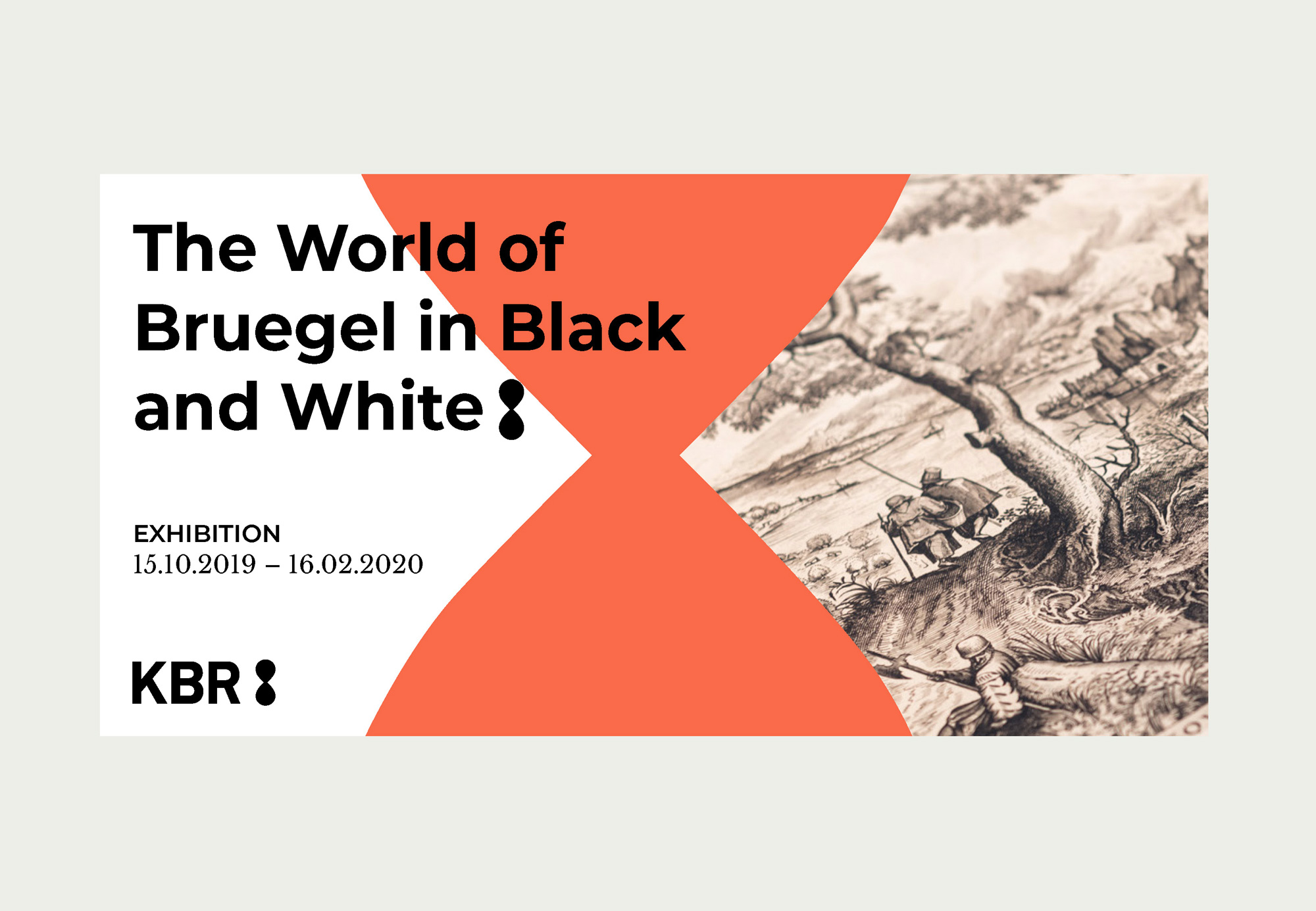
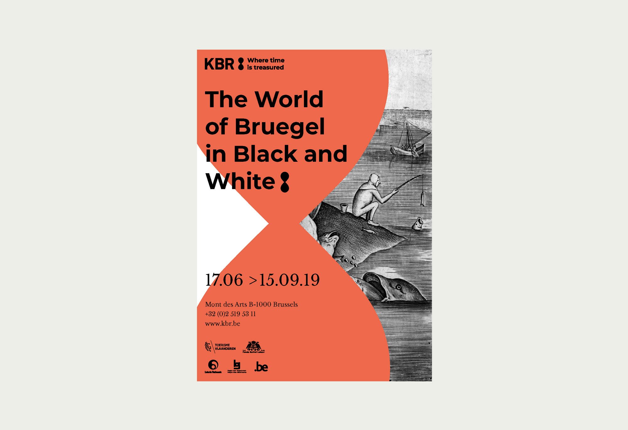
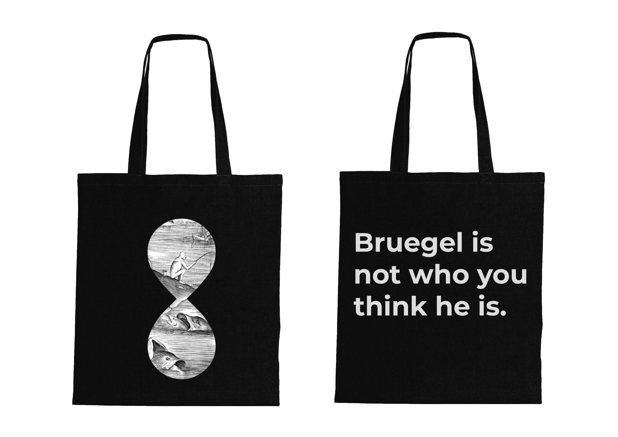
The KBR logo is an hourglass, preceded by the letters KBR. The hourglass symbolises time, but it is also reminiscent of the infinity symbol.
Images (opinion after)
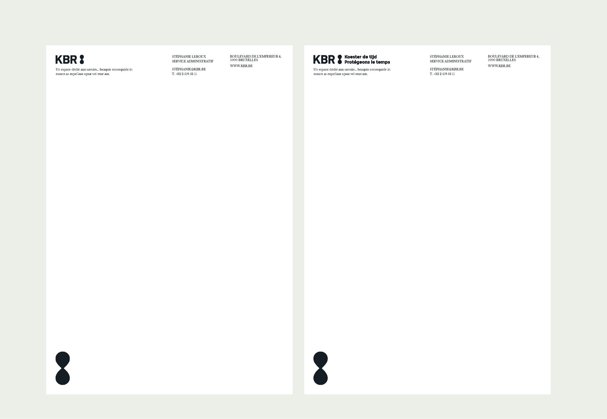
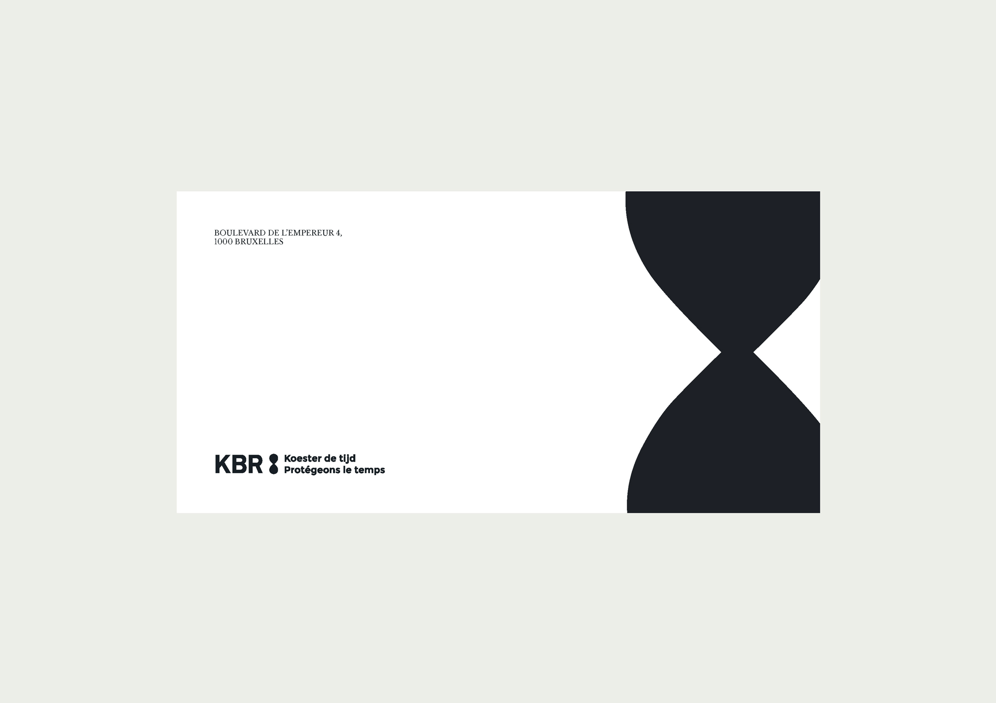
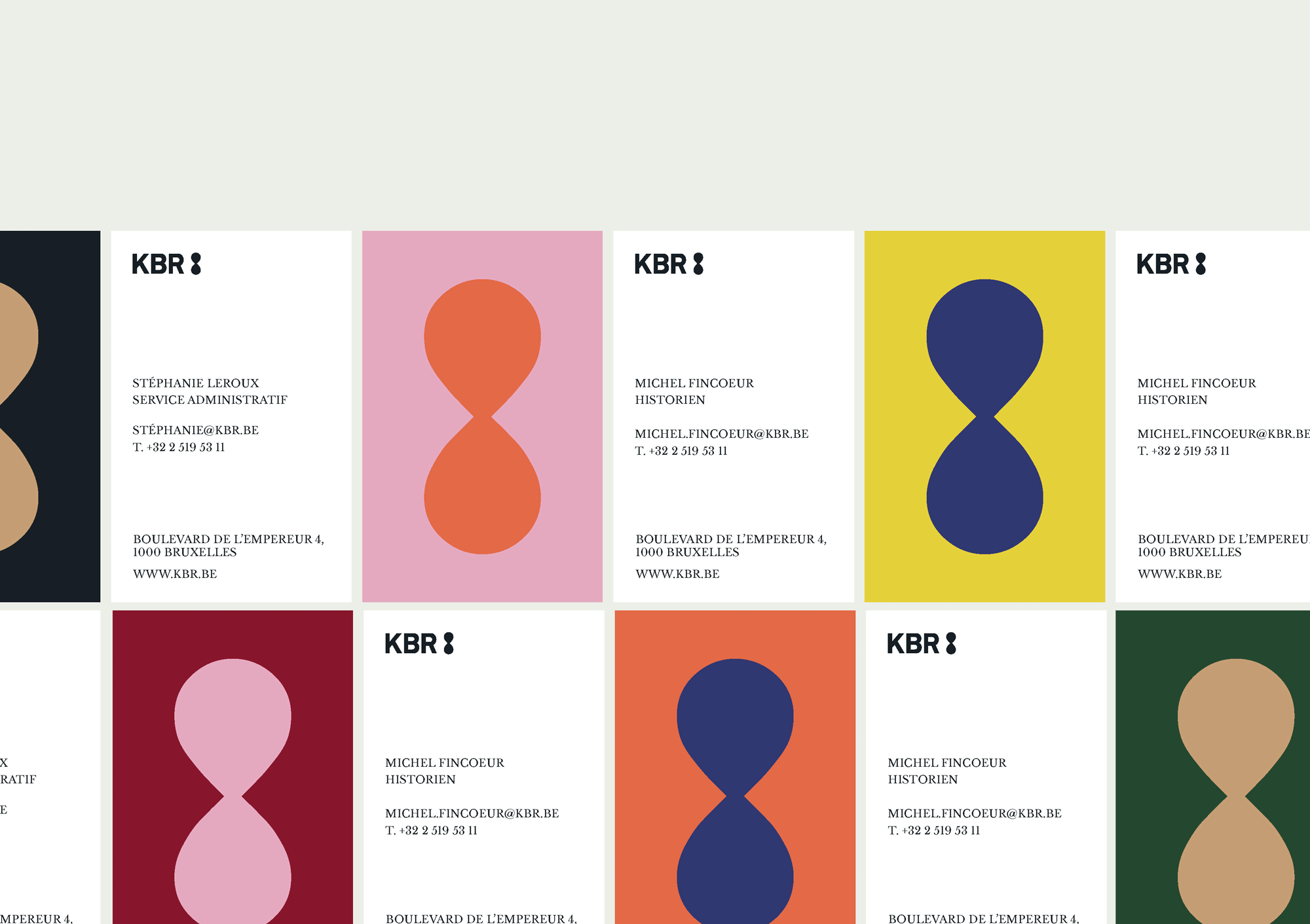
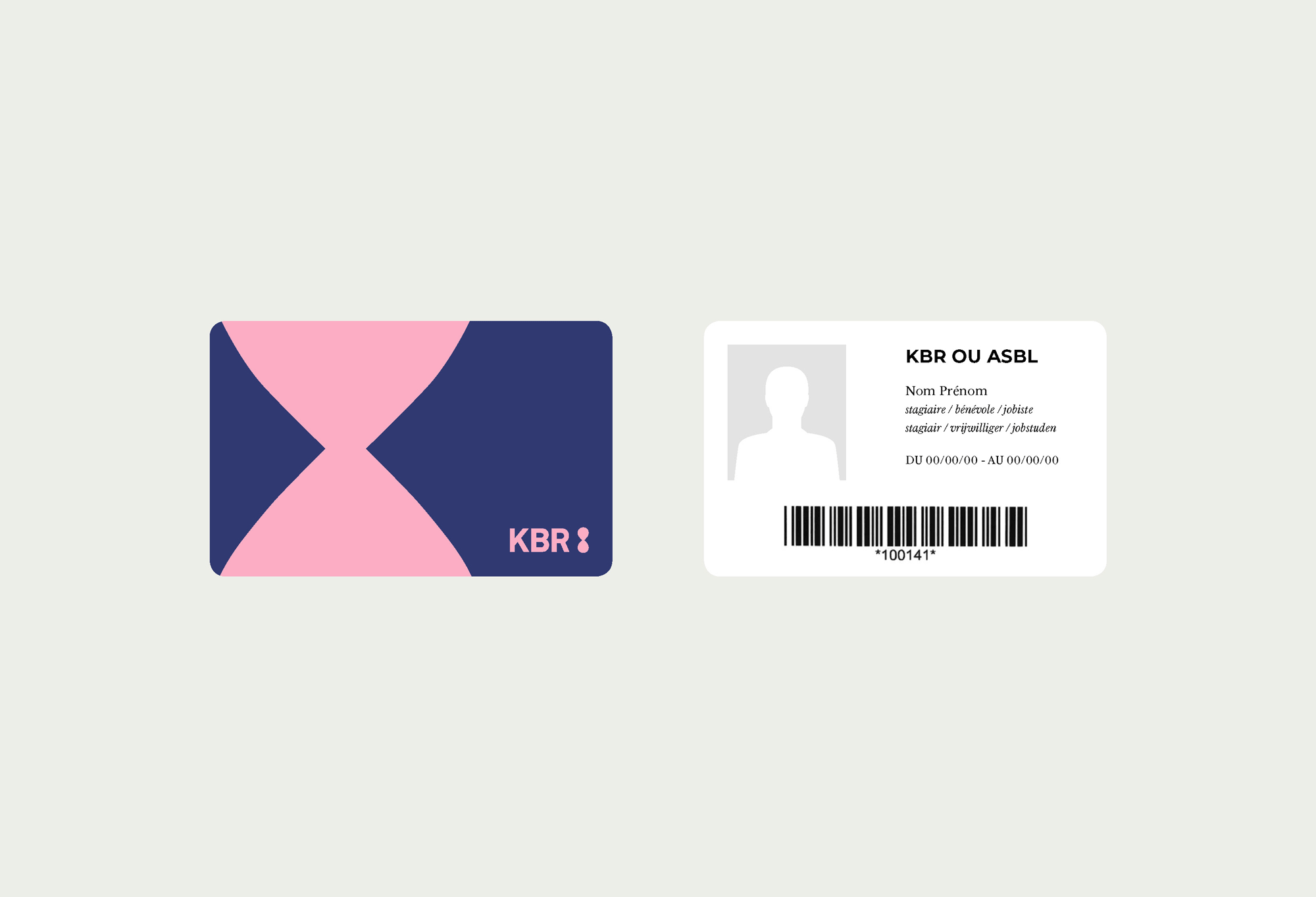
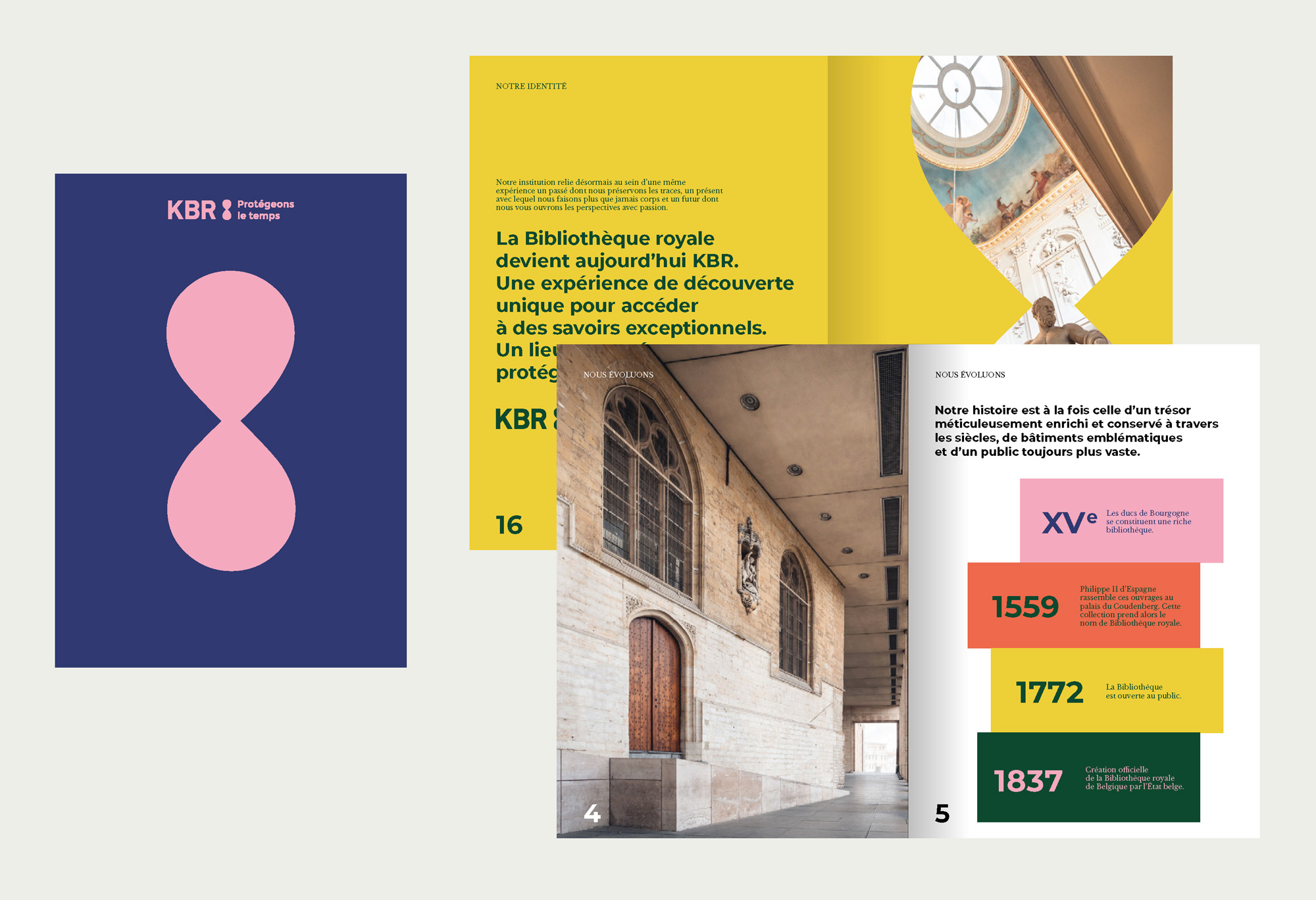
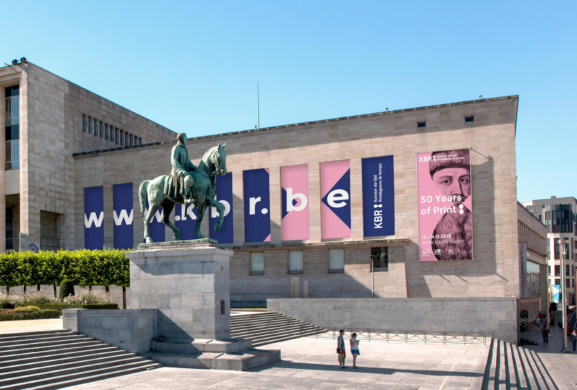

Opinion
The old logo I am guessing featured an abstraction of the library’s building and if it’s not, then I am unsure of what’s going on in that circle. The old name was long but clear. I wonder if many people referred to it as “KBR”, which would inform the new name, which is definitely shorter but, in such short form, not a name I would associate with a national library. Nonetheless, it makes for a far better logo and paired with a nice, minimal icon it works quite well. A combination of infinity symbol and hourglass, the icon has a nice mysterious ambiguity to it and within the context of a library, the icon can trigger a number of positive associations like the passage of time through books and knowledge, capturing a moment in time, or the infinite benefit of a library. This could easily be a corporate logo and, in that context, it would probably make me roll my eyes. The applications are fairly straightforward and make good use of the icon by making it big, making it colorful, making it punctuate sentences, using it as window, or using it to separate content. At times it’s too many hourglass icons in one application but they have good cause to be excited about using their icon. Overall, it has a slightly heavy corporate vibe but it’s a strong system and when infused with old-timey images and illustrations the corporate effect gets balanced out.