
Noted: New Logo and Identity for The Lester Prize by Block

“Face Forward”
(Est. 2007) "The Lester Prize (formerly ARTrinsic Inc's Black Swan Prize for Portraiture) is a not-for-profit organisation founded in 2007 and has grown to become one of the country's richest prizes for portraiture. The Lester Prize (through the talent, dedication and hard work of our artists) is proud to provide Western Australia and the country with the opportunity to engage with the best of the artform in a format that puts both artists and community front-and-centre."
Design by
Block (Perth, Australia)
Related links
Campaign Brief story
Relevant quote
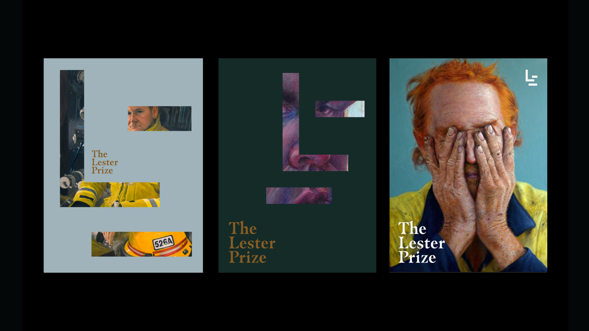
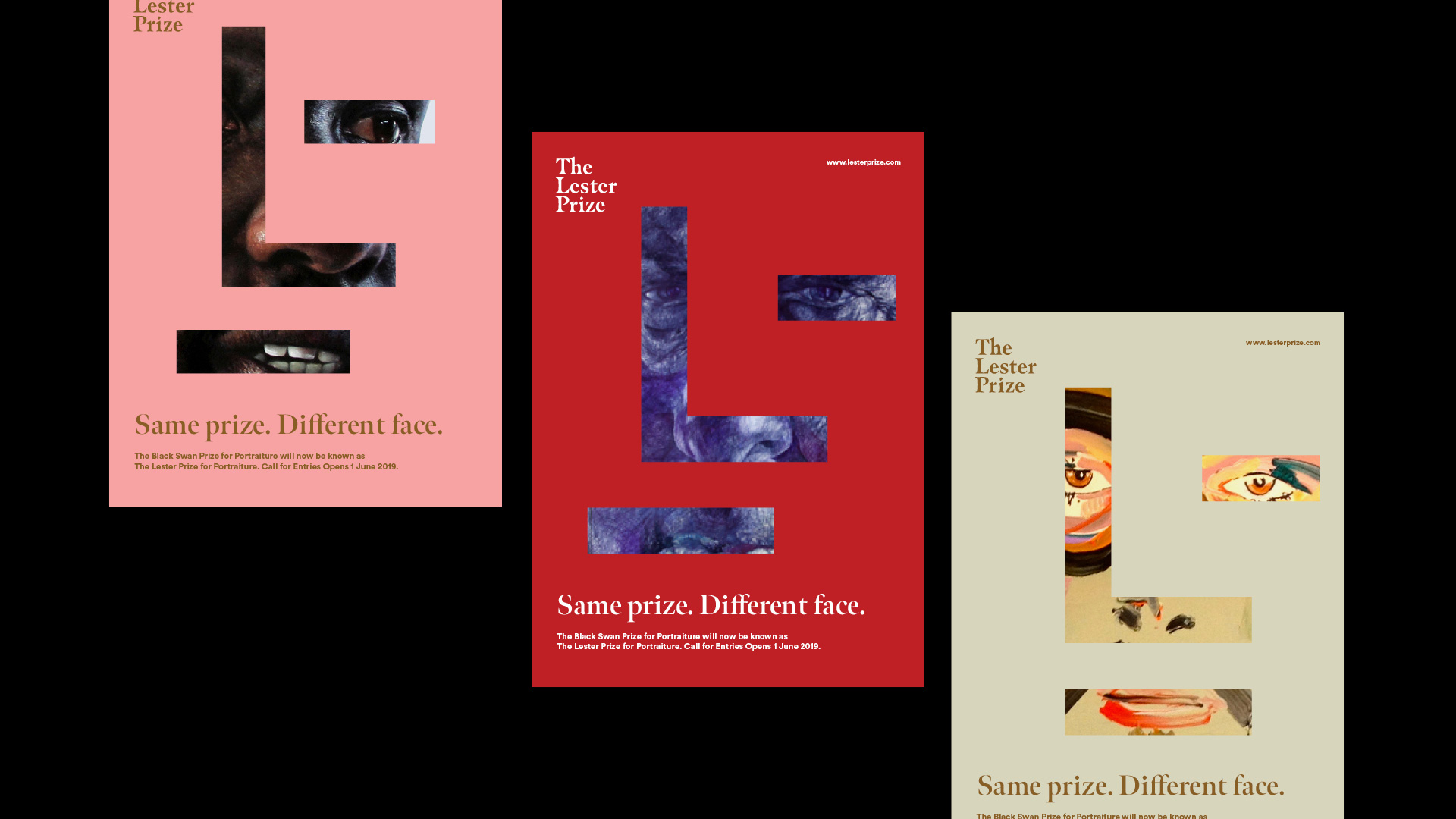
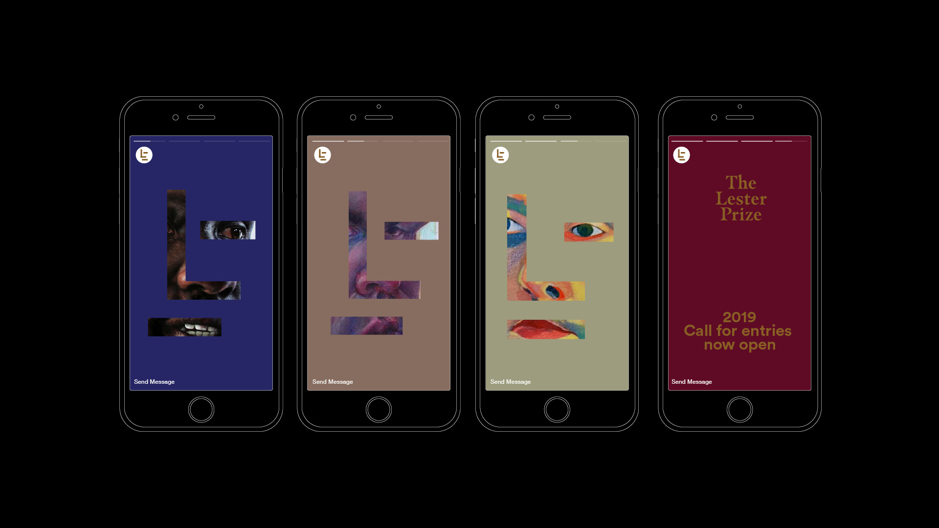
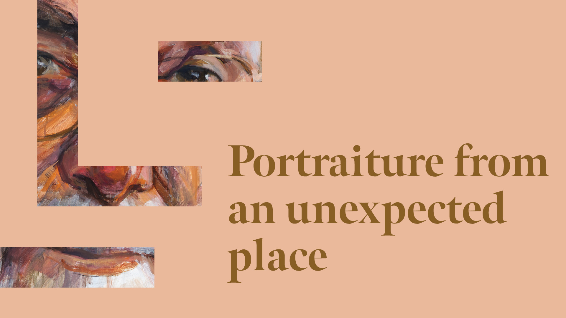
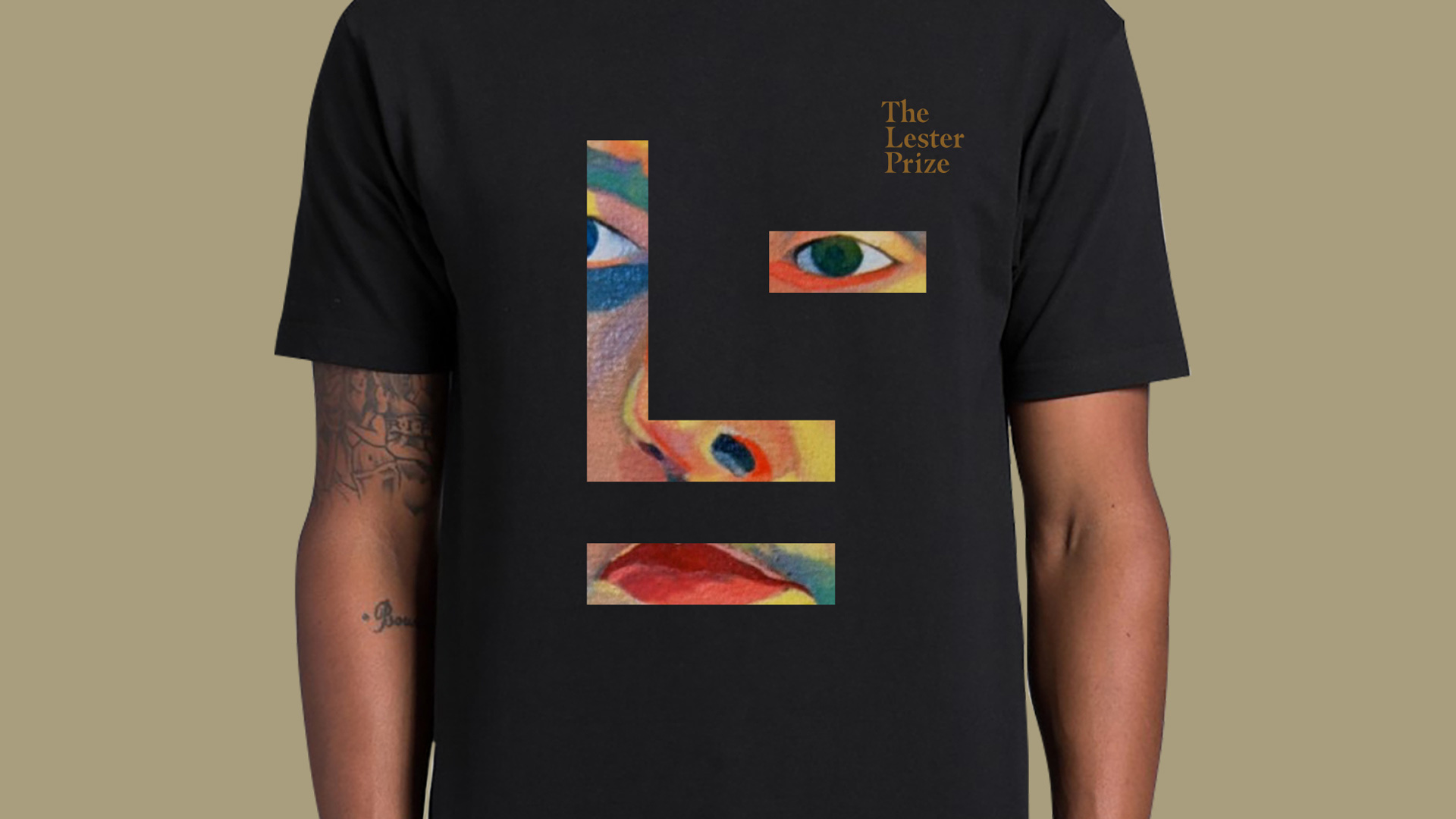
To elevate the profile and prestige of The Lester Prize, we have designed a very classic, timeless and dynamic identity. The icon plays on the ‘L’ in Lester to create a framing device that can be adapted to reflect the different styles and faces represented in the portraiture prize. The rebrand also delivers the consistency and clarity needed to attract world-class partners and sponsors.
Images (opinion after)
Opinion
The old logo was okay, I guess. It had a black swan in a semi-artistic aesthetic and decent type but it didn’t look prestigious. The new logo features a lovely serif wordmark, set in a dark gold hue, that has a very formal-wear aesthetic and now oozes prestige. Even if you don’t know what The Lester Prize prizes you know it means business. Complementing the wordmark is an abstract face icon (it’s also an “L”) that can be used on top of portraits and adjusted so that its eye, nose, and mouth land on top of the portrait. It can also be used in the logo-as-window modality with a portrait seen through it. The icon reminds of Oskar Schlemmer’s Bauhaus logo, which isn’t a good or a bad thing — it just came to mind. The icon and wordmark don’t go so well together in a formal lock-up and work best when the icon is bigger and the wordmark serves a supporting role. Overall, a lovely and smart redesign.