Noted: Follow-up: Packaging for WW by Pearlfisher
“FTWW”
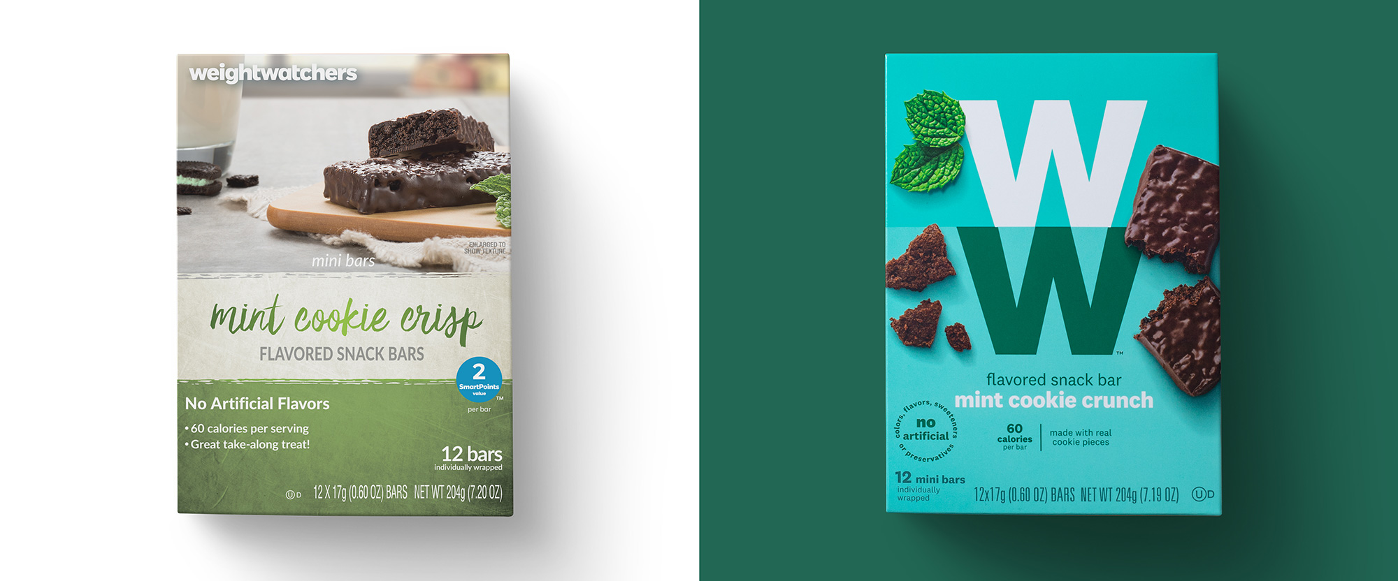
(Est. 1963) "WW - the new Weight Watchers - is a global wellness company and the world's leading commercial weight management program. We inspire millions of people to adopt healthy habits for real life. Through our engaging digital experience and face-to-face group workshops, members follow our livable and sustainable program that encompasses healthy eating, physical activity, and a helpful mindset. With more than five decades of experience in building communities and our deep expertise in behavioral science, we aim to deliver wellness for all."
Design by
Strategy and identity: SYPartners
Packaging: Pearlfisher
Related links
Pearlfisher project page
2018 Brand New Noted post
Relevant quote
We focused on the values and mission of WW, imbuing the new packaging design with emotion and impact. As a result, the redesign expresses the brand transformation in a bold and visionary way to extend the appeal of the brand to everyone while continuing to resonate with existing members around the world.
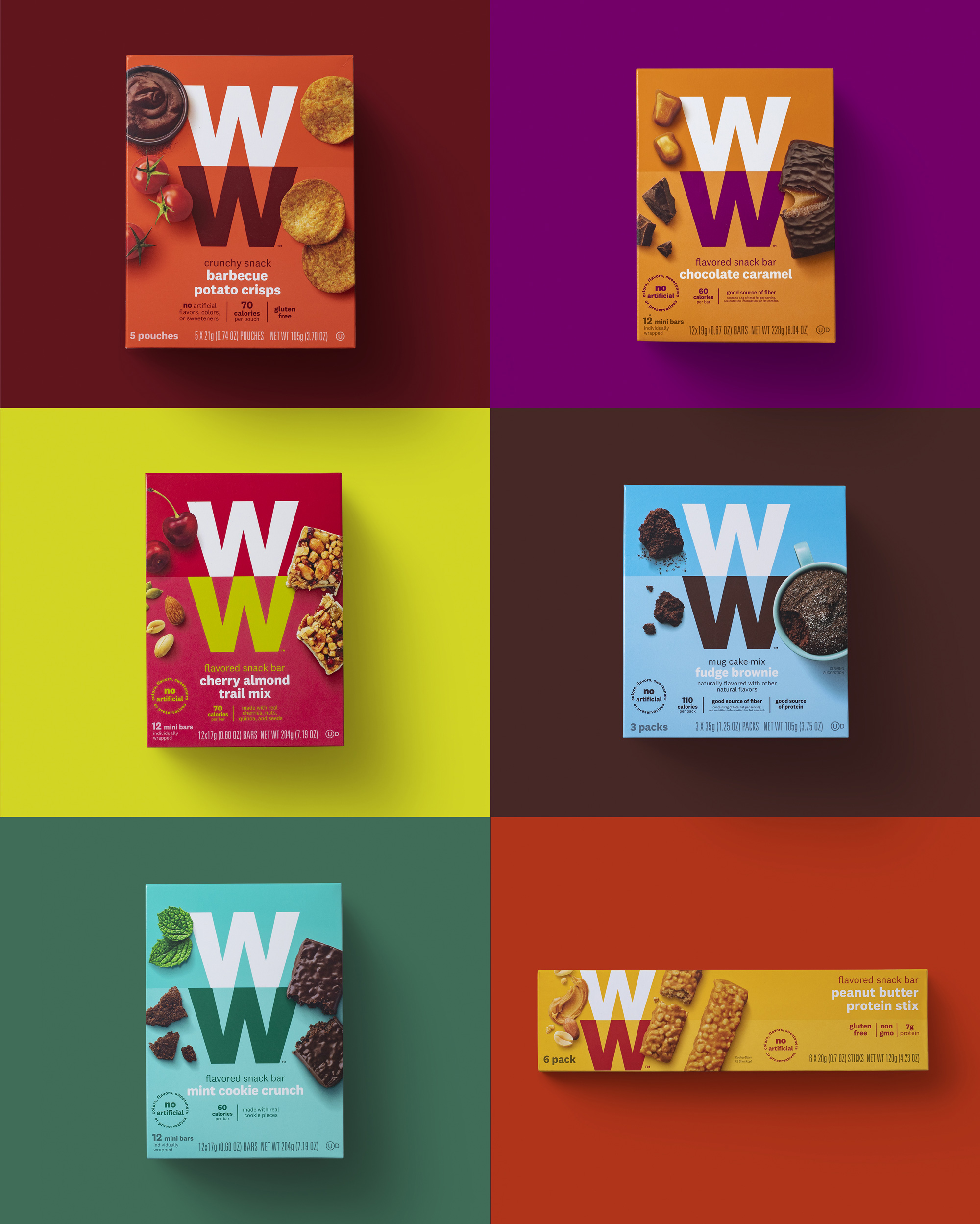
WW's new packaging design has a bold, brand-forward and iconic attitude to create a deep and visceral connection with its audience while moving away from functional packaging toward a more vibrant and diverse expression.
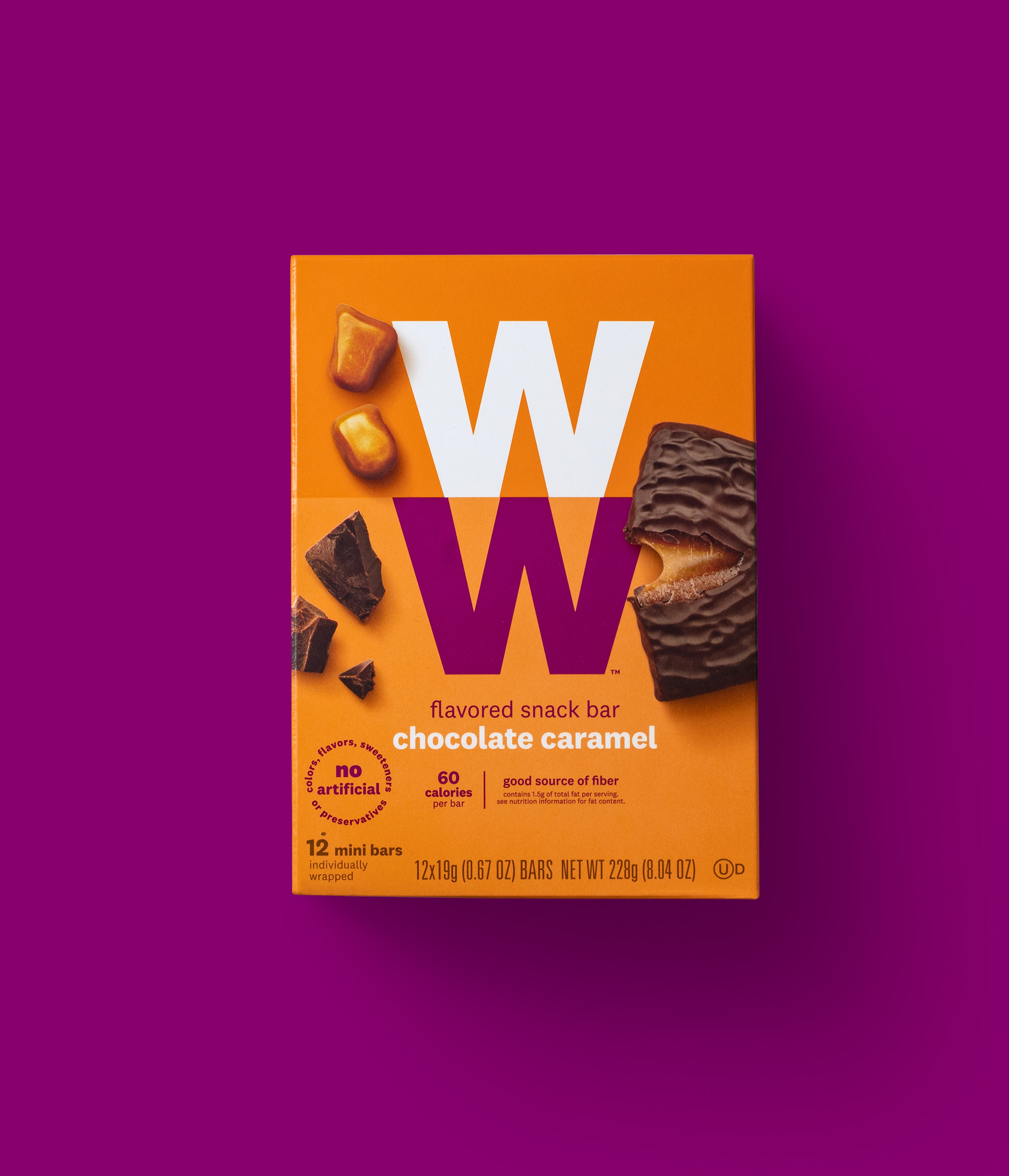
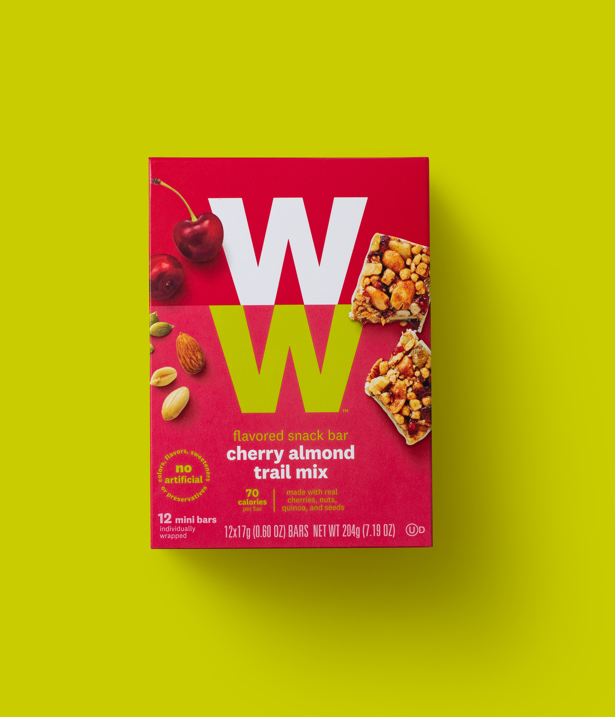
The new food photography focuses on the actual ingredients, calling out that products are free of artificial sweeteners, preservatives and color, with crumbs showing spontaneity and real-life imperfection. SmartPoints, the brand’s proprietary point value system, have been shifted from the front-of-pack placement to ensure that the focus is on the enjoyment of the food and a modern lifestyle approach to the WW brand.
Images (opinion after)


Opinion
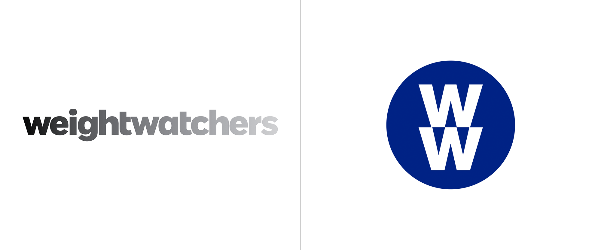
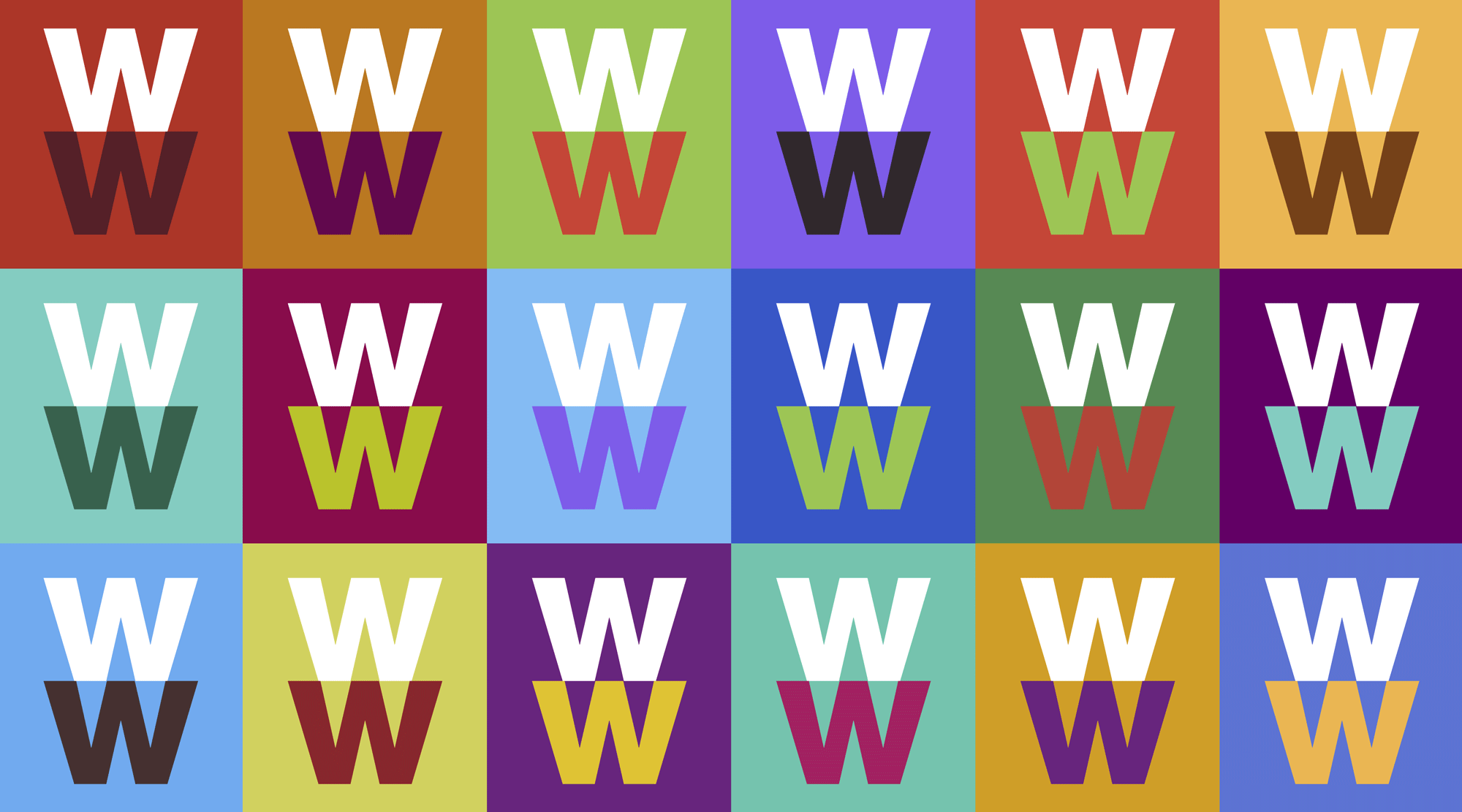
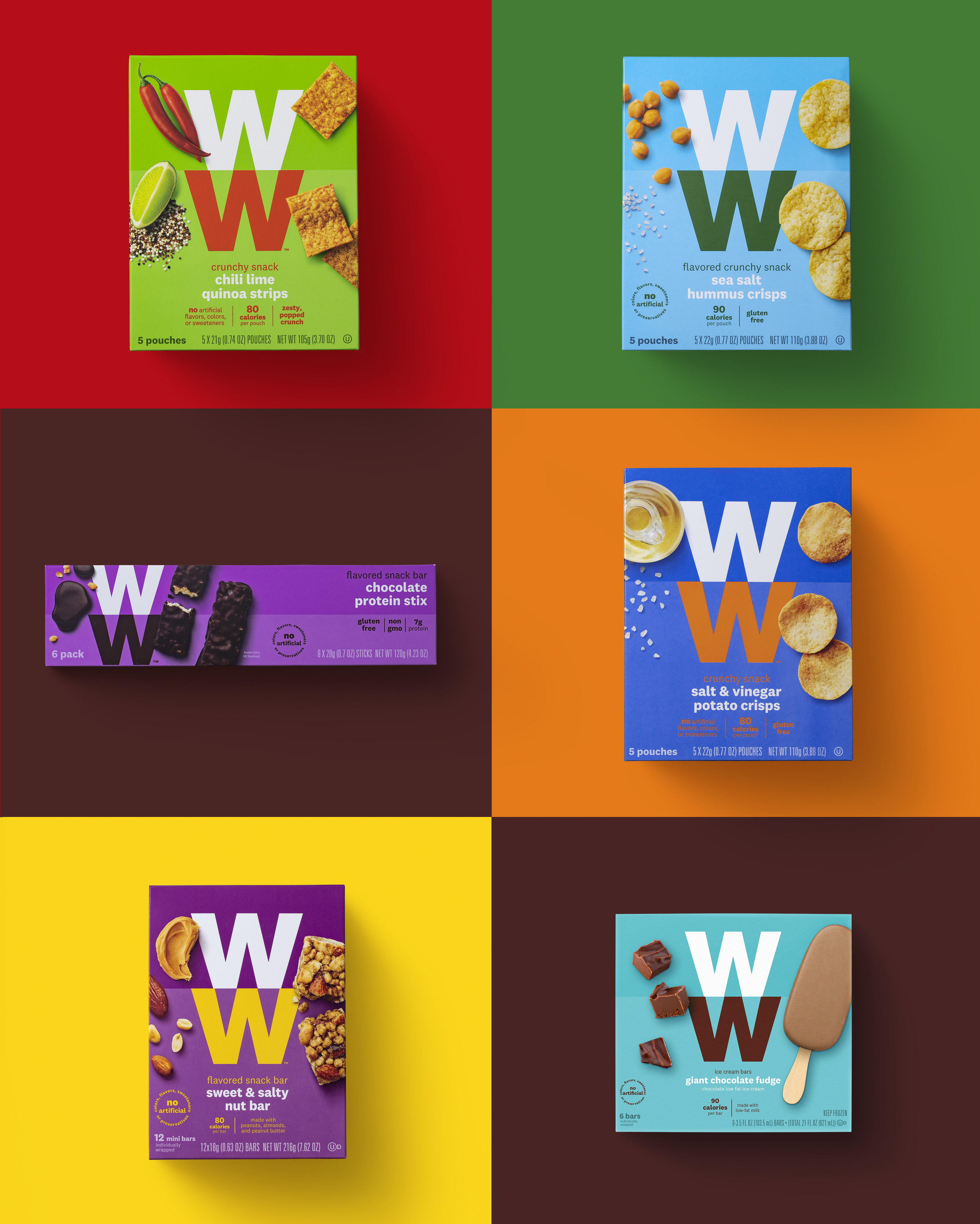
In the previous post I wrote that “the applications look promising” and the new packaging delivers modestly on it. The new boxes are fairly striking with the big “WW” logo anchoring a range of tone-on-tone color combinations for the different products and peppered with photos of the ingredients and the products, which are kind of obligatory but handled well with some neat clipping paths and drop shadows. The combination isn’t mind-blowingly awesome but it gets the job done efficiently and makes the packaging look infinitely better than what the header image shows the old packaging doing, which was being kind of annoying. The one thing that I’m surprised I didn’t mention in the previous post was (and still is) the lack of alignment/continuation between the two “W”s. This was clearly done on purpose and I would assume came with plenty of discussion around it with, possibly, the argument of visual alignment and balance winning over vector-snapping. However, with the logo being used so big in the packaging with high-contrast color combinations, my eyes keep going back to it and all I wanna do is make all of those joint points come together and honor the Snap to Point Gods. This “feature” is carried over from SYPartners’ part of the job so it shouldn’t derail (too much) your opinion on the on the packaging, which I think is nice enough, especially if you consider this is a global rollout that needs to work for a whole bunch of different folks.


Comments
Packaging is noice!! Not sure I’m feeling that two-tone background colour, though, but hey. Fresh.