
Noted: New Logo and Identity for Halifax by Rufus Leonard

“Will it ’fax?”
(Est. 1853) "At Halifax we've been helping our customers since 1853. Whether buying a home or saving for a rainy day, we'll help you with all your everyday banking needs. With every branch open Monday to Saturday, 24/7 Online and Mobile Banking, and easy to use Telephone Banking, we're giving our customers more time and more ways to manage their money. We offer a wide range of accounts and services to suit your banking needs. Visit our website to find details of our very latest offers."
Design by
Rufus Leonard (London, UK)
Related links
Design Week story
Relevant quote
Halifax’s new brand strategy is based around “fintech meets humanity”, says Carlo D’Alanno, executive creative director at Rufus Leonard, which has drawn inspiration from the “straightforward and simple” feel of financial technology brands.
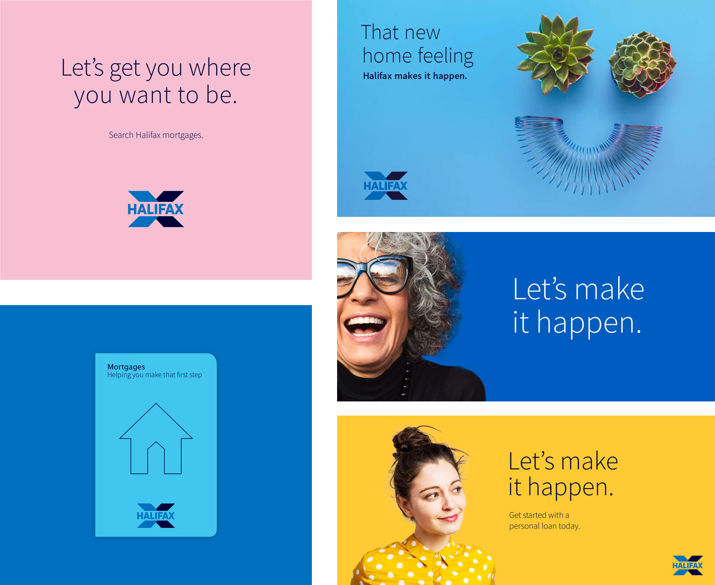
The refreshed Halifax logo retains the brand’s “X” symbol, but includes a new, bespoke logotype, as well as a redesigned “X” that is now filled-in rather than striped with horizontal lines. The new typeface is less bold, with thinner letterforms and smaller kerning, while the new “X” is also thinner and slightly elongated.
[D’Alanno] adds that the new identity aims to humanise Halifax, and through using softer colours, flatter graphics and people photography, help it appear “more honest and democratic”, and enable it to stand out from high-street competitor banks such as Natwest, Santander and Barclays. “We want to make it feel less like an institution and more a bank of choice that is easy to engage with,” he says.
Images (opinion after)
Opinion
I wasn’t familiar with this finance organization before but based on the number of tips I guess I have been missing out. As such, I’m not sure how liked or disliked the logo and brand were but I get the gist that the old was old and the new is new (as in let’s-get-those-young-people-new). The old logo was fine… a horror to reduce and a little aggressive on the extra heavy font but fine for the most part. The new logo is fine execution-wise — the “X” is clearer and the type is better — but it has a super weird evil corporation vibe that seems to go against the goal of attracting a younger audience and competes with the overly friendly layouts with the light font, smiling people, and soft pastel colors. Overall, it has a cobbled-together feel that fails to communicate whether this is an old-fashioned, storied institution or one of those digital-first finance fun things and in trying to be both, it nails neither.