
Noted: New Logo and Identity for Daisie by Koto

“Dai and Night”
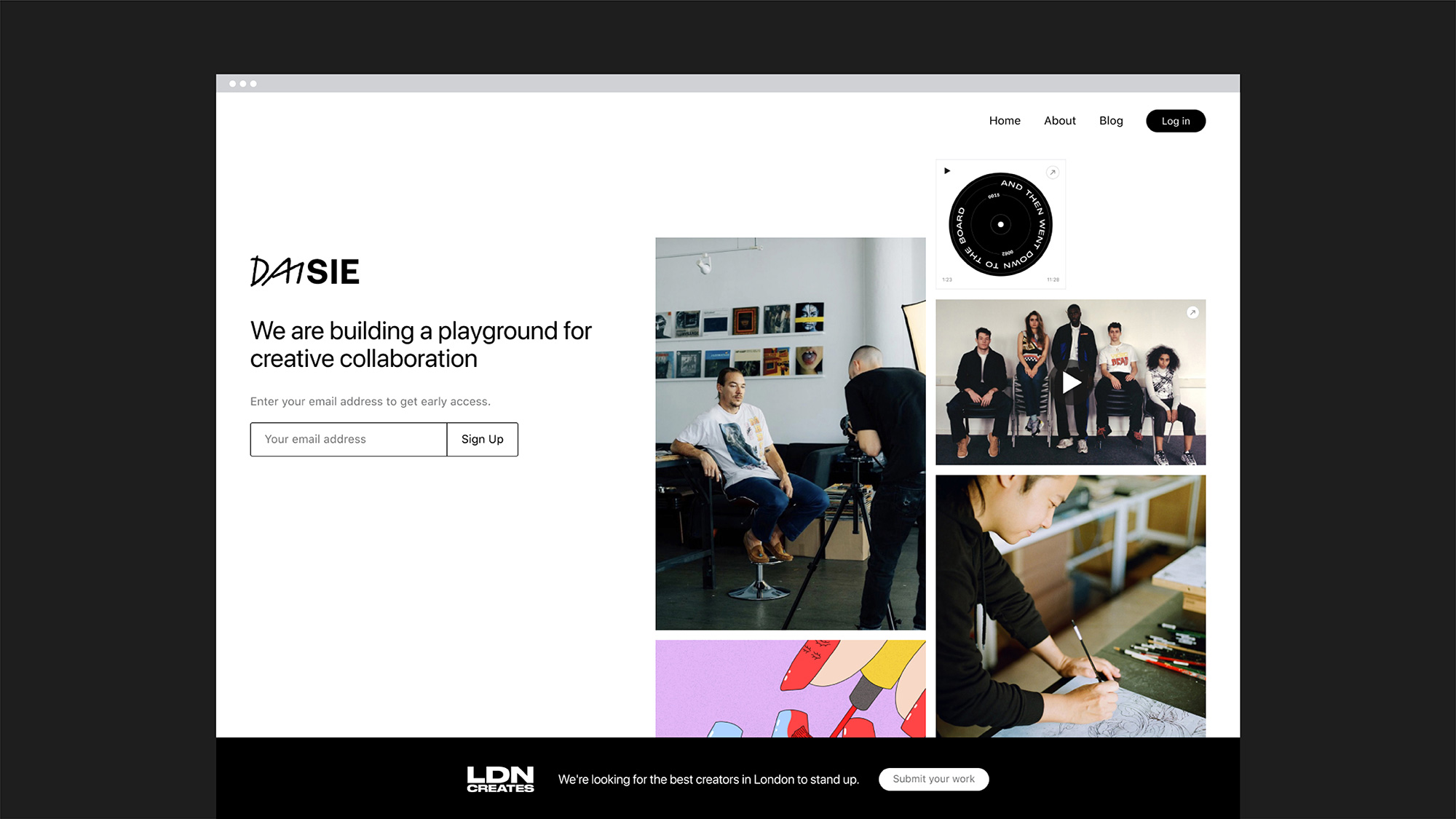
(Est. 2017) "Daisie was founded in London in 2017 by Maisie Williams and Dom Santry. It is currently in early access, and launches worldwide in May 2019. Daisie brings creators together and supports them to do amazing work. It aims to solve the 'messy middle' in projects by providing creators with the tools and community they need to make their ideas happen. Available on desktop and iOS, Daisie enables users to connect with creators around the world, work collaboratively on projects, find an audience and get inspired, and build a lasting career."
Design by
Koto (London, UK)
Related links
N/A
Relevant quote
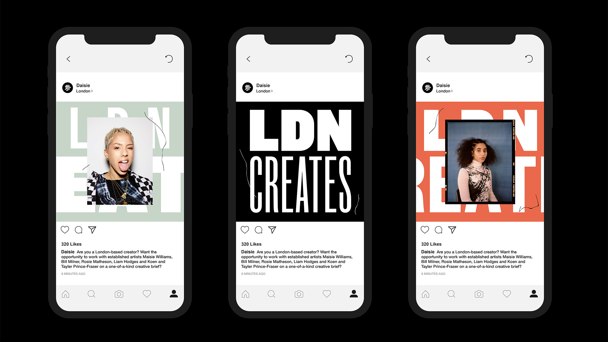
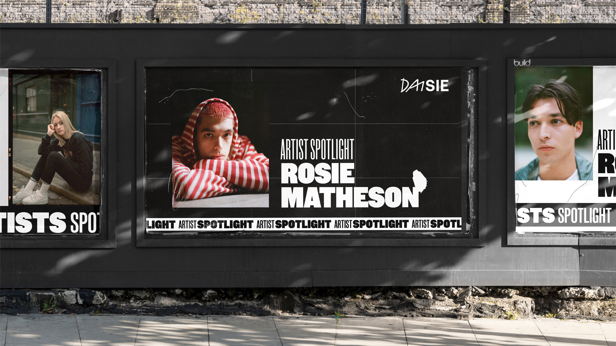
Working quickly and collaboratively, Koto sought to land on a look and feel that nodded to Daisie's London roots but that also spoke to a global audience of youthful creatives. Instead of leaning towards a classic tech brand or "Stripecore" style , the emphasis was firmly on creativity, imagination and collaboration.
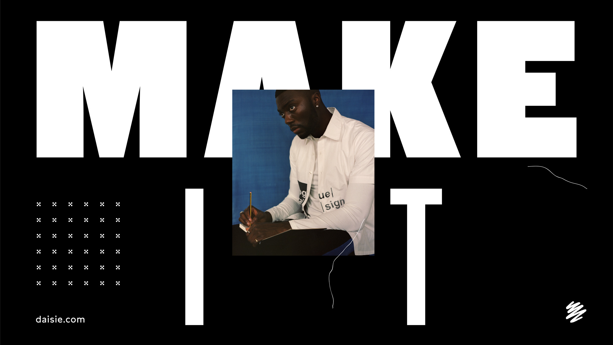
The logo is raw, honest and human. The resolution from hand-drawn to typography reflecting the evolution of creative thinking from idea to finished product.
The symbol captures the essence of Daisie's distinct scribble language and acts as a visual shorthand. The scribble shows up elsewhere, suggesting the scrappy nature of creativity and "work in progress".
Daisie's primary brand typeface is New Grotesk Square. It is loud, unapologetic and impactful – ensuring the brand gets seen and heard. Lynstone is the secondary brand typeface; it's main function is across body copy for maximum legibility.
Colour – or the lack of it – is a critical part of the brand. The primary colour palette is purely monochromatic, it is built from Black, Slate and White. It's only when Daisie wants to communicate about an external topic – a creator, a collaborator, a partner – that other colours are introduced.
Images (opinion after)

Opinion
I have no idea what’s going on with the old logo other than it being a “d” but why the bean inside or the line separating the stem are there is a mystery. The new logo is pretty cool with half of it hand-drawn and half of it a straight sans. It manages to convey, if we wanted to get philosophical, the interplay between creativity and business and how you need a little both to succeed. After the logo, things get iffy and this is coming from a member of the Koto fan club. The icon is a scribble. It’s a cool scribble but that’s about it. Then there is a mix of light and extra bold condensed typography that has no relation to the logo and some very weird floating single hairs and some plus signs and some multiply signs. It all looks like it’s supposed to look: moody, trendy, and creative-y but it’s all mostly superficial. It also feels like it further confuses what Daisie is, which I still don’t quite get what it is. Perhaps when it fully launches everything will come into focus but, for now and for the most part, this feels oddly unfocused.