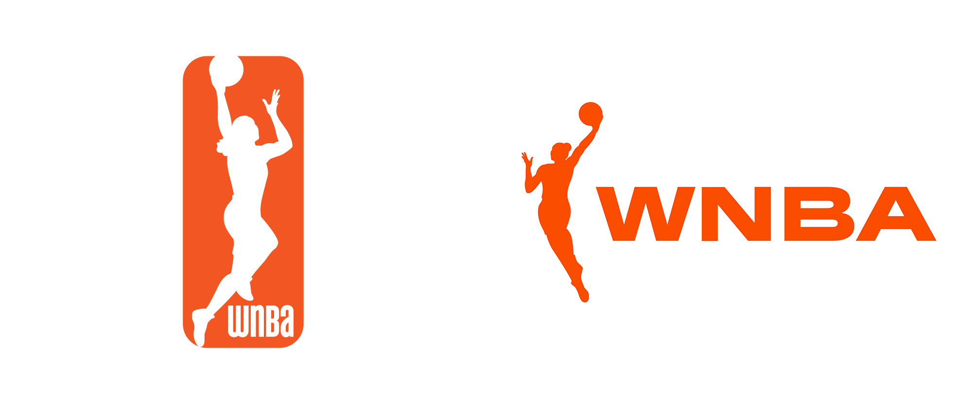
Noted: New Logo for WNBA by Sylvain Labs
“Thinking Outside the Box”

(Est. 1996) "The WNBA - which features 12 teams and is the most successful women's professional team sports league in the world - is a unique global sports property combining competition, sportsmanship, and entertainment value with its status as an icon for social change, achievement, and diversity."
Design by
Sylvain Labs (New York, NY)
Related links
Washington Post story
2013 Brand New Review
Relevant quote
“They took the silhouette out of the box which is a massive breakthrough as she was perceived totally different,” [WNBA chief operating officer Christy Hedgpeth] said. “She was free, there was more movement there, taking up more space. She’s more athletic, longer physique. This is basketball on our terms. That was a phrase that really resonated with the players. That’s really symbolic in that regard.”
The new logo is different from others affiliated with the NBA.
“The NBA logo, there’s a rectangle around him, he’s in a box. Same with the G-League logo and the previous W-logo. She had a box around her,” Hedgpeth said. “The box is going away. It’s powerful, it’s freeing and it’s expansive.”
Images (opinion after)


Opinion
The old logo was good, working in parallel with the NBA logo using the same holding shape and tension within it. I never liked the wordmark because I have a severe allergy to unicase but I did like the energy of the typographic system designed by The Original Champions of Design back in 2013 and all the inline-y-ness. The new logo is also good. I think you can debate the pros and cons of each figure and get nowhere. They are both equally valid answers to the same challenge. The biggest change in the new one is the removal of the holding shape, which seems like sacrilege for a professional U.S. sports organization but, yeah, it does feel liberating and goes very well with the overall vibe of the WNBA being different from other sports organization. The new wordmark is a little too extended but I guess if the goal was to play opposites to what existed before, this does that. It’ not great, it’s not bad — it’s just something else. There is nothing in application yet and based on the Washington Post article, this season (May to September, 2019) will be odd, as balls and uniforms (and many other things) will still carry the old logo but all the marketing and digital will use the new one. So, we’ll see what happens in 2020.


